The network for creativity
Join 1.25M professional creatives like you
Connect with clients, get discovered, and run your business 100% commission-free
Creatives on Contra have earned over $150M and we are just getting started
Back to feedPost

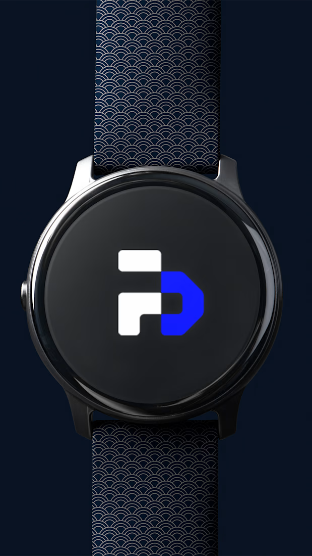
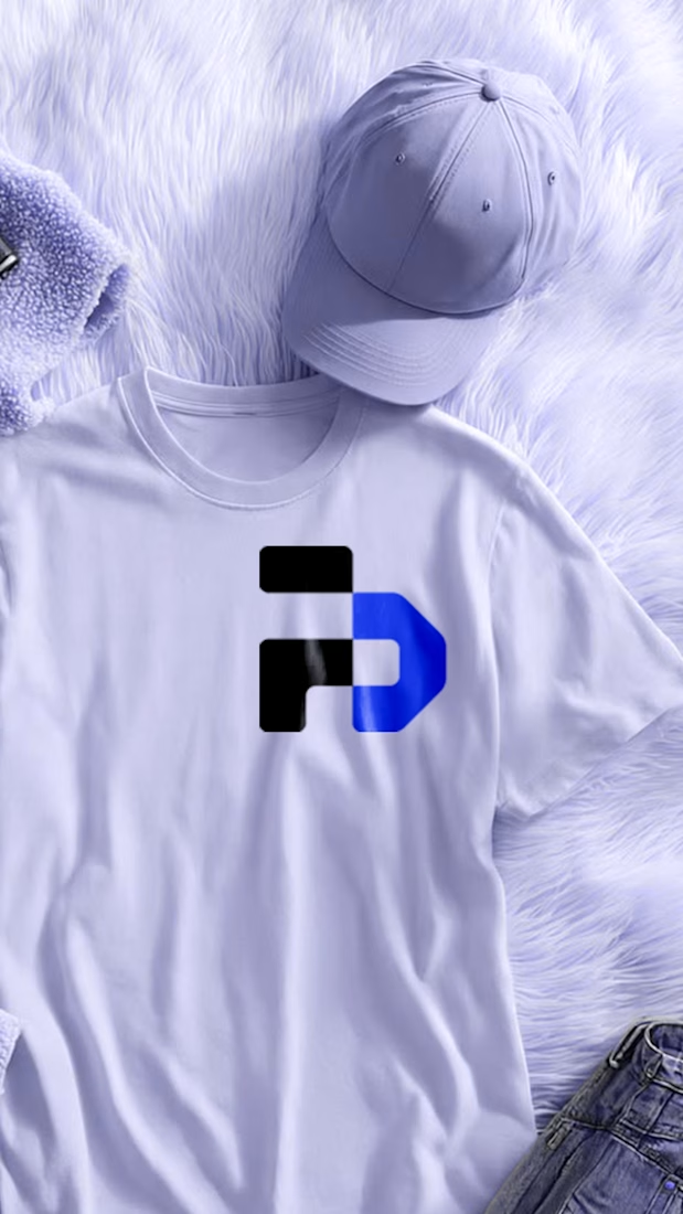
NEOKINETIKA - Visual Communication
Healthcare brands often fall into two extremes: overly clinical and cold, or overly soft and generic.
The challenge was to create an identity that communicates medical credibility, reflects movement, and scales naturally across brand, digital, and physical applications - while still feeling human.
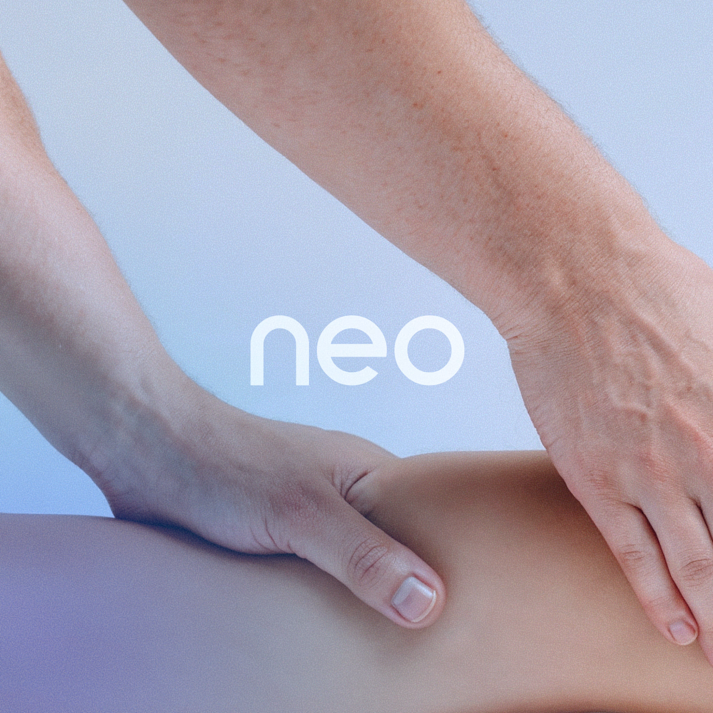
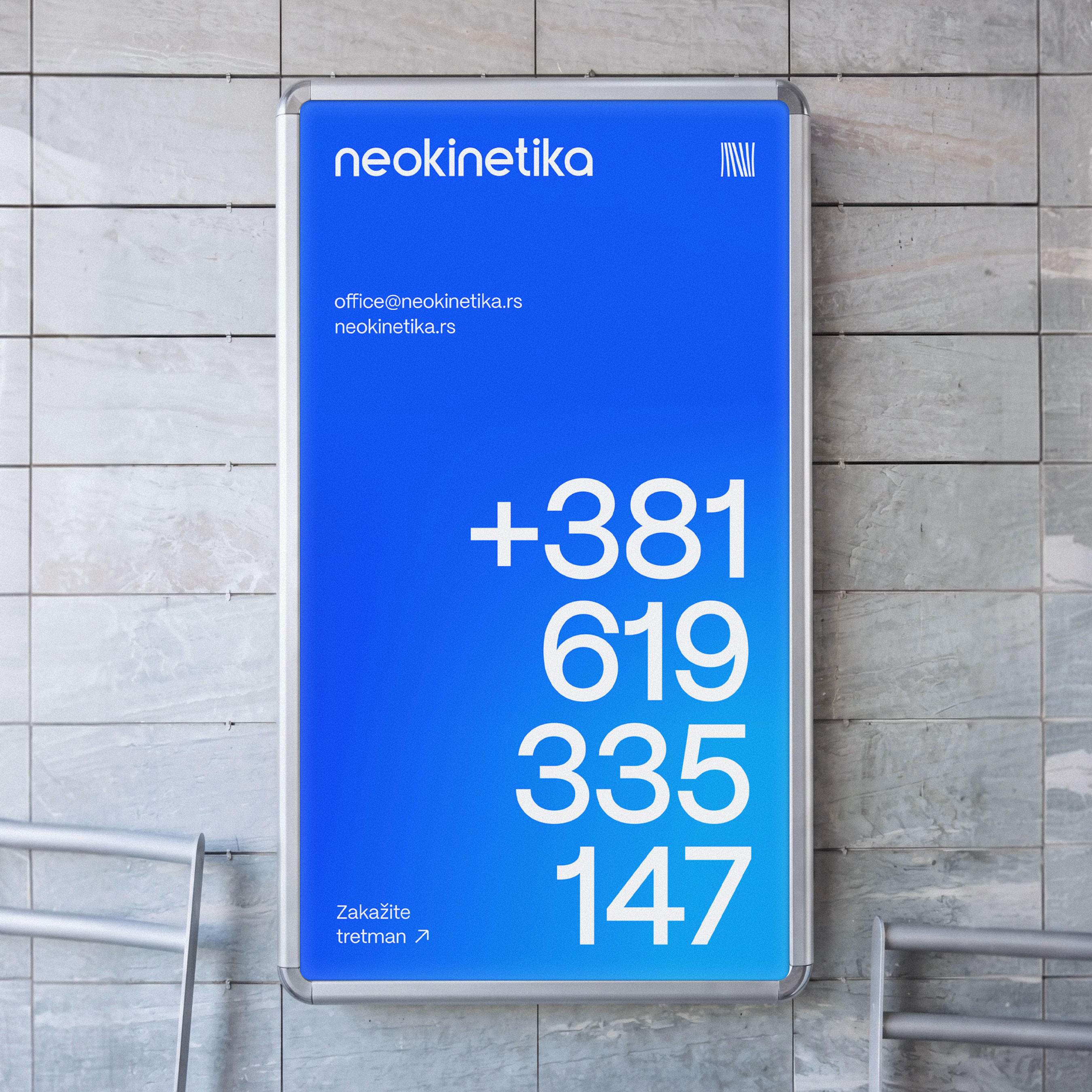
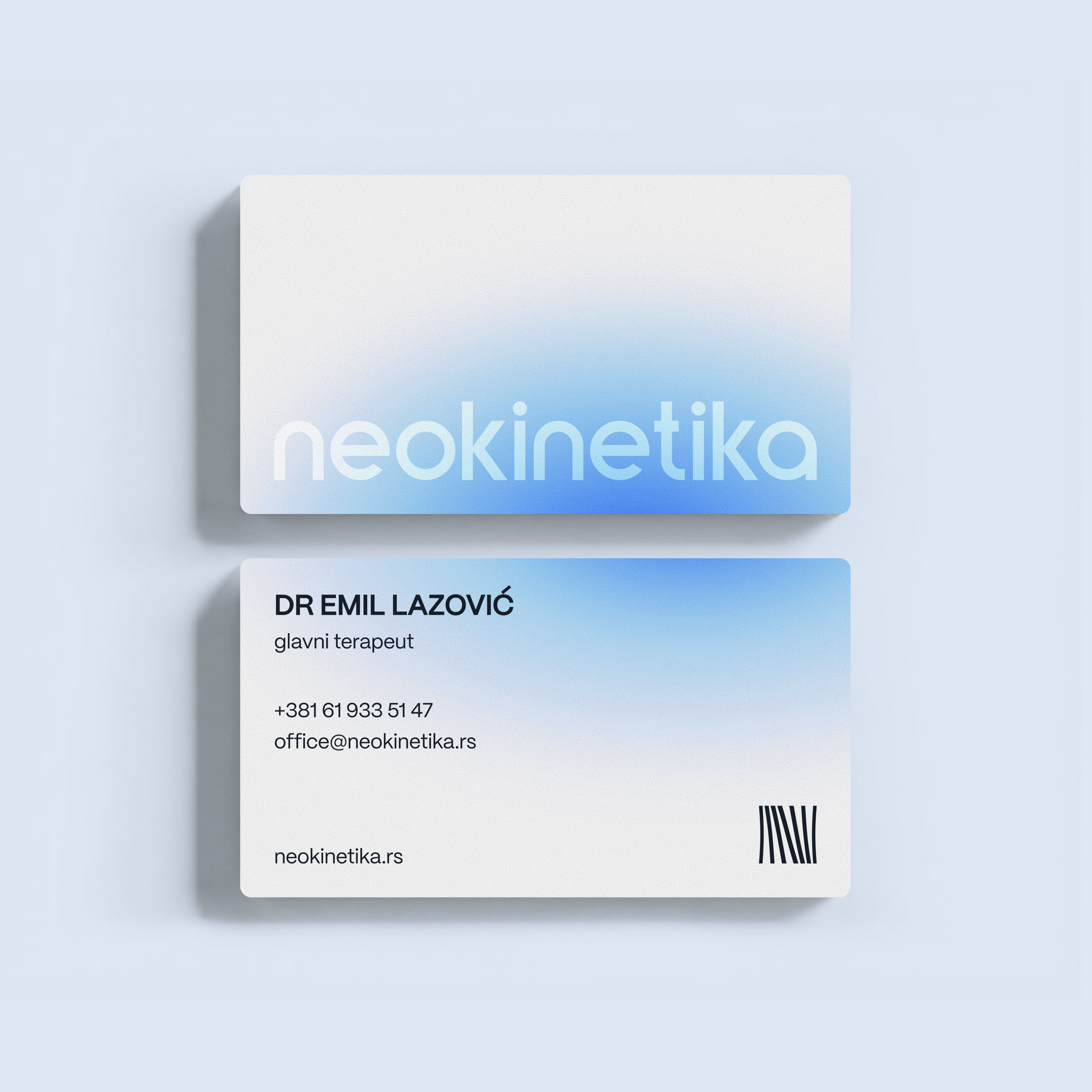
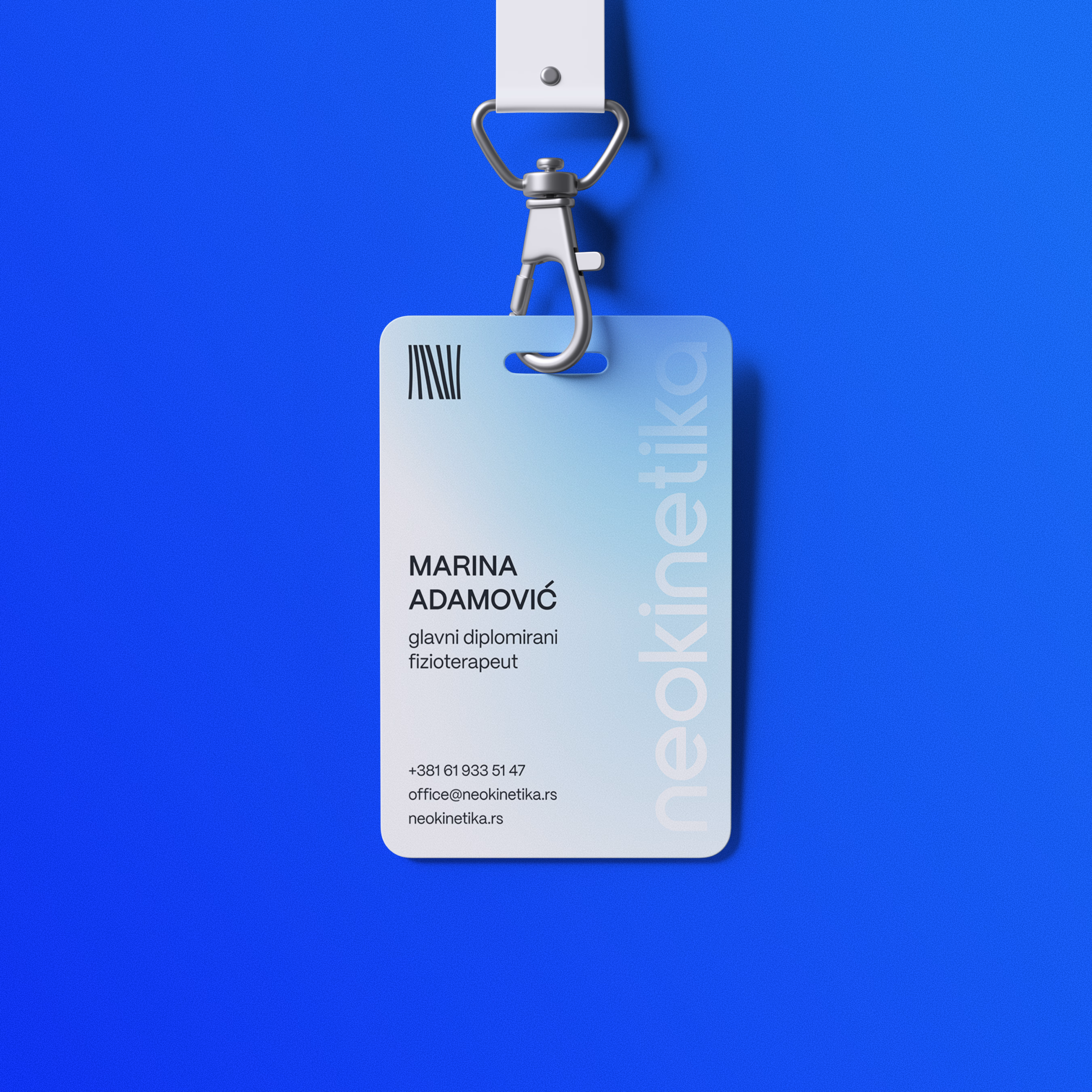
Blue was chosen deliberately - not as a generic healthcare default, but as a controlled, expressive system. Deep, saturated blues communicate trust, stability, and professionalism. Soft gradients introduce depth and calm. A subtle noise texture adds tactility, referencing the hands-on nature of manual therapy and fascia work.
The result is a balance between precision and warmth - clinical, but never sterile.
The network for creativity
Join 1.25M professional creatives like you
Connect with clients, get discovered, and run your business 100% commission-free
Creatives on Contra have earned over $150M and we are just getting started



Related posts

Healthcare web design collection. Four clients, one category, very different briefs.
Good Company Dental: warm and community-first. Dark tones, real patient photos, trust built through storytelling.
Carolin Schrinner: professional interpreter and translator. Clean navy and teal, credential-forward, built for international clients.
Vineland Dental: neighbourhood practice with 26 years in the community. Approachable layout, bilingual, patient-centred copy.
COVA Dental: premium and editorial. Sage and warm neutrals, before/after showcases, feels more like a lifestyle brand than a clinic.
Every brief in healthcare comes down to the same thing. Make people feel safe before they even book. That is what good design does here 🩺

this is amazing design

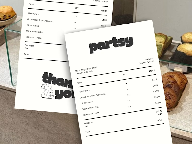
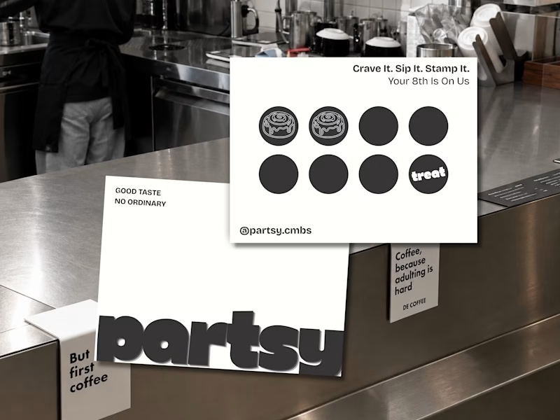
trying out a visual identity for a pastry brand 🥐☕️
from the receipts to the loyalty card, every little detail is part of the brand experience.
which one made you stop scrolling? 👀
lemme know what u think! 🖤
1 voted
50%
1 voted
50%
2 votes
Closed

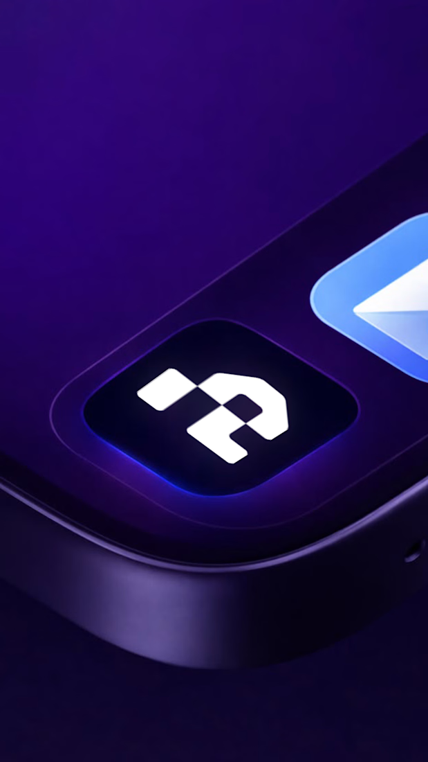
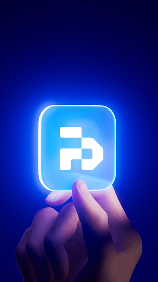
A bold app icon concept brought to life through vibrant blue and purple tones, sleek 3D visuals, and a distinctive logo. Extended across digital visuals and branded merchandise, the design explores a consistent identity across multiple touchpoints.



Bold visuals, striking colors, and seamless brand consistency. Excellent execution!