The network for creativity
Join 1.25M professional creatives like you
Connect with clients, get discovered, and run your business 100% commission-free
Creatives on Contra have earned over $150M and we are just getting started
Back to feedPost

Every time someone picks up their phone with nothing specific to do, TikTok wins. The dopamine is instant. No thinking, no effort, no decision. Just reward.
That's the moment we're designing for. I'm building a product with a friend for exactly those low-energy gaps. And early on we realized the competition isn't other wellness or focus apps. It's the scroll.
So we looked at how most apps try to fight that. Streaks you end up completing at 11:58pm just to keep a number alive. Notifications guilt-tripping you for not showing up. Badges that nobody asked for.
All of those reward consistency. None of them reward showing up right now. And right now is the only moment that matters when someone is deciding between your app and Instagram.
That's what pushed us toward a different idea. What if the reward was the open itself? What if tapping the icon felt so good that it competed with the first second of TikTok?
We're prototyping it now. Haptics on tap. A splash screen with motion. A transition that lands before you've had time to think. The whole thing takes about a second and the goal is to make that second feel like a small win.
No guilt. No streaks. Just a reason to reach for this instead of the usual.


Love the timer and the idea behind it
The network for creativity
Join 1.25M professional creatives like you
Connect with clients, get discovered, and run your business 100% commission-free
Creatives on Contra have earned over $150M and we are just getting started


Related posts

Your body is ready for sleep. But is your mind ready to switch off?
That’s the moment Elivara is designed for.
Instead of another endless scroll, imagine opening an experience that makes slowing down feel natural.
Because better rest starts with how you end your day.
Would you trade 20 more minutes of scrolling for 20 minutes of peace?
#SleepApp #UIUXDesign #ProductDesign #WebDesign #MotionDesign


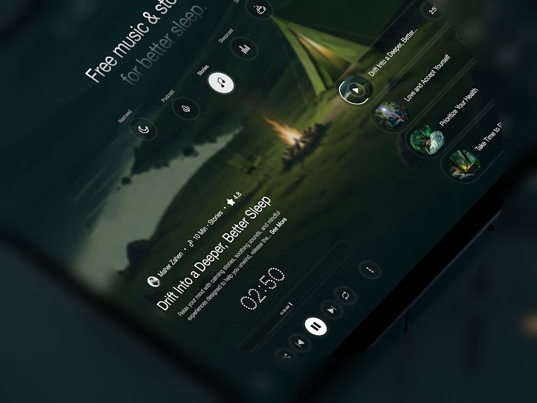
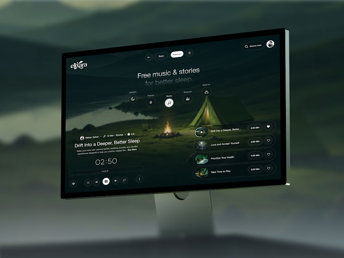

Great UX understands the user's state of mind, not just what they want to click.

The press is running hot.
The press is not the problem.
Sneak peek of MODULO. A dashboard that skips the symptom and points straight at the cause.
Oil +6.4 °C. The culprit is a chiller on the other side of the floor.

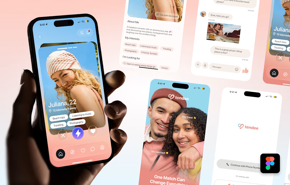
Tendee - Dating App UI UX Design
A mobile app UI design showcase focused on discovery, profiles, matching and conversation.
The visual challenge was to bring profile content, interest tags, primary actions and messaging into a consistent mobile experience. The design uses a soft lavender and coral palette, clear typography, rounded cards and recognizable navigation.
The selected mockup presents a profile discovery screen, detailed profile information, chat, onboarding and sign-in views. These screens demonstrate visual hierarchy, consistent interface styling and attention to mobile interactions.
Personal portfolio showcase. Project cost is an illustrative quote for comparable design work, not a past client payment. The date marks this showcase's preparation in October 2026; duration is an estimated production timeframe.

Love the colors!