The network for creativity
Join 1.25M professional creatives like you
Connect with clients, get discovered, and run your business 100% commission-free
Creatives on Contra have earned over $150M and we are just getting started
Back to feedPost

So excited to be featured in the Standout Projects, with my most recent matcha branding Luma! 🔥
The network for creativity
Join 1.25M professional creatives like you
Connect with clients, get discovered, and run your business 100% commission-free
Creatives on Contra have earned over $150M and we are just getting started





Related posts

Branding and Packaging done by @Rita Saaidi

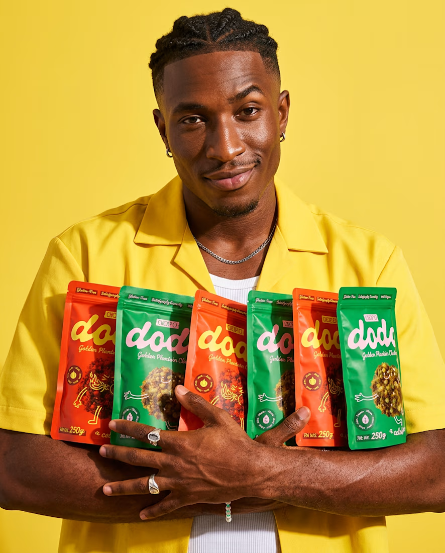
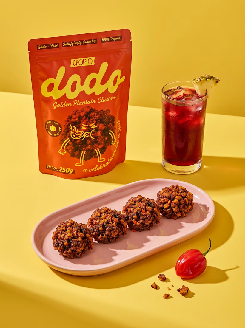
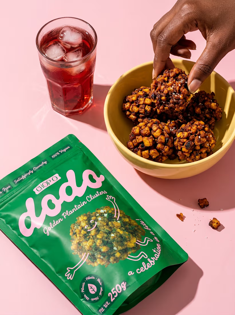
A packaging project I worked on earlier this year for Chop O, a plantain cluster snack brand targeting Nigerian and European markets.
The idea was to create something bold, playful, and full of personality, with vibrant colors and a packaging system that stands out on the shelves.


some visuals from iki, a matcha shop i’m currently working on 🍵
one of the most interesting parts of this project has been figuring out how to turn an abstract concept into something people can actually see and feel.
from the typography to the illustrations and overall visual language, every element is an opportunity to give the brand more personality and make it feel like its own world.
still exploring, but i’m really enjoying where this is going.
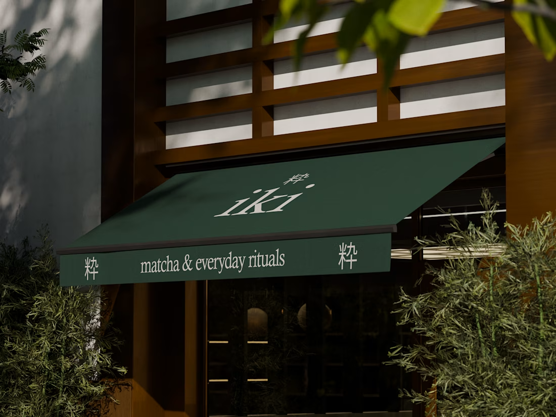
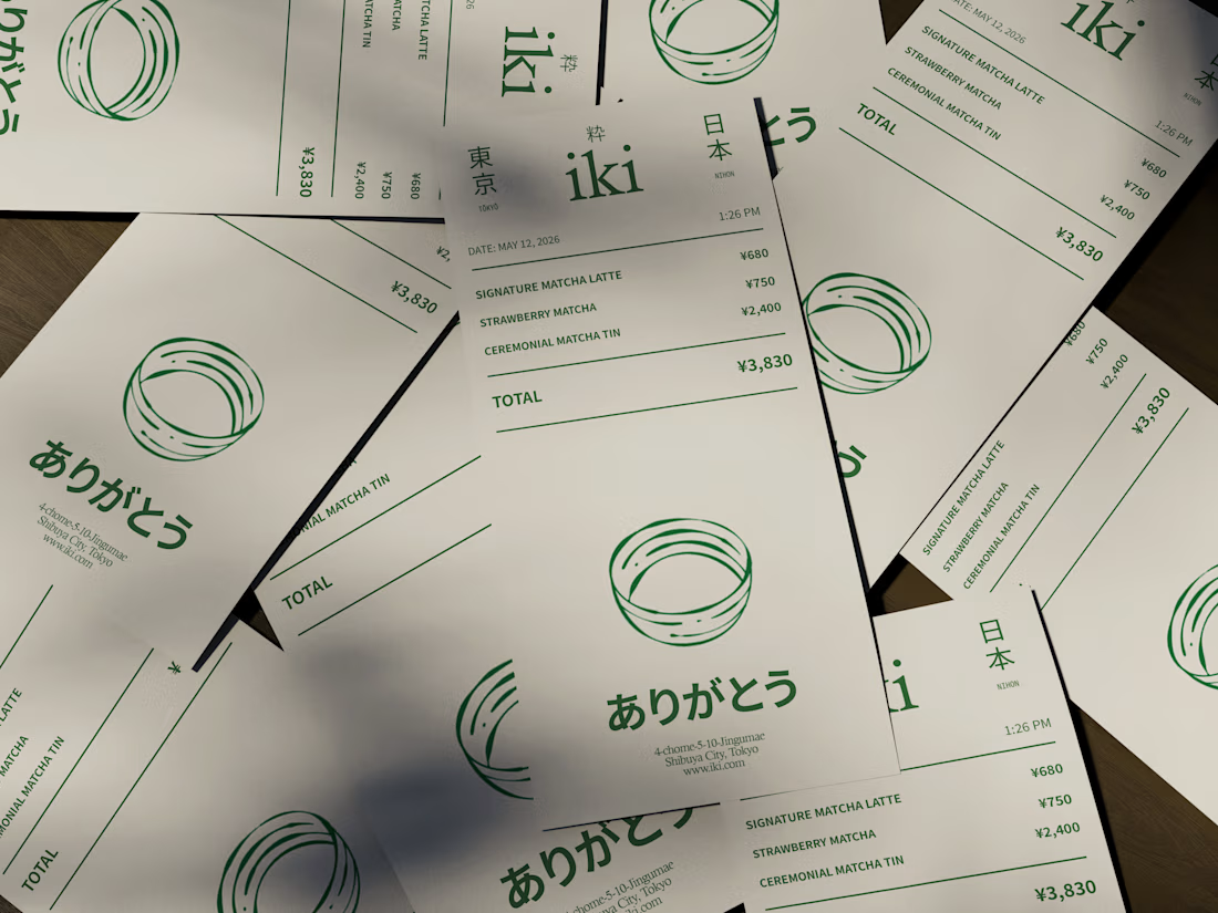
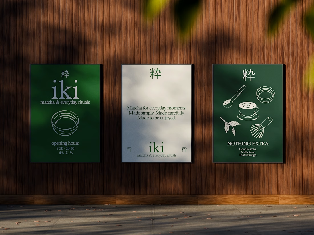
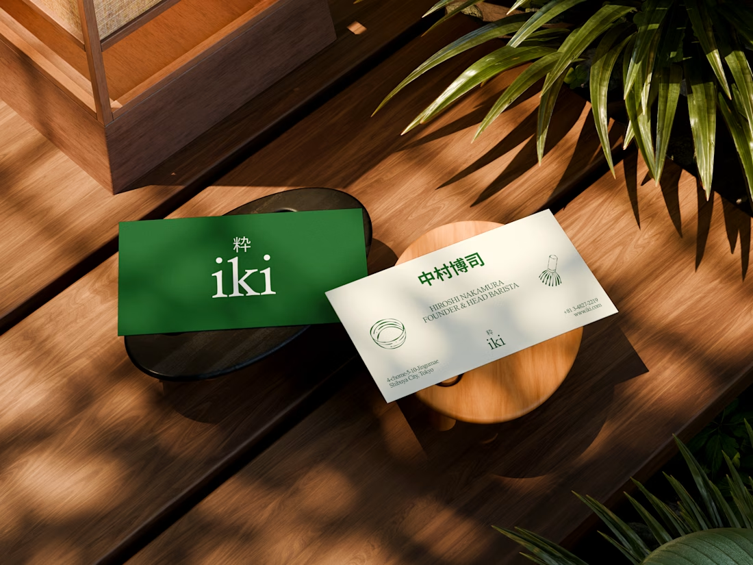


the illustration direction feels like it could take over the whole shop interior, not just the cups. thats usually where these projects fall apart

A little milestone worth celebrating ✨
My work was selected for Dribbble Select’s editorial feature on Top Design Agencies with Original Brand Concepts and I’m genuinely proud to see my work recognized for its creativity and original thinking As a Product Designer I care about more than making interfaces look good. I love turning ideas into thoughtful digital experiences that make sense for both the people using them and the businesses building them now I’m excited to bring that same energy to Contra connect with ambitious teams and work on products that deserve to stand out
https://dribbble.com/resources/agencies/web-design-and-ui-ux-agencies-with-original-digital-concepts
If you’re building something interesting in SaaS, AI, or digital products, I’d love to hear what you’re working on ✨
dribbble.com
Web Design and UI/UX Agencies with Original Digital Concepts | Dribbble
The CapCut x Dribbble collaboration brought together designers and studios exploring how original visual ideas can translate into digital experiences. Across the selected projects, strong concepts take shape through expressive typography, unconventional layouts, motion, interaction, illustration, and carefully structured interface systems. This roundup highlights web design and UI/UX projects that go beyond surface-level aesthetics. Each …

The specific focus on translating original visual concepts into functional digital experiences is a difficult gap to bridge. Many teams struggle to maintain that creative integrity once the design moves from static presentation into actual product development.