The network for creativity
Join 1.25M professional creatives like you
Connect with clients, get discovered, and run your business 100% commission-free
Creatives on Contra have earned over $150M and we are just getting started
Back to feedPost

Bloop — Storefront Redesign Concept
Self-initiated · Shopify · Beverage / CPG · Conversion-focused.
Why we picked this one
We track DTC storefronts continuously and rebuild the patterns that work into our clients’ stores. bloop caught our attention because the product is genuinely strong — real doses, five flavours, serious shelf appeal — while the site was doing the standard beverage thing: [one line on what the live site does — e.g. “a flavour grid with no tasting notes or dosage”].
In functional beverage the site has a harder job than the shelf. No fridge door, no sampling, no comparison — just a visitor who has never tasted the thing deciding whether to spend $39 on a case. So we rebuilt the page around that single decision.
What we changed, and why
Hero: packaging, not product shot. The can sits centre on a lavender field, framed by kinetic type — “fizz”, “&”, “float” — plus stickers and a starburst lifted from the can’s own art. One CTA. The site and the packaging read as one object instead of two.
→ The hypothesis: brand recall carries from shelf to screen, which matters most for the visitor arriving from a paid social ad.
Benefits as stickers, not bullets. Four tilted pills — helps you unwind, supports focus, zero added sugar, gut-friendly prebiotics — over lifestyle imagery. Scannable in under two seconds, which is all a cold visitor gives you.
→ Target: reduce hero bounce.
Flavours: grid → carousel. The page flips light-to-plum so the cans become the only light source. Each flavour carries serving size, active dose (150mg L-theanine, 300mg ashwagandha) and a sensory description — the information a first-time buyer needs and a grid has nowhere to put. Neighbouring cans peek in from both edges, and the buy button travels with the carousel so price stays visible at every step.
→ Target: add-to-cart rate, and flavour-page depth per session.
New section: occasion merchandising. “How to sip” maps the product to four moments — ice cold, over ice, as a mocktail, after a workout. This answers when would I drink this, which is the real objection in this category, not price.
→ Target: first-time purchase rate.
Objections, in sequence. Reviews → FAQ covering shipping, payment and subscription pause/cancel → Journal for SEO and education → newsletter capture. Cleared in the order a buyer actually raises them.
→ Target: checkout drop-off, and email capture from non-buyers.
Nav that tracks you. A sticky pill nav highlights the active section on scroll, so a long scroll-led page never loses the visitor’s sense of place.
Art direction
Oversized geometric sans, set tight and bold, used at display scale as a graphic element rather than as headings. Palette pulled off the can and held to four colours — lavender, lime, orange, plum. Motion is restrained: scroll reveals, carousel transitions, hover states. Nothing that delays a buy decision.
Build
Shopify custom theme sections — hero, benefits, scrolling trust marquee, flavour carousel, occasion grid, reviews, FAQ accordion, blog feed, newsletter. Every section is merchant-editable: flavours, doses, copy, imagery and FAQ entries swap from the theme editor without touching code. Subscription-ready.
How we’d measure it
We have no performance data on this build — it was never deployed. If it were, we’d run it as a themed A/B test against the current storefront and watch add-to-cart rate, scroll depth to the flavour carousel, and first-time purchase rate, in that order.
What we can point to: these are the same patterns we’ve implemented in live client stores, where we’ve measured conversion rate increases of up to 7–8%.


The network for creativity
Join 1.25M professional creatives like you
Connect with clients, get discovered, and run your business 100% commission-free
Creatives on Contra have earned over $150M and we are just getting started



Related posts

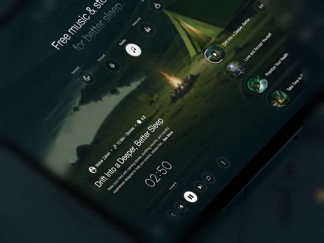
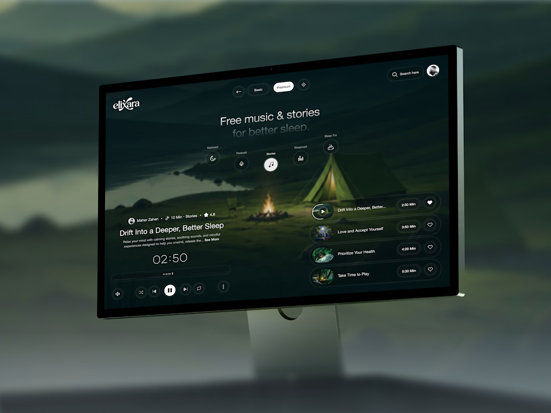
Your body is ready for sleep. But is your mind ready to switch off?
That’s the moment Elivara is designed for.
Instead of another endless scroll, imagine opening an experience that makes slowing down feel natural.
Because better rest starts with how you end your day.
Would you trade 20 more minutes of scrolling for 20 minutes of peace?
#SleepApp #UIUXDesign #ProductDesign #WebDesign #MotionDesign



Great UX understands the user's state of mind, not just what they want to click.

Tendee - Dating App UI UX Design
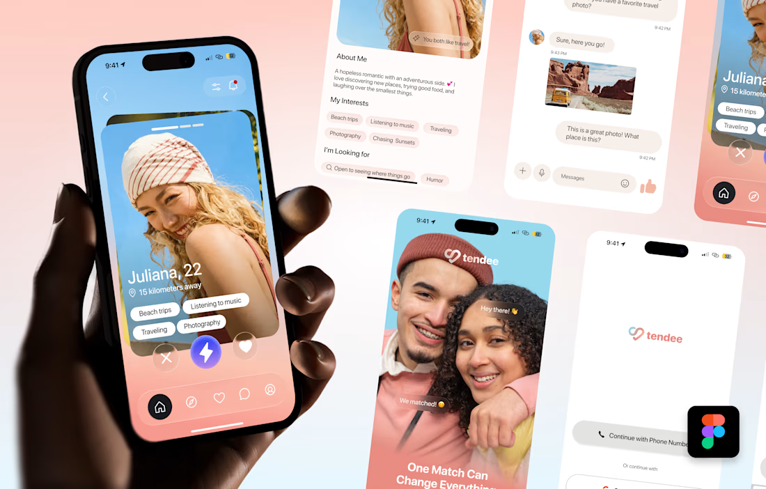
A mobile app UI design showcase focused on discovery, profiles, matching and conversation.
The visual challenge was to bring profile content, interest tags, primary actions and messaging into a consistent mobile experience. The design uses a soft lavender and coral palette, clear typography, rounded cards and recognizable navigation.
The selected mockup presents a profile discovery screen, detailed profile information, chat, onboarding and sign-in views. These screens demonstrate visual hierarchy, consistent interface styling and attention to mobile interactions.
Personal portfolio showcase. Project cost is an illustrative quote for comparable design work, not a past client payment. The date marks this showcase's preparation in October 2026; duration is an estimated production timeframe.

Love the colors!

've reviewed 50+ startup websites, and I noticed a pattern.
Their hero sections are often simple. They tell you who the product is for and what it does.
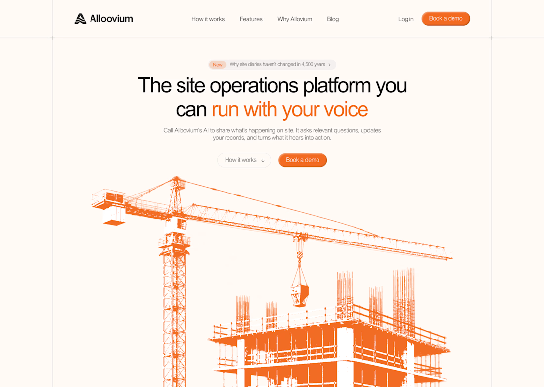
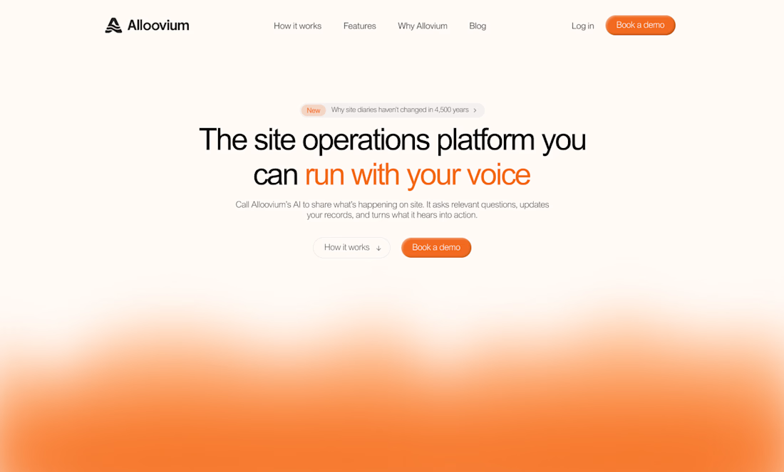
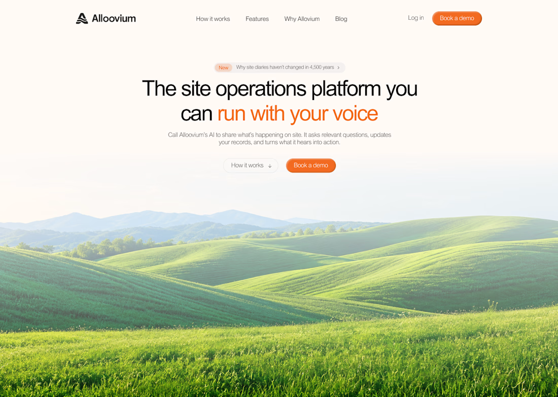
While working on this redesign concept for
@Alloovium, I wanted to explore a different direction.
Their original website already explained the product and its audience.
But what if the hero also used visuals that reflected the world their customers work in?
People often scan websites before deciding what to pay attention to.
Relevant visuals can catch their attention and create a connection with the audience before they start reading.
So I explored a few visual directions inspired by the construction industry.
Building a startup? I'd love to help you explore a new direction for your website.

The construction visuals work well.