The network for creativity
Join 1.25M professional creatives like you
Connect with clients, get discovered, and run your business 100% commission-free
Creatives on Contra have earned over $150M and we are just getting started
Back to feedPost

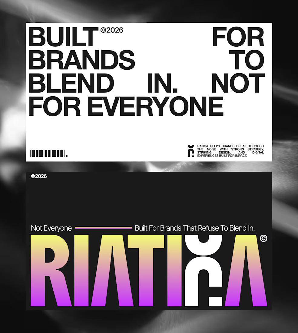
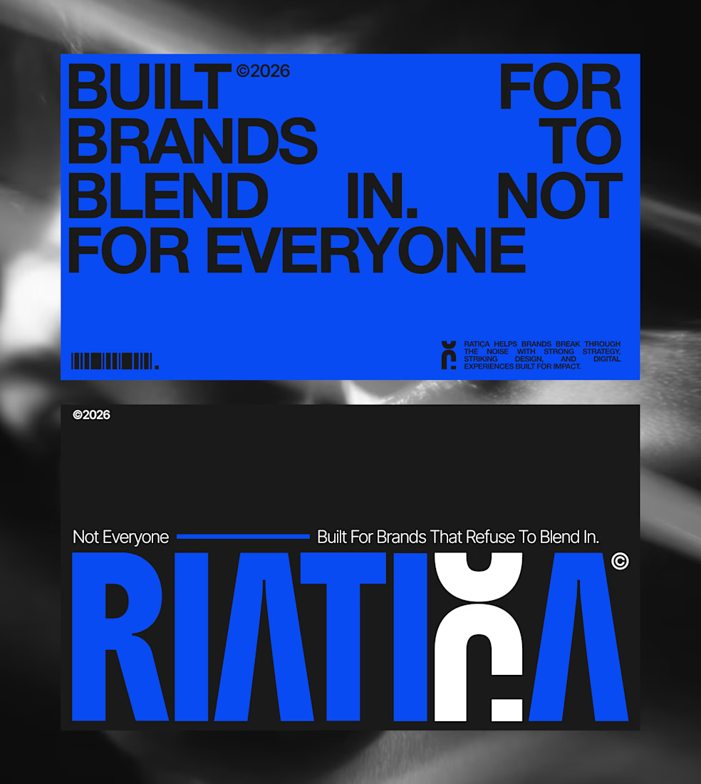
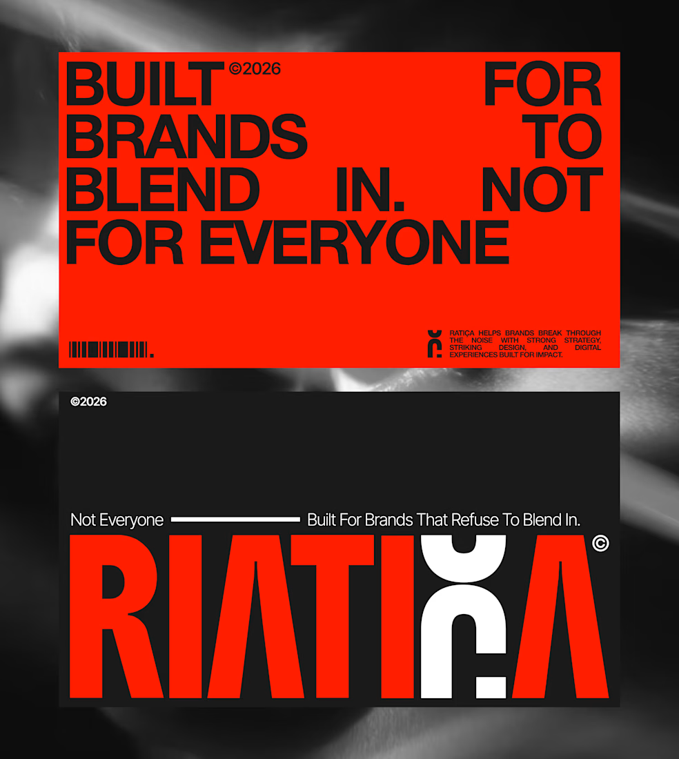
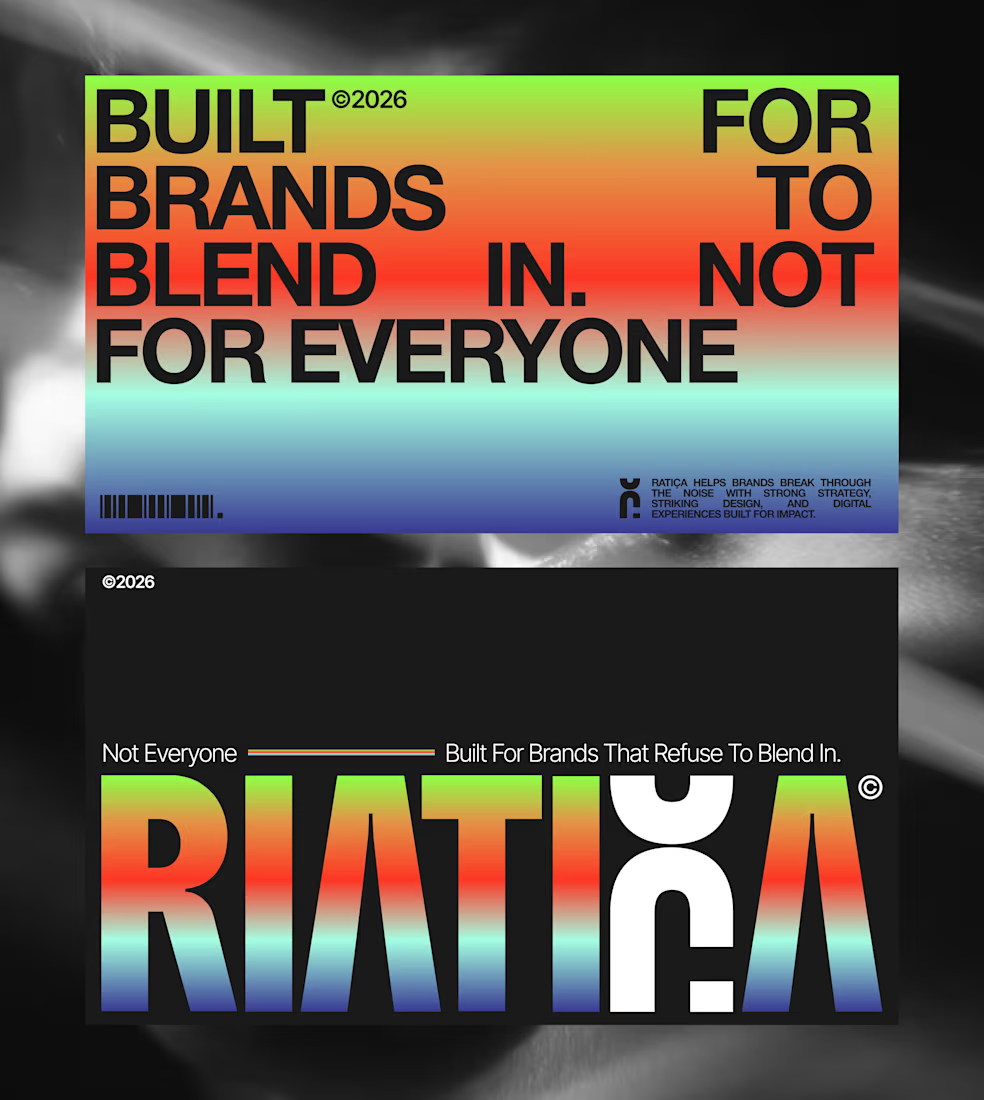
One visual card, four completely different feelings. That’s why color can change everything.
The network for creativity
Join 1.25M professional creatives like you
Connect with clients, get discovered, and run your business 100% commission-free
Creatives on Contra have earned over $150M and we are just getting started





Related posts

Same data, two different ways to experience it 🤔
I explored two patient list layouts for a mental health platform: a card view and a table view.
Cards feel more visual and personal, but space is limited and adding more information can quickly make them crowded. For complex enterprise products, I often find tables more practical — they’re easier to scan, compare, sort, and can support more columns when users need greater visibility.
For this kind of workflow, I’m leaning toward the table view. Which would you choose — cards or table?

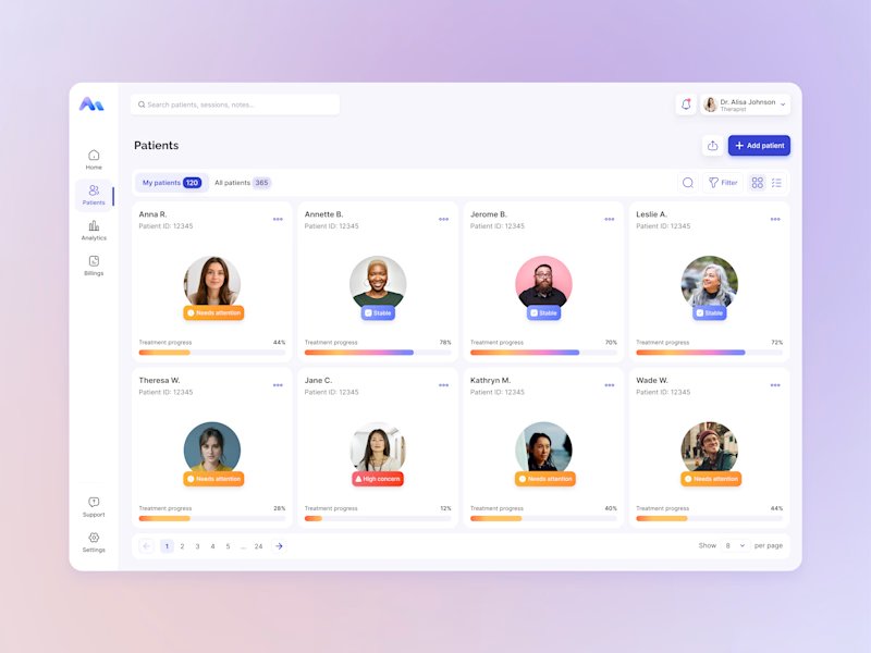
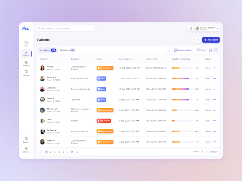
13 votes
Ends in 1d

A collection of brand identity concepts exploring different visual directions across technology, wellness, healthcare, logistics, food and fashion. Each concept was developed around a distinct audience, tone and use case, with attention to logo versatility, typography, color systems and real-world brand applications.




Six sectors in one set is a good stress test for a logo system. Did you work from a shared construction logic across them, or let each concept find its own starting point?

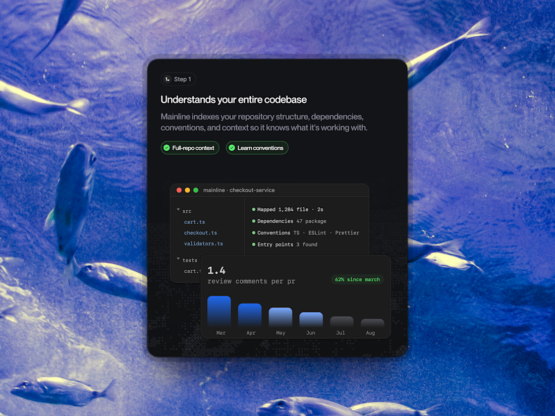
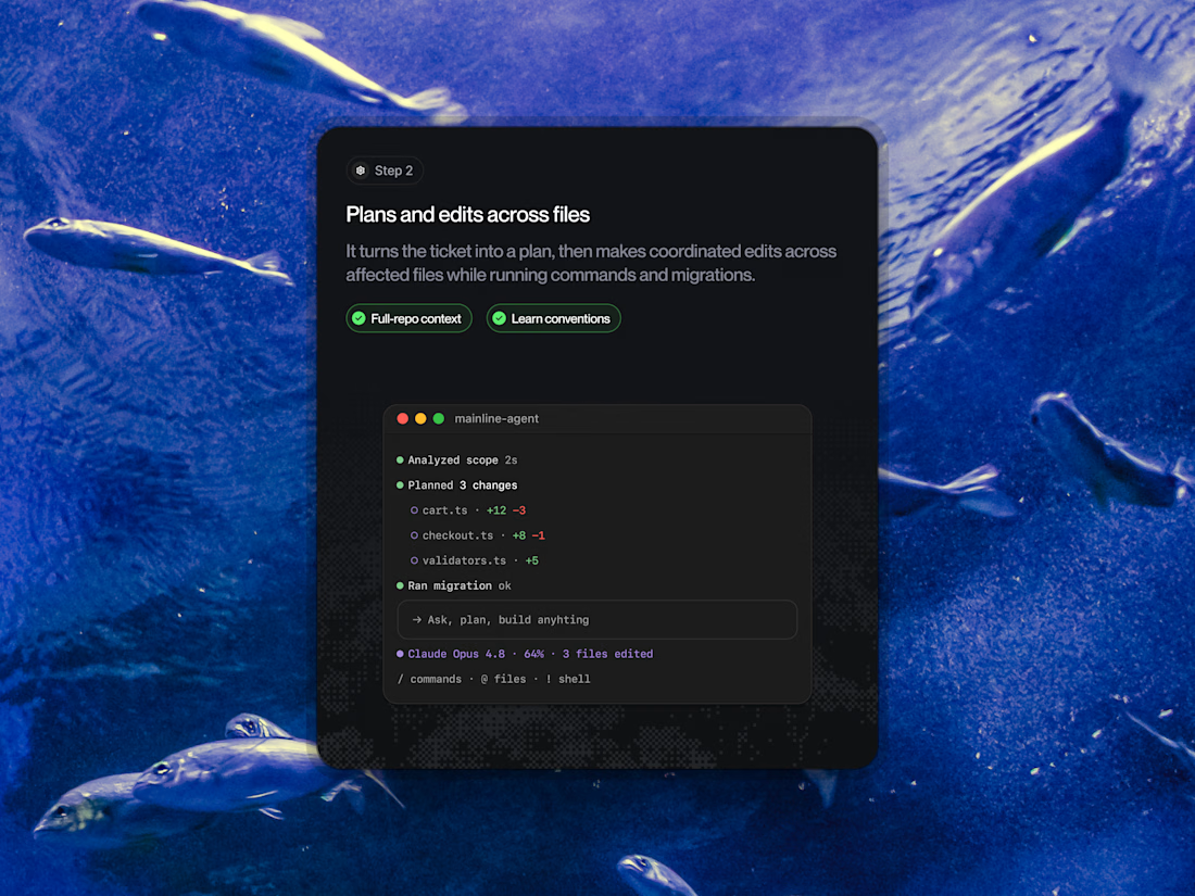
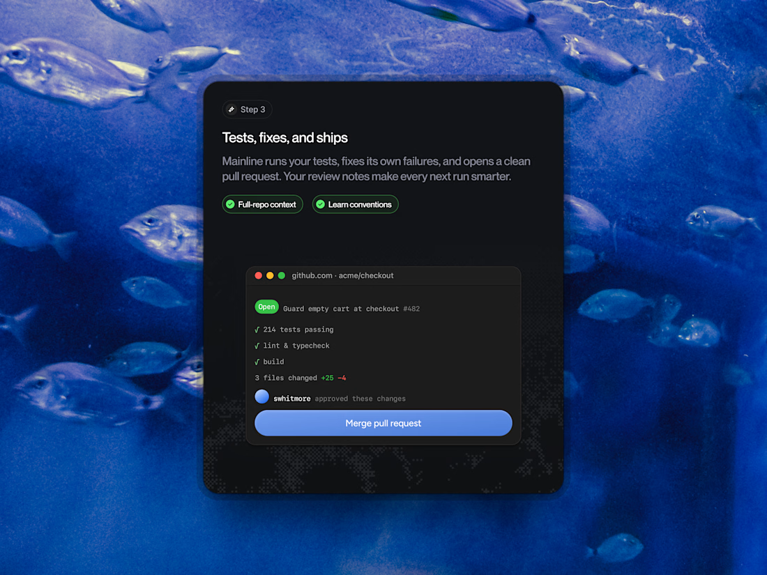
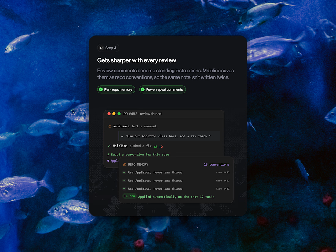
When you're building an interface for autonomous software engineering, the workflow steps need to project complete transparency, precision, and speed. For Mainline, we broke down the multi-stage AI agent journey into modular dark-mode cards packed with live terminal outputs, PR merge states, and automated repo memory widgets.
Slide through the 4 attached frames to see how we balanced our deep charcoal cards against an oceanic blue ambient backdrop.
Drop your thoughts and feedback in the comments below! ❤️👇