The network for creativity
Join 1.25M professional creatives like you
Connect with clients, get discovered, and run your business 100% commission-free
Creatives on Contra have earned over $150M and we are just getting started
Back to feedPost

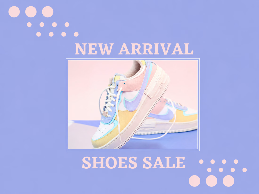
Designed a clean and modern promotional social media post for a footwear brand. The layout uses soft pastel colors, balanced typography, and a product-focused composition to highlight a new collection while maintaining a premium and eye-catching aesthetic,
Skills: Social Media Design, Graphic Design, Product Advertising, Typography, Brand Design, Marketing Design


amazed
The network for creativity
Join 1.25M professional creatives like you
Connect with clients, get discovered, and run your business 100% commission-free
Creatives on Contra have earned over $150M and we are just getting started

Challenges
View all


Related posts

Logo design for StocksWithJosh, a prominent online trading mentor with 195K YouTube subscribers.
The concept was simple: blend the initials SWJ with a subtle nod to his status as the "GOAT" (Greatest Of All Time), a moniker earned from his community.
The result is a bold, recognizable brand mark that fits his business perfectly.
What do you think of the end result?




The mark reads instantly at thumbnail size, and the framed SWJ lockup gives it a strong YouTube-avatar presence. The subtle crown/GOAT cue is a nice detail without overpowering the initials.

Sometimes it’s hard to visualise data clearly without overwhelming users, but that’s what we aim for.
A snippet from daily design explorations using Magicpath and Figma.


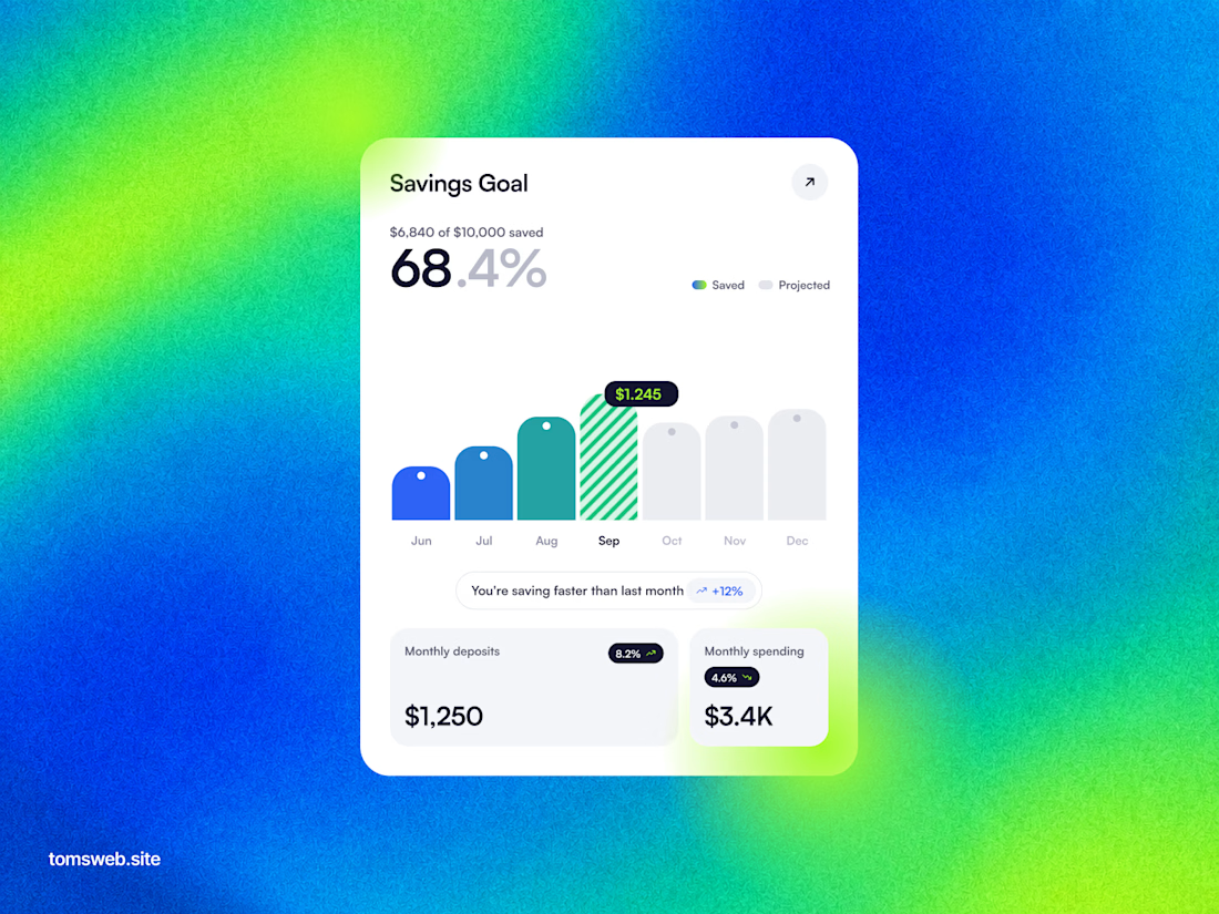
The chart keeps the progress story legible without turning the dashboard into a wall of metrics. The bright gradient is a bold backdrop, while the centered white card gives the key numbers a clear focal point.

I'm working on a store concept mixing art supplies, gifts and tech. I presented two moodboards: one inspired by traditional art supply stores, and another cleaner, modern direction inspired by Japanese gift and tech stores. They chose option 2.
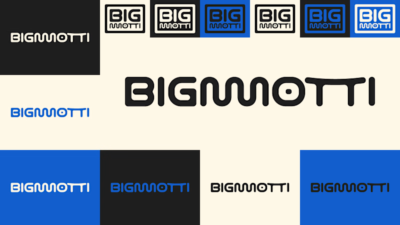
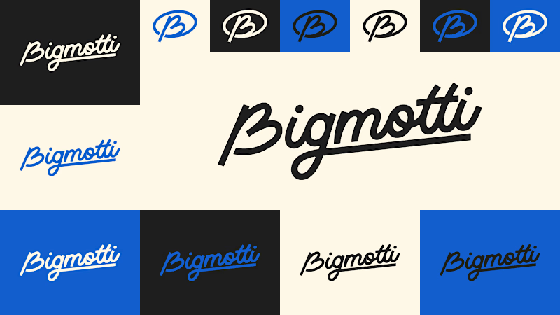
I presented four logo ideas. These two are my favorites and the ones the client liked most.
1_ Based on the second moodboard, with a more neutral and slightly futuristic feel. My favorite detail is the boxed version: its vertical weight balances with the I and O, making it feel tidy and visually appealing.
2_ Inspired by traditional art supply stores, but with a modern, clean style. Handwritten lettering adds a human touch and keeps it timeless.
Which one is your favorite and why?
Which one do you think the client chose?
1 voted
14%
6 voted
86%
7 votes
Closed

I'll guess they picked #1, the boxed Bigmotti reads cleaner next to a gift-and-tech assortment than the handwritten route. That vertical weight balance on the I and O is the kind of detail that's invisible until someone points it out, was there a runner-up logo the client seriously debated before landing on this one?