The network for creativity
Join 1.25M professional creatives like you
Connect with clients, get discovered, and run your business 100% commission-free
Creatives on Contra have earned over $150M and we are just getting started
Back to feedPost
Taste Test


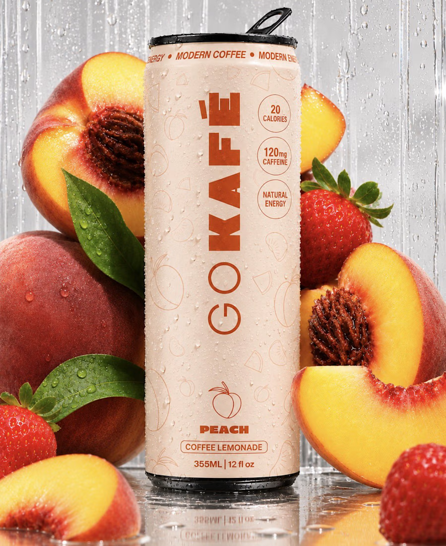
Exploring two different directions for a potential brewery website refresh in Framer. The idea was to showcase their products in a dynamic way: showing the custom labels designed for each variety of beer, custom designs and information.
The first direction is a bit static (PNG), easier for updates and loading times. But the second one... it took a bit more work but was able to workaround Framer and include native-ish 3D objetcs to have a more interactive experience.
Same product. Same brand. Two different approaches. Which direction feels more engaging to you?

4 voted
25%
12 voted
75%
16 votes
Closed

Definitely the 3D!


3D looks great!

I prefer 3D cans.

3d Cans has the drip


3D Cans all they way..

This is good .. Honestly
The network for creativity
Join 1.25M professional creatives like you
Connect with clients, get discovered, and run your business 100% commission-free
Creatives on Contra have earned over $150M and we are just getting started



Related posts

New here, so I'm slowly filling in my portfolio and getting to know the place. So far I like it.
Here's an extract from Software Intelligence, a Framer site I designed and built a few months ago for an enterprise data consulting startup.
The visual idea mirrors what they do with data: compact blocks that animate, break apart and recompose, like charts taking shape. Few effects, all consistent, everything managed through the CMS.
If you have a minute, take a look at the full case study.
I'd love to know what you think, especially whether the motion supports the content or ends up overpowering it.

You're very welcome, Francesco — glad the note landed. The motion in that extract really does the heavy lifting for the content, so keep sharing your work here. Looking forward to seeing what's next from you. ✌️

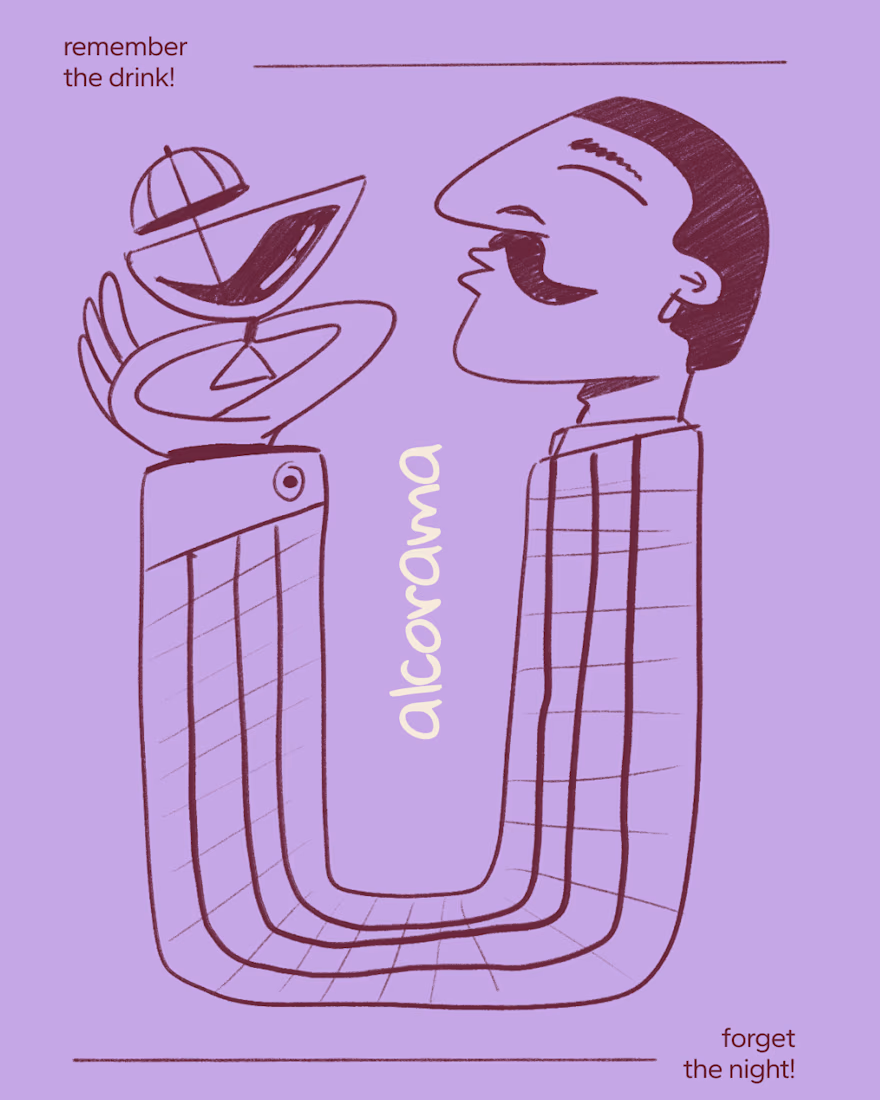
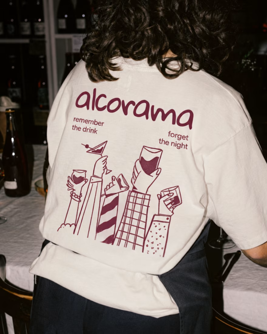
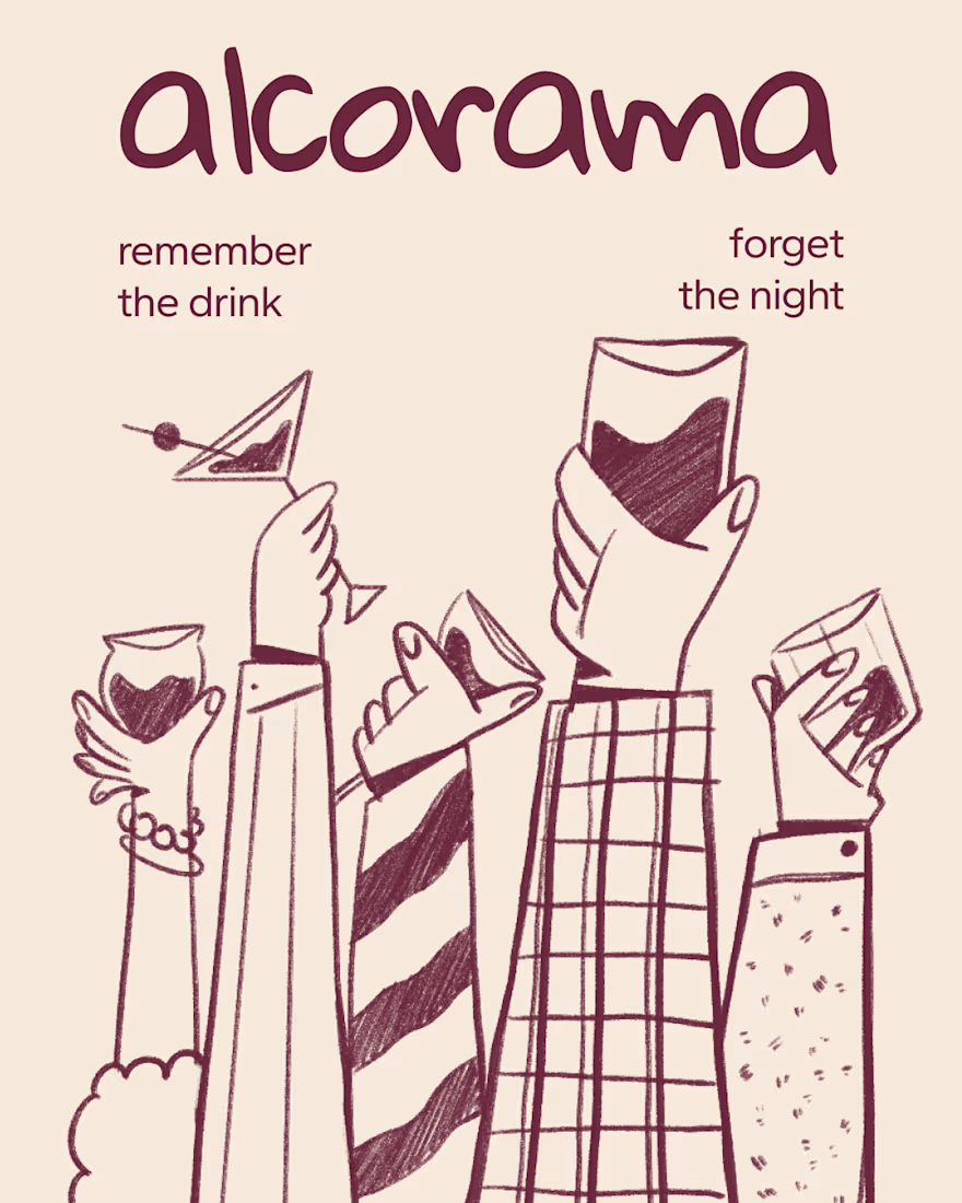
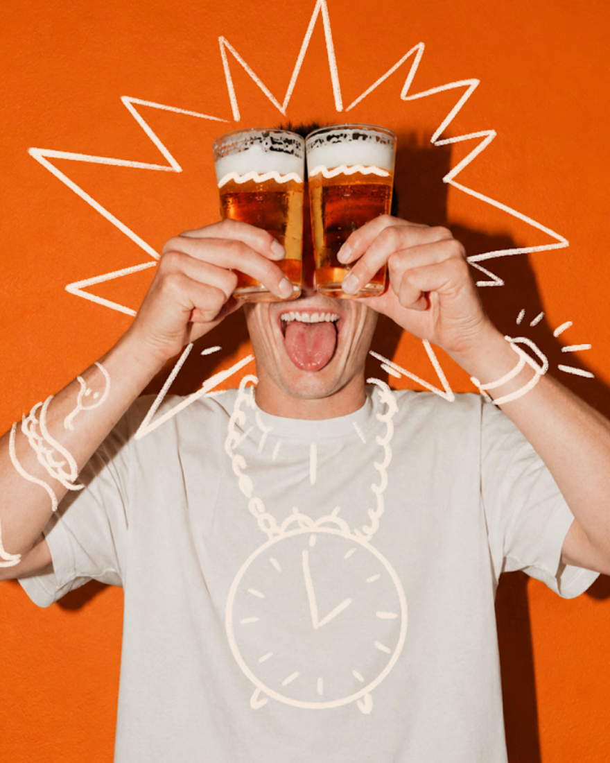
Final direction picked! I love when brands use custom illustration as the main way to communicate with their audience.
Direction discovery should not take more than one week and it should be full of personality! Ready to upgrade your brand?

Amazing work!



Impressive :)