The network for creativity
Join 1.25M professional creatives like you
Connect with clients, get discovered, and run your business 100% commission-free
Creatives on Contra have earned over $150M and we are just getting started
Back to feedPost

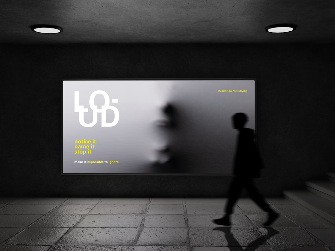
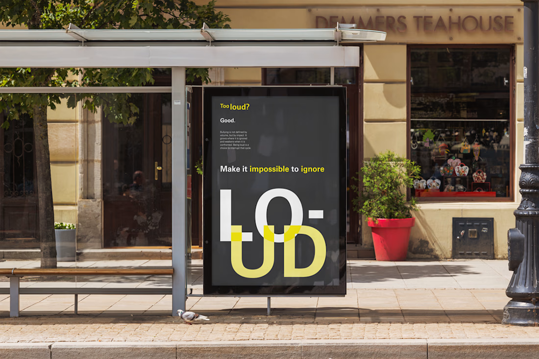
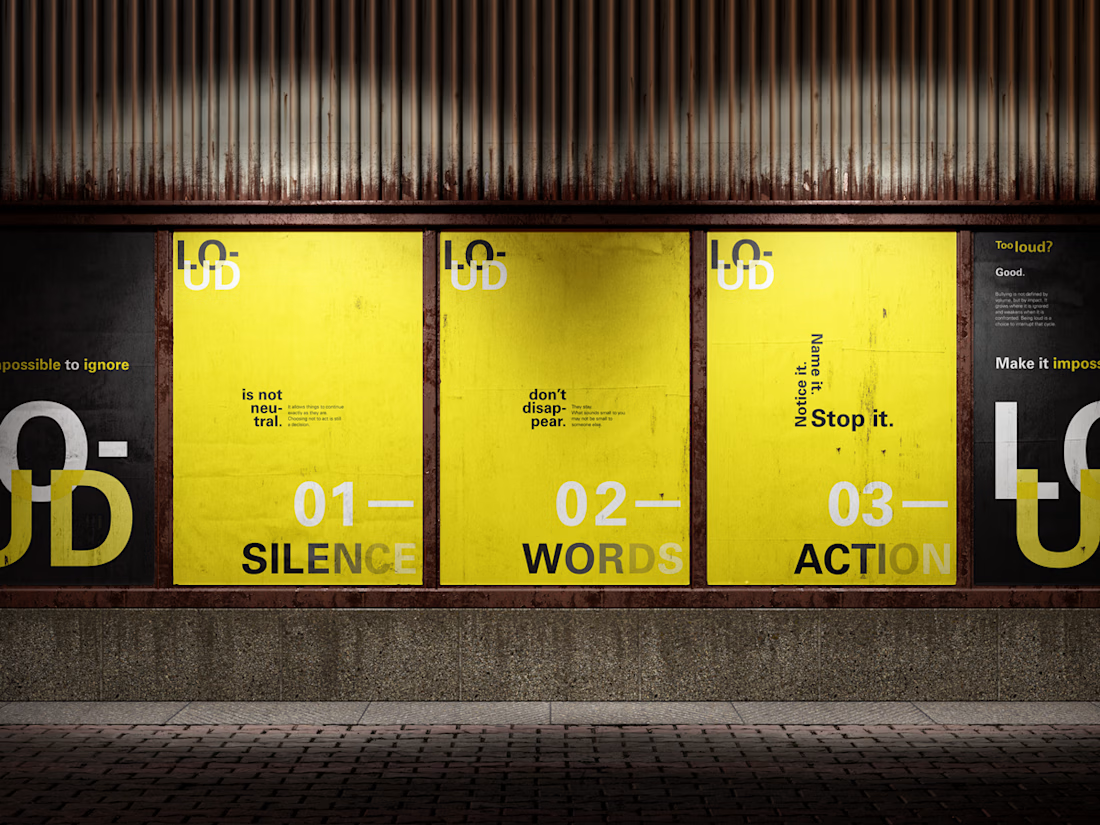
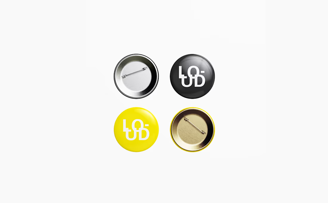
A concept for a Campaign against bullying.
For this one I got inspired by the International Typographic Style which focuses on the message rather than noisy imagery.
The network for creativity
Join 1.25M professional creatives like you
Connect with clients, get discovered, and run your business 100% commission-free
Creatives on Contra have earned over $150M and we are just getting started





Related posts

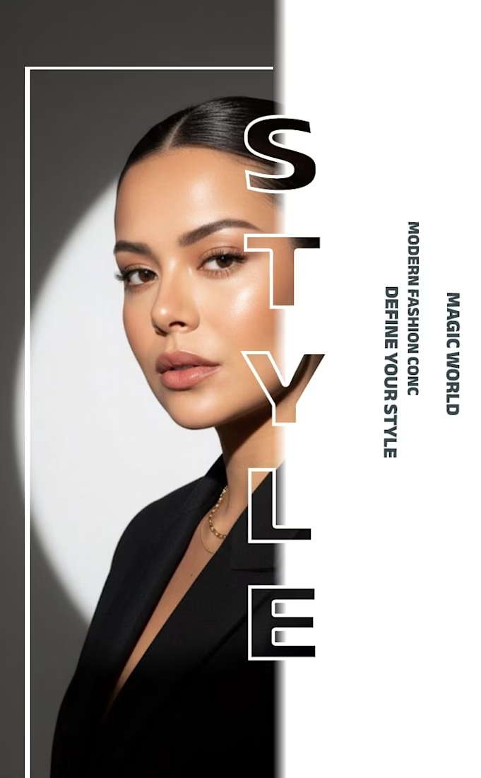
✨ Modern Fashion Poster Design - STYLE ✨
Designed a clean, high-fashion poster concept focusing on bold typography and minimalist aesthetics.
Concept: Modern Fashion | Define Your Style
Tool: Canva / Photoshop
Style: Luxury, Minimal, Editorial
Open to feedback and freelance work!
#GraphicDesign #PosterDesign #FashionDesign #Canva #ContraCommunity


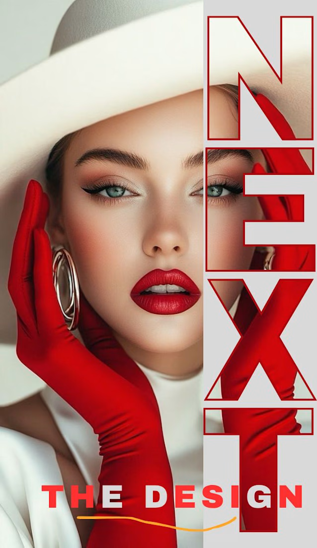
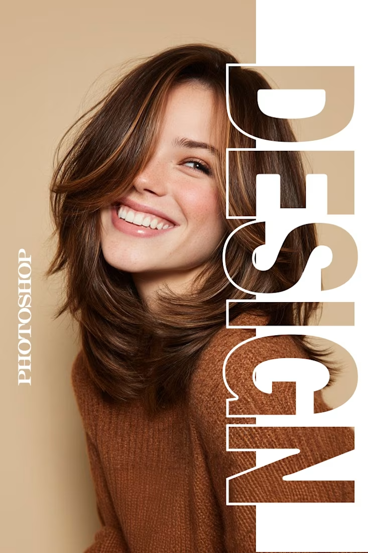
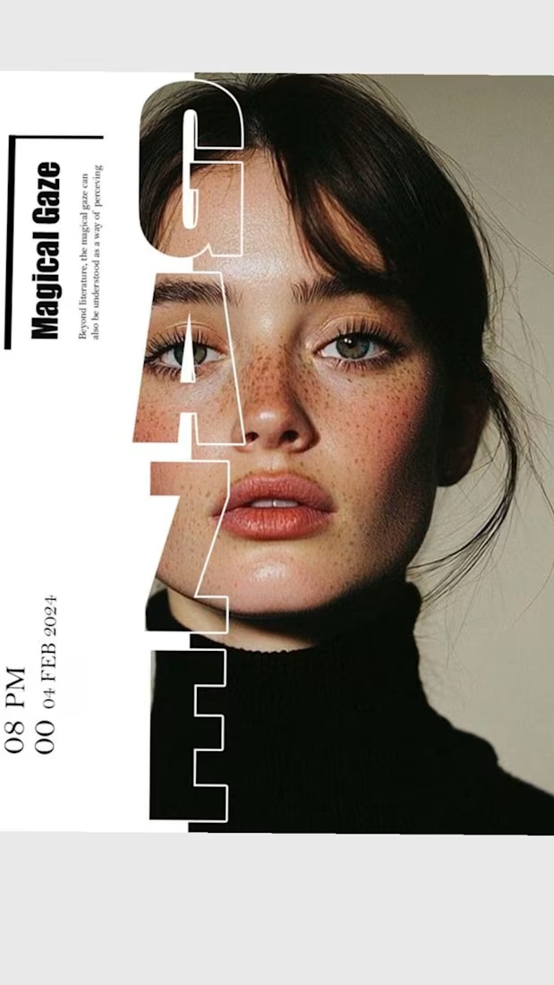

The way you let the bold type dominate the empty space really drives the luxury feel.

Very well looking composition, good sinergy

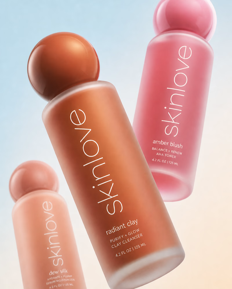
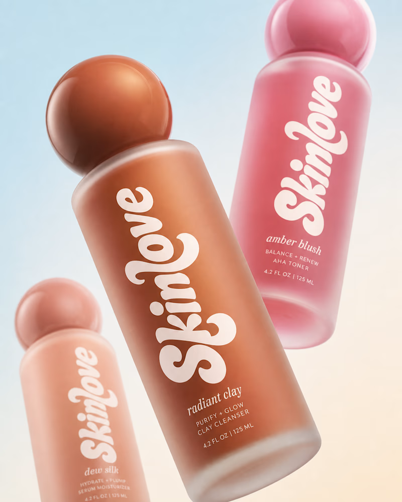
Safe or bold, which one actually makes you stop scrolling? 🤔
Sans: the serif, tight tracking, one accent color playbook every skincare brand is running right now.
Bold: the same idea, redesigned with attitude. 💅
25 voted
32%
53 voted
68%
78 votes
Closed

🚨 TYPOGRAPHY ISN'T JUST AESTHETICS—IT'S USER PSYCHOLOGY & PERFORMANCE
Most people choose fonts solely based on looks. High-performance engineers optimize typography based on visual hierarchy, eye-scanning psychology, and load speed.
When a visitor lands on a digital product, typography dictates where their eyes move in 0.05 seconds. If your custom web fonts cause Layout Shifts (CLS) or slow down initial rendering, you lose user trust before they even read your headline.
How I engineer typography directly in VS Code:
• Fluid Typography: Using CSS clamp() to build smooth, proportional text scaling across every screen size without bloated libraries.
• Zero Layout Shift: Preloading critical variable fonts and executing fallback strategies so rendering is instant and crisp.
• Typography in Code: Blending monospace code fonts with modern UI elements (using RML & WGSL Shaders) to create deep visual contrast.
Great typography captures attention. Hand-coded optimization ensures it delivers results without sacrificing speed.
💬 Quick Question for Designers & Engineers:
What is your go-to typography stack for modern web applications, and how do you handle web font performance?
👇 Drop your favorite font pairings below—let's connect and share workflows!
#Typography #WebDevelopment #UIUX #CleanCode #DesignSystems #VSCode #FullStack




clamp() for fluid type saved me so many breakpoints. inter plus a variable serif usually