The network for creativity
Join 1.25M professional creatives like you
Connect with clients, get discovered, and run your business 100% commission-free
Creatives on Contra have earned over $150M and we are just getting started
Back to feedPost
Coca-Cola — Cinematic Brand Storytelling
Project Overview
A cinematic motion design project exploring the story of Coca-Cola's global expansion and the strategic blueprint behind building one of the world's most recognizable brands.
The video combines editorial visuals, vintage-inspired textures, animated maps, archival-style compositions, typography, and symbolic storytelling to turn a business narrative into an engaging visual experience.
Rather than using a traditional corporate presentation style, I focused on creating a documentary-like atmosphere that feels cinematic, thoughtful, and visually distinctive.
My Role
Creative Direction
AI Visual Development
Motion Design
Storytelling & Visual Narrative
Typography Animation
Video Editing
Sound Design & SFX Direction
The Creative Approach
The visual direction was built around a vintage editorial aesthetic with:
Animated global maps and expansion routes
Bold kinetic typography
Paper textures and archival-inspired compositions
Symbolic visual storytelling
Cinematic transitions
Minimal color palette with strong contrast
Documentary-style pacing
Each scene was designed to support the narrative and make complex business ideas easier to understand through visual storytelling.
Tools Used
Figma · Adobe After Effects · Adobe Premiere Pro · AI Image Generation Tools · AI Video Tools
Deliverables
1 Cinematic Brand Storytelling Video
AI-generated Visual Assets
Custom Motion Graphics
Animated Typography
Map & Data Visualizations
Sound Effects and Final Video Edit
Project Type
Motion Design · AI Art Direction · Brand Storytelling · Explainer Video · Creative Direction · Video Editing


I really loved this project! The AI visuals and the overall cinematic feel are amazing. May I ask which AI tools you used to create the visuals and video?

@gülfem soral Thank you so much! 😊 I used a mix of AI tools—mainly *Chatgpt for visuals and Veo for video, along with careful prompting and editing to create the cinematic feel. 🎬✨
The network for creativity
Join 1.25M professional creatives like you
Connect with clients, get discovered, and run your business 100% commission-free
Creatives on Contra have earned over $150M and we are just getting started







Related posts

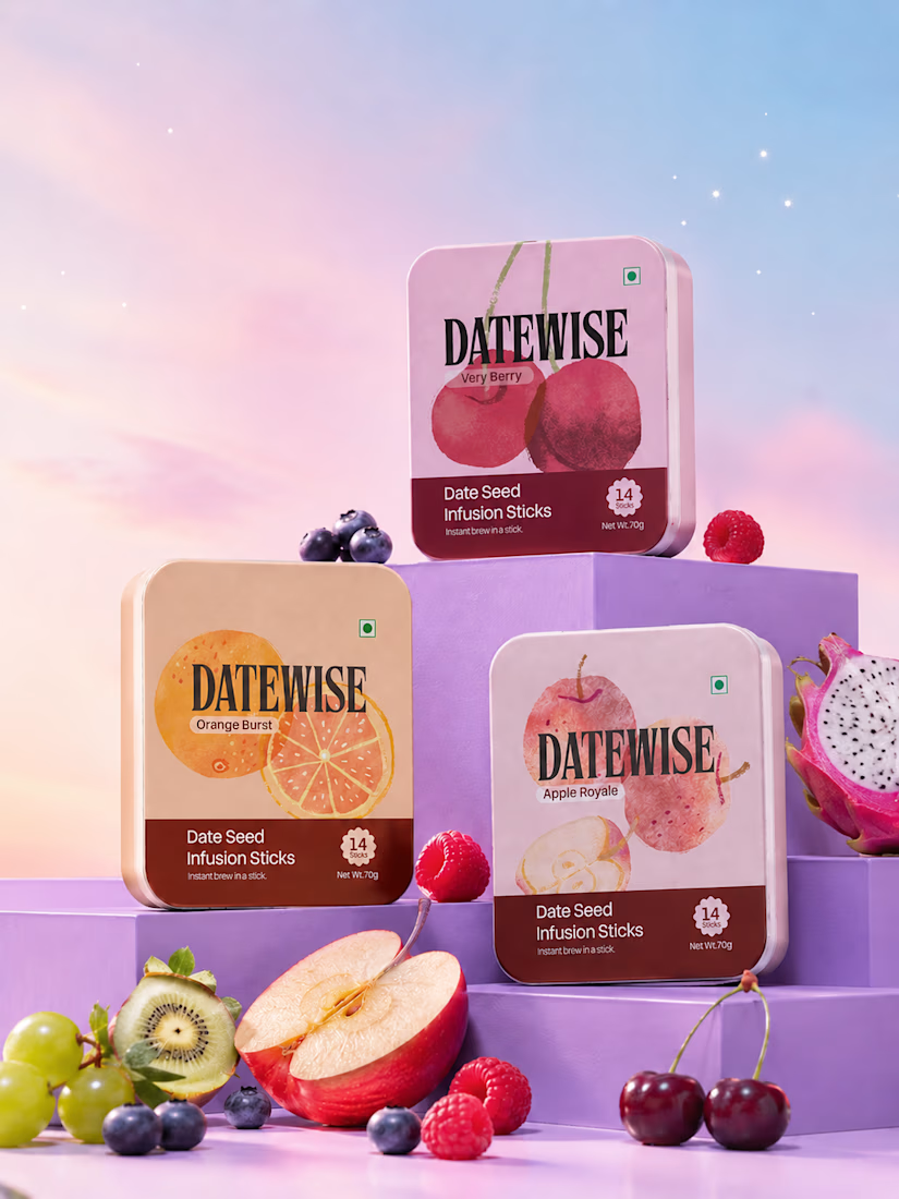
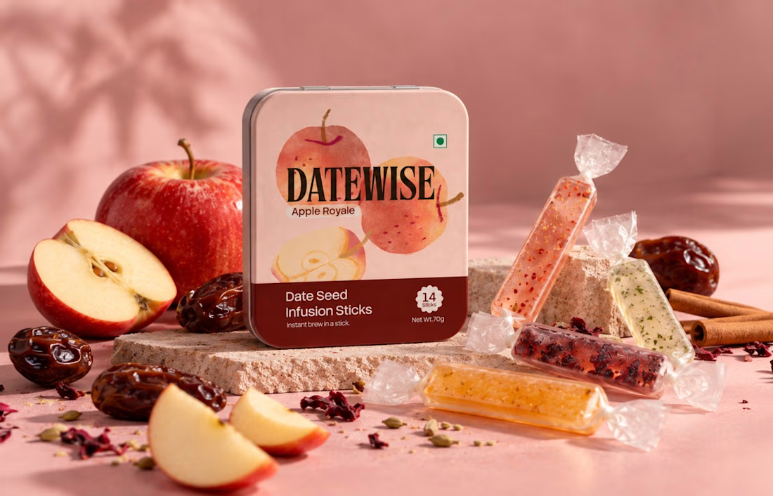
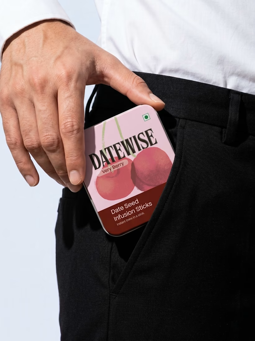
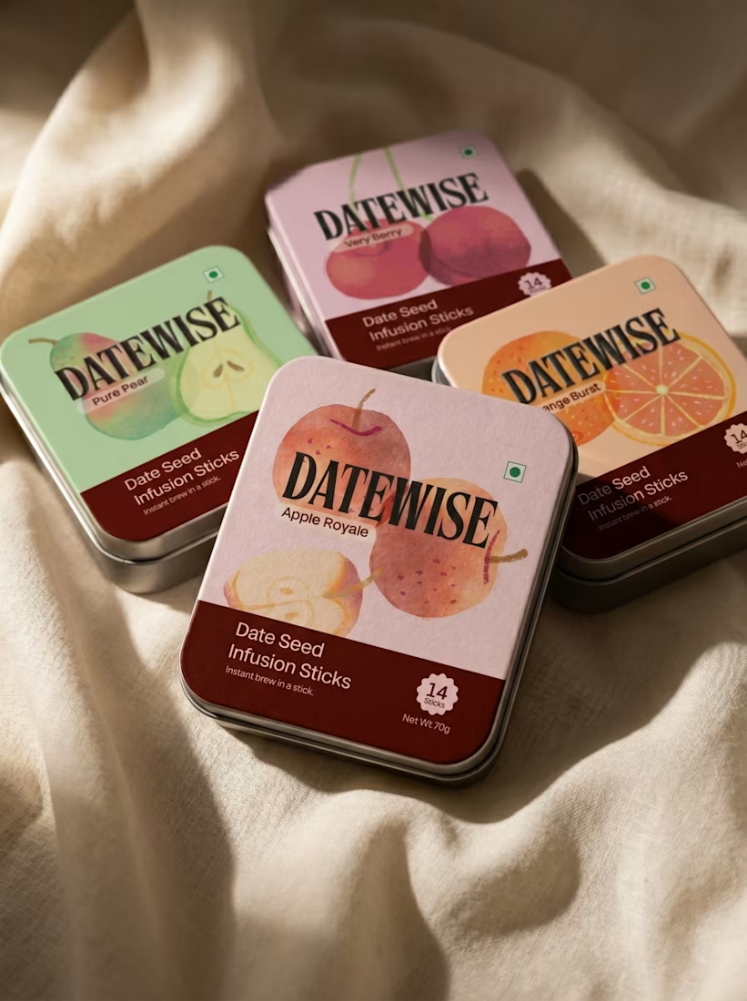
This image showcases a premium fruit-flavoured date seed infusion stick packaging design for a fictional brand called DATEWISE. The design combines modern packaging graphics, realistic 3D tin-can mockups, vibrant fruit photography, and a soft pastel environment to create a high-end commercial product presentation.
The packaging features three flavours: Very Berry, Orange Burst, and Apple Royale. Each rectangular tin has rounded corners, a pastel-coloured background, bold black serif typography, fruit illustrations, and a dark burgundy information panel at the bottom.
The products are arranged on layered purple display platforms, surrounded by fresh fruits such as apples, oranges, raspberries, blueberries, cherries, kiwi, and dragon fruit. The pink-to-blue gradient background, soft lighting, subtle shadows, and glossy surfaces create a luxurious advertising aesthetic.
Design style: Premium FMCG Packaging, 3D Product Mockup, Photorealistic Product Advertising, Pastel Colour Grading, and Editorial Art Direction.



So Good

From Raw Footage to Final Cut | SVGator Challenge
Every edit starts the same way: a pile of raw clips and no story yet.
For the #svgatorchallenge, I built a product-style motion piece around that journey. Clips tumble in, snap onto the timeline, the playhead sweeps through, and the final cuts land as ready-to-post formats: Reels, Shorts and Long-form.
Cut. Polish. Deliver.
What I focused on:
Clean, product-video style motion with a premium feel
Staggered timing, so the eye always knows where to look
Stroke-draw check marks and soft ease-outs for the finishing touches
A warm paper palette with one orange accent
Made with: SVGator (1920×1080, 11 sec)
I’m a video editor with 4 years of experience in short-form and long-form edits, plus AI video work. If you need Reels, Shorts, podcasts or product videos, let’s talk!

Thanks for replying Faiz 🙏
I saw you have 63 followers and 5 ratings on Contra - that's amazing. I'm new here from Kenya, still trying to get my first hire.
If you have a bit of time, could you guide me a bit? Like:
What made your first client trust you?
How did you price your...

Have raw footage you want to turn into a professional video?
You're in the right place!
I transform raw footage into polished videos with smooth transitions, motion graphics, text animations, captions, sound design, and engaging storytelling.
Watch my video to see the difference between raw footage and the final edit. The right editing can make a big difference!
I edit Instagram Reels, TikTok videos, YouTube videos, and other short-form content to bring your ideas to life.
Have footage to edit?
Feel free to contact me. Let's create something great together!

0 voted
1%
0 voted
1%
0 votes
Closed
