The network for creativity
Join 1.25M professional creatives like you
Connect with clients, get discovered, and run your business 100% commission-free
Creatives on Contra have earned over $150M and we are just getting started
Back to feedPost

LAB42
Hello community! Happy to share with you the logo for LAB42, representing both my personal creative identity and a brand that combines graphic design and lifestyle products.
While the logo is simple and minimalist, crafting a design that is adaptable, balanced, and effective across print, digital, and products was a true challenge. Its clean geometric form gives it a timeless and instantly recognizable identity.


The network for creativity
Join 1.25M professional creatives like you
Connect with clients, get discovered, and run your business 100% commission-free
Creatives on Contra have earned over $150M and we are just getting started



Related posts

Pulsix started with a question: how much of a sportswear identity can you fit on the front of a cap?
I designed the brand around an angular X with a pulse cut through its center. On a pink cap, the chartreuse X can stand alone. On a billboard, the photograph and “Future is now!” headline take the lead. In this loop, the black Pulsix logo anchors a moving grid of apparel, campaign graphics and digital layouts.
My roles: Brand Designer, Graphic Designer, Motion Designer.
Tools: Adobe Illustrator, Adobe After Effects, Figma.
Where would you try the X first: on the cap or in motion?



I'd try it on the cap first. Motion can borrow the pulse cut once the static X proves it holds up at small sizes, and the watch face already hints that it does. Did the pulse line change shape between the cap and the animated loop?

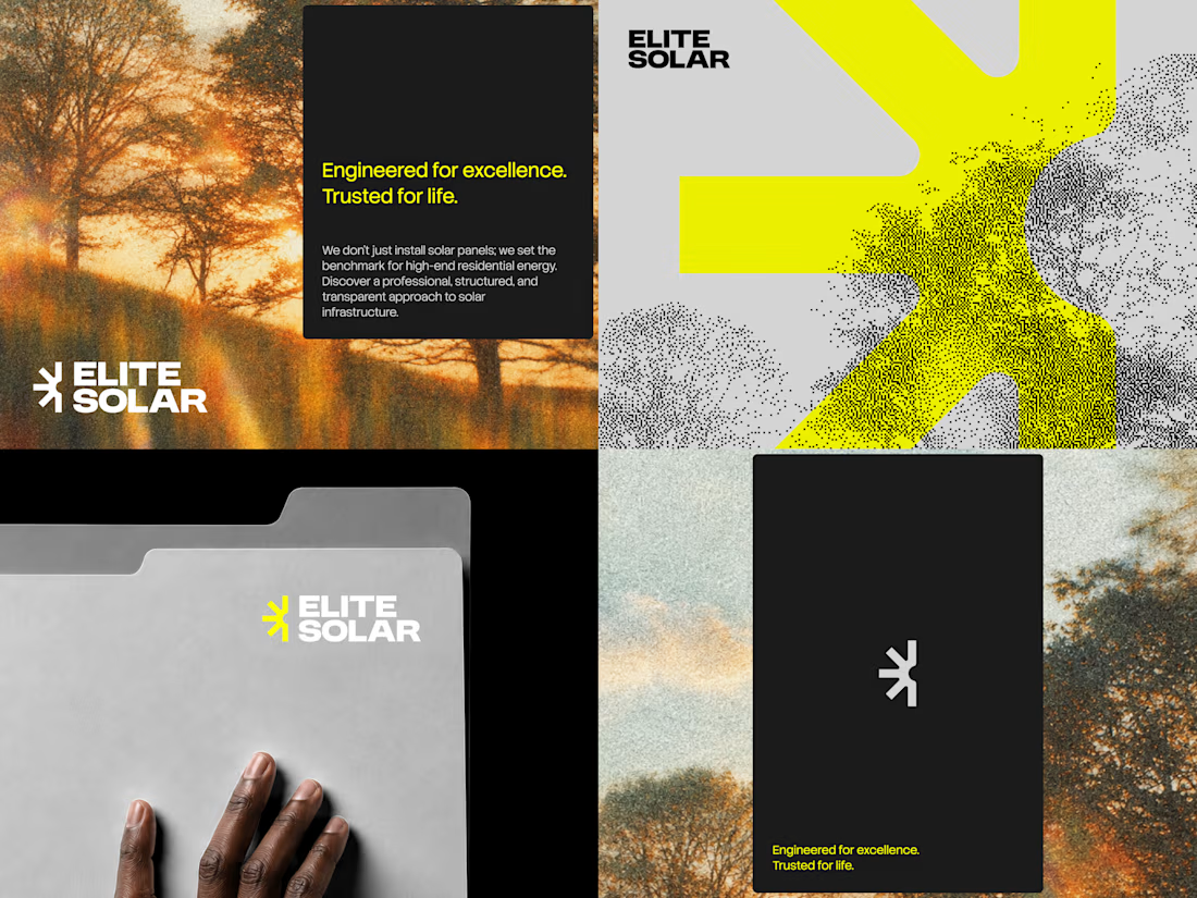

Great job with the visual direction. 👏

Exploring the logo and brand assets for Harmonic, an AI sleep app that builds immersive soundscapes around your body.

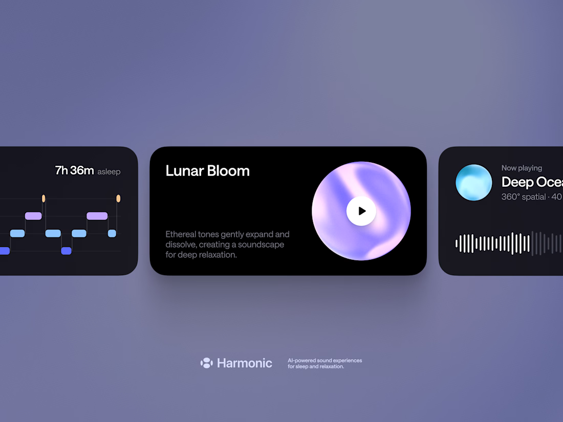
This looks fantastic. I know it's not the focus but Harmonic logo is top notch👌