The network for creativity
Join 1.25M professional creatives like you
Connect with clients, get discovered, and run your business 100% commission-free
Creatives on Contra have earned over $150M and we are just getting started
Back to feedPost


The network for creativity
Join 1.25M professional creatives like you
Connect with clients, get discovered, and run your business 100% commission-free
Creatives on Contra have earned over $150M and we are just getting started





Related posts


Twenty-five years of credits, finally on a website that looks the part.
Just take a look at what kind of web we create ✨👇
Reflection of the brand history with taste, precision, and premium branding.
Scroll responsibly: https://productionportugal.com 😉🔥


Wow! Nice setup 🎥

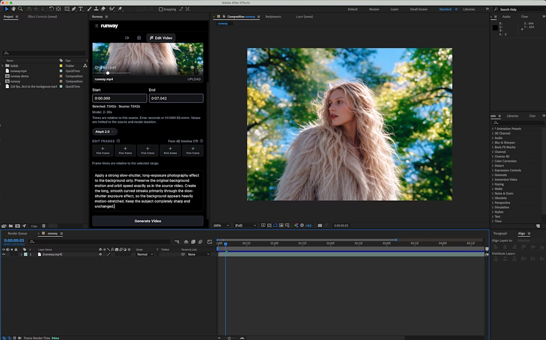
Sharing a simple trick for transforming a video background:
Add a slow-shutter effect.
By turning the surroundings into long, curved motion streaks, you can transform an ordinary environment into a more abstract composition that adds another layer to the shot.
I applied the effect to my own footage using Runway’s Aleph 2.0, editing only the background while keeping the original subject and movement intact.
There are also Runway plugins for After Effects and Premiere Pro if you want to use this directly inside your editing workflow.
Prompt is in the comments.
What do you think of this effect?


🧠 this is not just an edit. this is a feeling delevery in a unique style . turning the possibility into a reality. DM "unique" to start your next level content !

great ads creative