The network for creativity
Join 1.25M professional creatives like you
Connect with clients, get discovered, and run your business 100% commission-free
Creatives on Contra have earned over $150M and we are just getting started
Back to feedPost


The network for creativity
Join 1.25M professional creatives like you
Connect with clients, get discovered, and run your business 100% commission-free
Creatives on Contra have earned over $150M and we are just getting started











Related posts

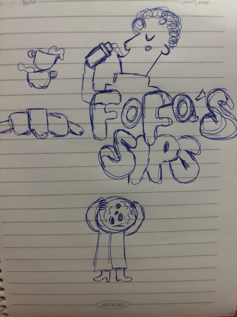
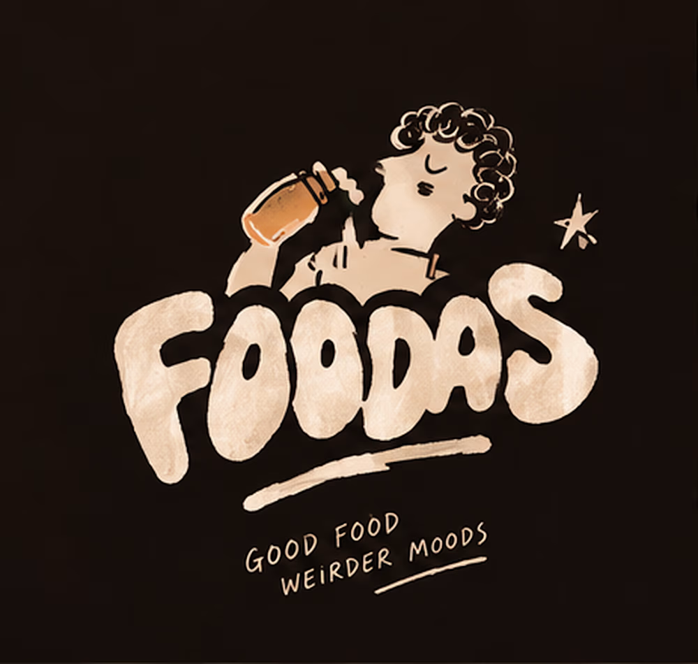
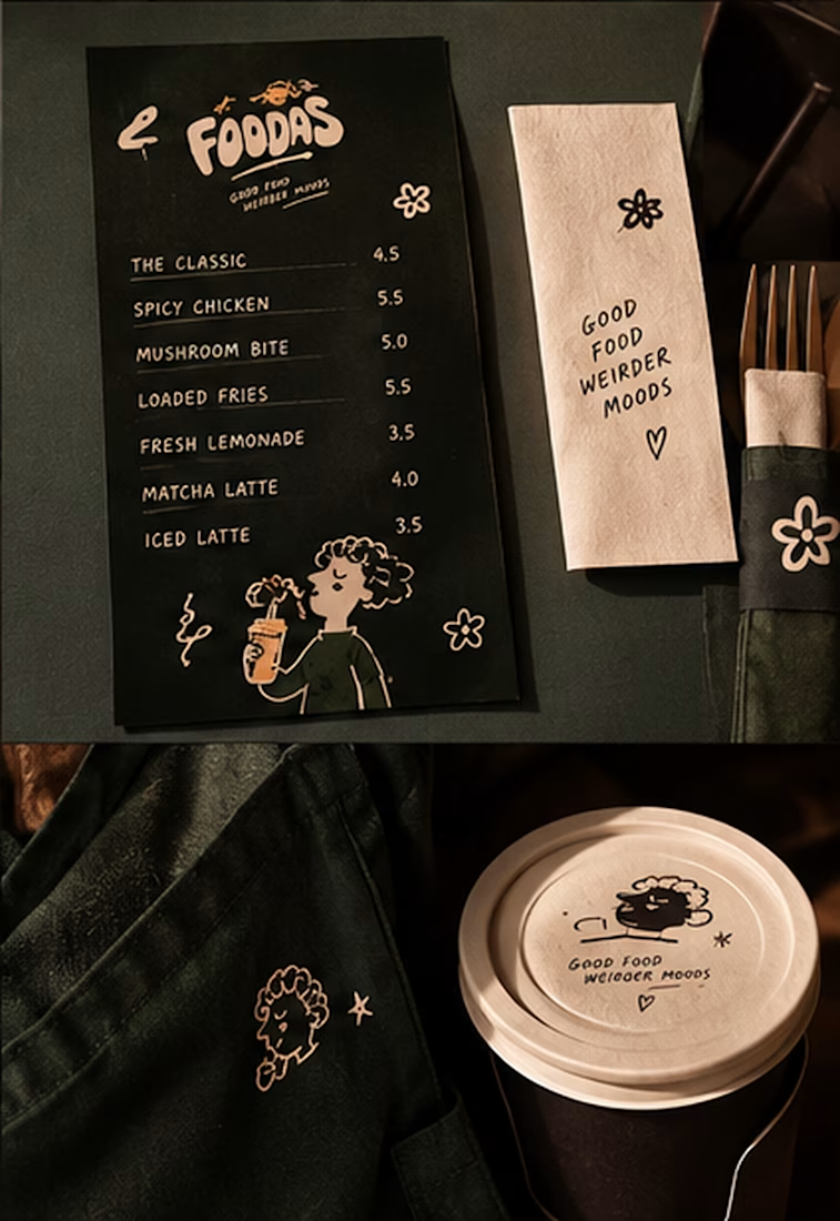
I turned one of my notebook doodles into a whole brand identity. And honestly this was way more fun than I expected I usually work on UI/UX and digital products so I wanted to take a step back from screens and explore something completely different: illustration-led branding.
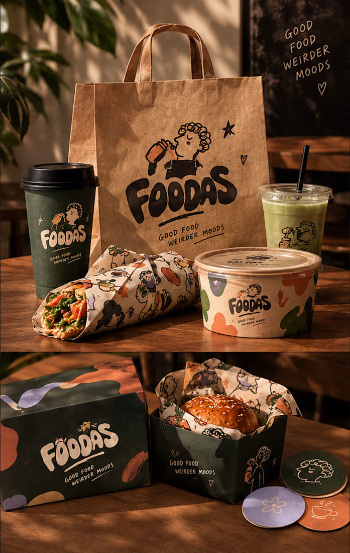
I took my original FOODAS sketch and built an entire visual world around it from the logo and mascot illustrations to the color palette packaging, cups, and menus
The goal wasn't to make it look perfectly polished and predictable I wanted it to feel playful, a little weird, and still premium.
Now I'm curious about one thing:
Can playful, imperfect illustrations make a brand feel more premium or do you think premium branding needs to be more minimal?
I have a feeling designers will disagree on this one



What if you could step into your own creation? ✨🌌
For the CapCut World LA challenge, I imagined a journey from my creative desk through a digital portal into a whole new world of creativity.
Created with AI visuals and cinematic effects in CapCut. 🚀
#CapCutWorld #CapCutWorldLA @capcutapp


Thanks for joining the CapCut World LA Challenge! 🌟 Just flagging: the submission requirements ask for your social post link along with the final video and project link. This helps us verify and feature your post — could you add it to your submission or share it in the comments below? Appreciate it!
Title: The Runaway Paintbrush 🎨 | CapCut World LA Challenge
Description:
What if a runaway paintbrush could take you on the most unexpected journey? 🎨✨
For my second entry in the CapCut World LA challenge, I created an imaginative AI video featuring a magical paintbrush, a colorful fantasy adventure, and an unexpected arrival at CapCut World LA.
Created using AI visuals, creative storytelling, character dialogue, and cinematic transitions in CapCut.
#CapCutWorld #CapCutWorldLA
Thanks for joining the CapCut World LA Challenge! 🌟 Just flagging: the submission requirements ask for your social post link along with the final video and project link. This helps us verify and feature your post — could you add it to your submission or share it in the comments below? Appreciate it!