The network for creativity
Join 1.25M professional creatives like you
Connect with clients, get discovered, and run your business 100% commission-free
Creatives on Contra have earned over $150M and we are just getting started
Back to feedPost

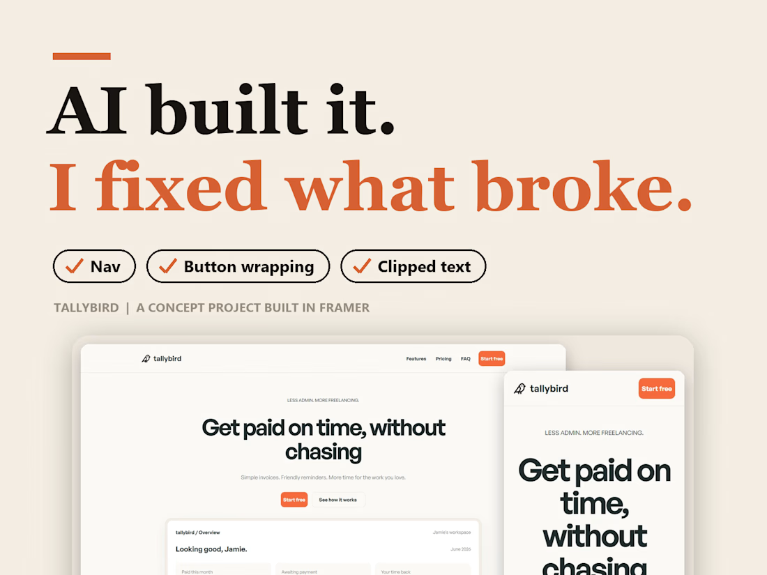
AI built my landing page in one pass. Then I fixed what it got wrong.
I gave Framer's AI Agent a brief for Tallybird, a fictional invoicing app, and let it build. It is a concept project, so the brand, prices and testimonial are made up.
It got the structure right fast. Hero, feature cards, a 3-step flow, three pricing tiers and an FAQ.
Then I checked every section on desktop, tablet and phone and fixed three things.
1. The nav needed work.
2. Button labels wrapped awkwardly.
3. Some text was clipped.
AI gets you to a first draft. Checking every breakpoint is what makes it feel finished, and that part was mine.
When you build with AI, what do you check first?
The network for creativity
Join 1.25M professional creatives like you
Connect with clients, get discovered, and run your business 100% commission-free
Creatives on Contra have earned over $150M and we are just getting started



Related posts

Nocturne is now on Framer 🌙
A sleep-app template where one night plays out as you scroll: dusk to dawn in three acts, with the sky, the clock and the widgets changing as you go.
Native Framer layers, a CMS, code components with properties and five skills for Framer's agent.
Get it on the Framer Marketplace, $59:
https://www.framer.com/marketplace/templates/nocturne-app/


Nice!

Most AI automation agency sites still end up on generic SaaS layouts. Relay, our free Framer template is built around how an agency like this actually sells: a live run log, an hours-back estimator and a hero that reacts to your cursor.
Remix for Free: Check it out

The hours-back estimator is a smart detail.

I've spent years obsessing over the stuff nobody notices on a website. Until it's missing.
AI can now build a whole site in an afternoon. I think that's great.
But it still can't decide what feels right.
I don't think AI is the problem. It just stops at "it works". The last part, the spacing, the type, the way things move when you scroll, still needs someone who cares about it.
That's the part I've always loved doing. So I made a small thing around it: you bring the site AI built, I finish it in Webflow.
It's called Verdikt https://verdikt.studio


Agreed. AI gets you a working layout fast, but spacing and type rhythm are where it still feels off. I'd add forms and mobile checks to that list too. What's the most common fix people bring you?