The network for creativity
Join 1.25M professional creatives like you
Connect with clients, get discovered, and run your business 100% commission-free
Creatives on Contra have earned over $150M and we are just getting started
Back to feedPost

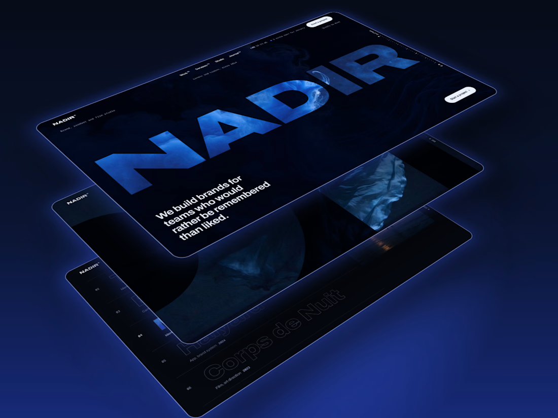
Nadir is out: a dark Framer template for film and brand studios. The studio's name is cut out of the hero like a window onto the showreel, and as you scroll the page dives through one letter and into the footage.
11 pages, Work and Journal CMS, a depth gauge and headings that compress as they rise. Checked down to 320px.
Live preview: https://orchid-guides-918905.framer.app
Get it on Contra: https://contra.com/products/1E2emffP-nadir-framer-template-for-studios-and-agencies


The showreel through the letters sounds lovely.
The network for creativity
Join 1.25M professional creatives like you
Connect with clients, get discovered, and run your business 100% commission-free
Creatives on Contra have earned over $150M and we are just getting started



Related posts

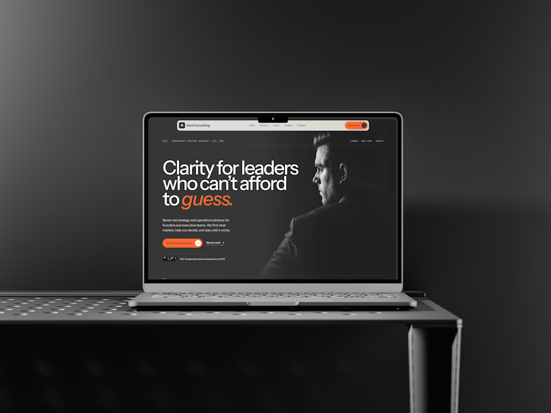
New @framer template: Nord Consulting
https://www.framer.com/marketplace/templates/nord-consultlng/
A premium template for consulting and advisory firms. Editorial, calm, one orange accent.
Built for Framer's AI agent: design system plus 11 skills included, so you can ask it to add a case study, rebrand or run a launch check.

Shipping a design system and skills for Framer's AI agent along with the template is a clever move, Edd. Being able to ask it to add a case study should make life easier for whoever buys it.


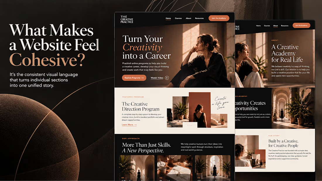
What makes a website feel cohesive?
It’s not just the colors.
It’s not just the typography.
And it’s definitely not about making every section look the same.
A cohesive website is built when every visual decision feels like part of the same story, from typography and imagery to spacing, buttons, cards, and even the smallest details.
The goal isn’t repetition.
It’s creating a visual language that people recognize and remember.
That’s when a website starts to feel like a brand, not just a collection of sections.
Well put, Serge. Consistent spacing, buttons and cards do more for that feeling than making sections match, and they are usually the first things to drift as a site grows.

Stille is live on the Framer Marketplace.
A cinematic template for yacht builders: a looping hero film, full-screen chapters that rise like curtains, spec cards that draw themselves, and a Hulls CMS where every boat gets its own page.
No WebGL. Light on any laptop.
Grab it here


Chapters that rise like curtains with no WebGL is a smart way to stay light, and "Anchor where nobody else can" is a strong line for yacht buyers. How heavy is the hero film after compression?