The network for creativity
Join 1.25M professional creatives like you
Connect with clients, get discovered, and run your business 100% commission-free
Creatives on Contra have earned over $150M and we are just getting started
Back to feedPost
Taste Test

Same visual approach. different fps. Which one do you prefer?

0 voted
0%
3 voted
100%
3 votes
Closed


24 fps feels more cinematic sometimes, but for this one i prefer 60 fps since the motion feels better flud like.

The network for creativity
Join 1.25M professional creatives like you
Connect with clients, get discovered, and run your business 100% commission-free
Creatives on Contra have earned over $150M and we are just getting started



Related posts

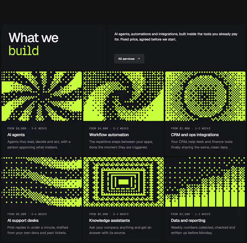
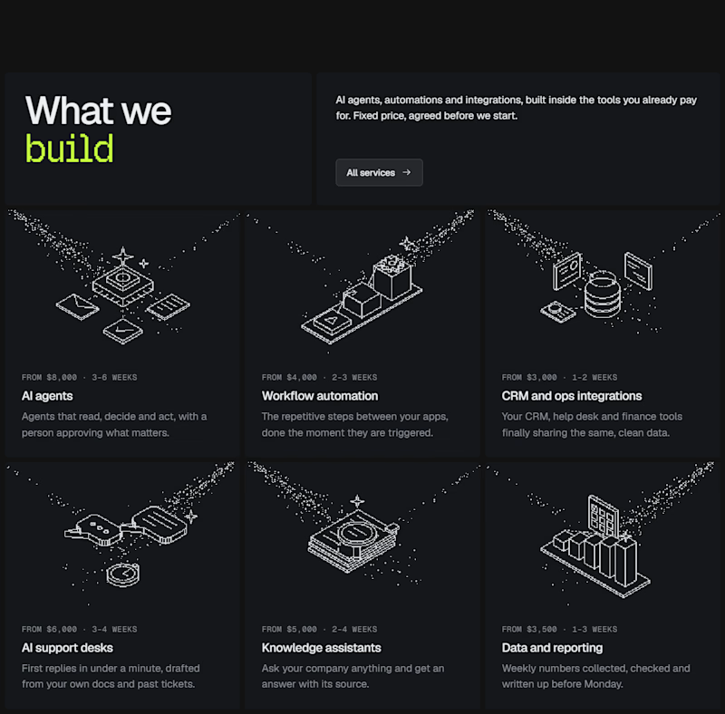
I experimented with a different illustration style for this section of my latest Framer template.
The goal was to make the UI feel more engaging without distracting from the content.
Which direction would you choose for a better user experience? Curious to hear your take. 👀
0 voted
0%
1 voted
100%
1 vote
Closed

This is a smart balance! Engaging but still content-focused. The Dither Pattern works really well here, not distracting at all.


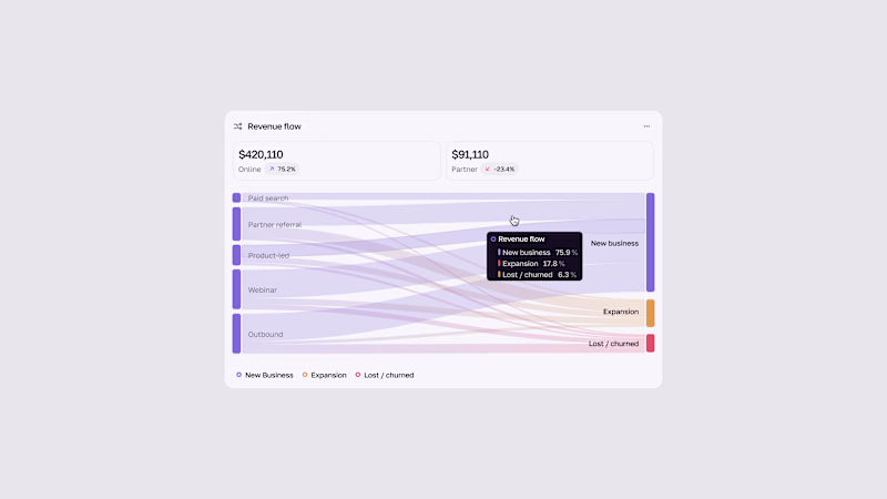
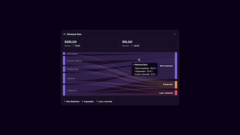


Such a neat experiment in AI-assisted spatial design! Using 10 photos of a real setup to train a local model like FLUX 3 Klein is next-level prototyping.
Both options look great, but Option A totally wins on the cozy lighting front for me. Check out the post and drop your vote


Turned my real desk into a tiny clay diorama ☕️
Made with FLUX 3 Klein running locally, using 10 photos of my actual setup as references: the pegboard wall, headphones, mug, shelves...
Which one do you like more, A or B?
21 voted
58%
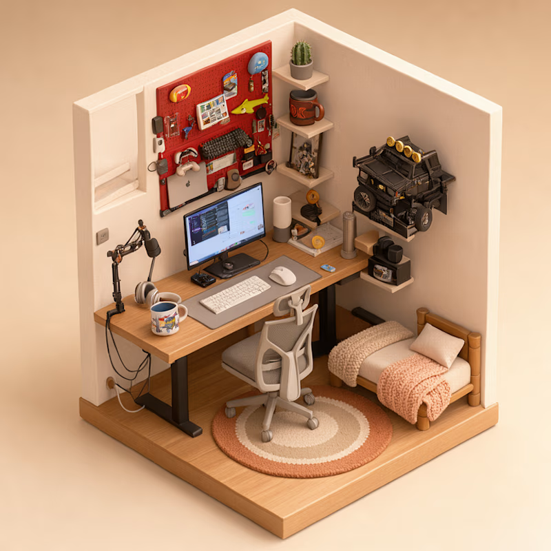
15 voted
42%
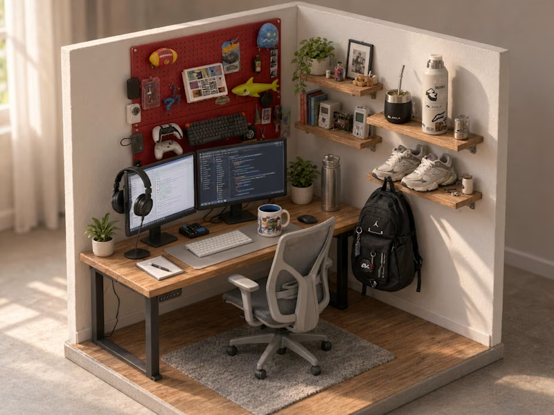
36 votes
Closed
This is insane! Option A is my favorite - the details are so realistic!
Love how you turned your real setup into clay with FLUX 3 locally, super creative idea!