The network for creativity
Join 1.25M professional creatives like you
Connect with clients, get discovered, and run your business 100% commission-free
Creatives on Contra have earned over $150M and we are just getting started


The network for creativity
Join 1.25M professional creatives like you
Connect with clients, get discovered, and run your business 100% commission-free
Creatives on Contra have earned over $150M and we are just getting started
Related posts

Proper Form — Social Media Branding System
A flexible social media system created for Proper Form as part of the wider brand identity.
The template system was designed to adapt across different post formats, banners and platforms while maintaining a consistent visual language.
Rather than repeating one rigid layout, the system gives the brand room to vary composition, imagery and content while remaining clearly recognizable.
Created by Lepisov Branding in collaboration with Creative Mints.
Logo design: Ilya Gorchanyuk
Creative direction: Dmitry Lepisov
Brand identity + social system: Lepisov Branding × Creative Mints


This is how a social system should work: strong enough rules that the brand reads at thumbnail size, loose enough that the feed never looks copy-pasted. Do you hand clients a Figma kit for this, or build it in something their team edits themselves?

🍨 Meet MORA — artisanal gelato with a softer side.
Bold typography, creamy tones, and playful flavor-inspired packaging designed to make every scoop feel special.
Explore the full project on my Contra profile and let me know your thoughts!
#BrandIdentity #PackagingDesign #FoodBranding #GraphicDesign #BrandDesign
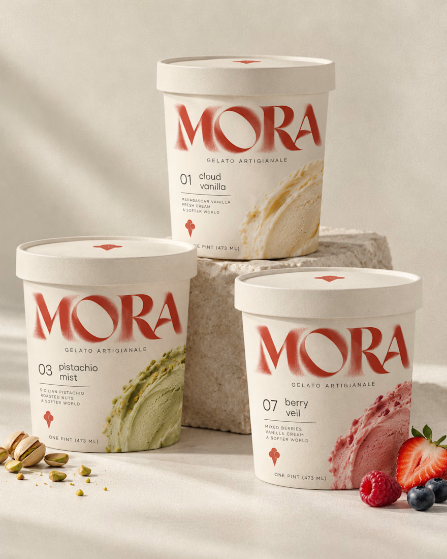
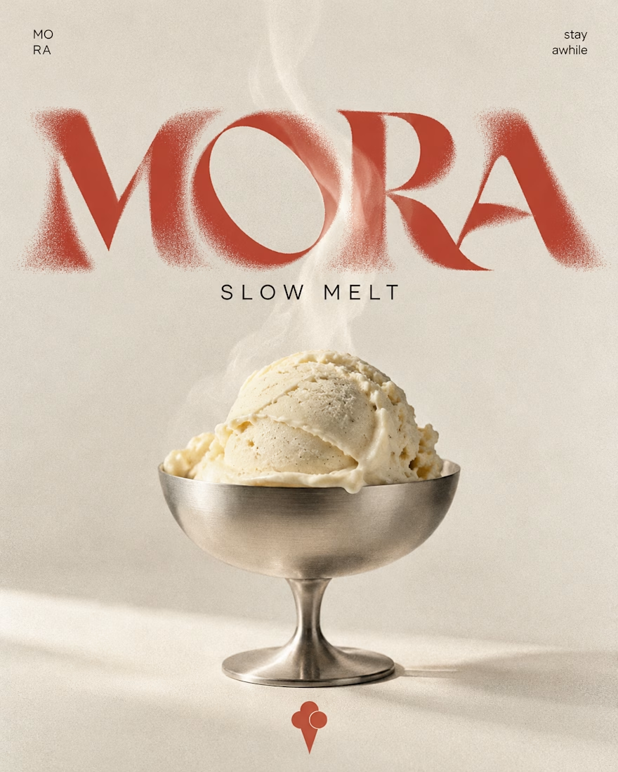
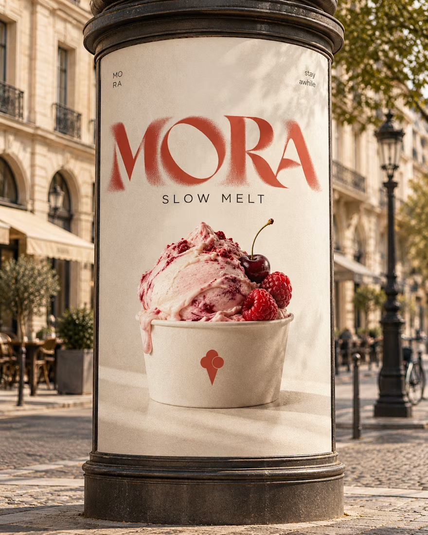

Love this MORA identity! 🍦 The bold typography against the creamy tones is such a perfect balance - feels artisanal yet playful. The flavor-inspired packaging with the watercolor smears for cloud vanilla / berry veil is a really nice touch, makes each scoop feel special as you...

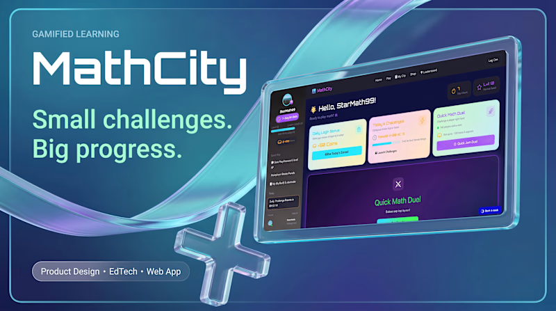
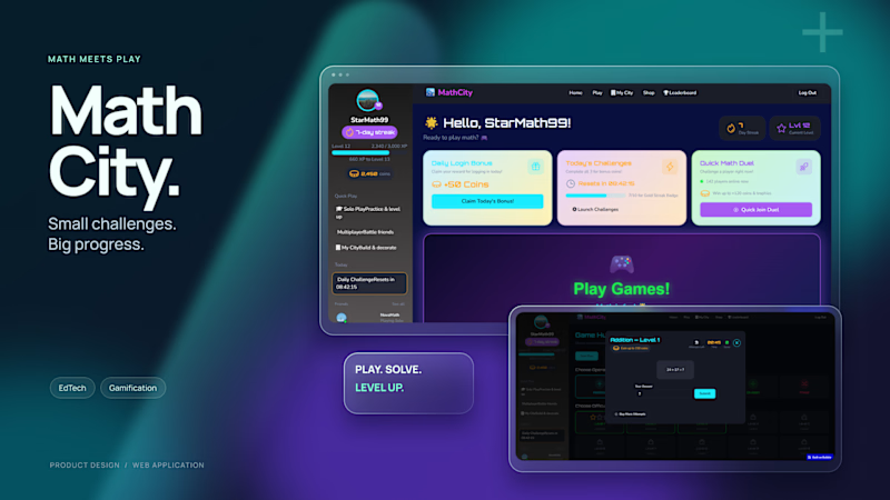
Experimenting with glass elements in banners for MathCity my app for learning math through play.
Which version do you prefer? I’d also love to hear your thoughts in the comments
4 voted
50%
4 voted
50%
8 votes
Closed

Went with B. The bold MathCity wordmark reads fast, and A's glass effect pulls attention from the name.