The network for creativity
Join 1.25M professional creatives like you
Connect with clients, get discovered, and run your business 100% commission-free
Creatives on Contra have earned over $150M and we are just getting started
Back to feedPost

I built this video as part of a series of LinkedIn posts about project control. It started with a simple question: why can a project look healthy while warning signs are already appearing?
I then explored five signals I watch — progress, schedule, dependencies, cost, and unresolved actions — and how I connect them into insight, decisions, and action.
That thinking led me to develop the Project Command Center, a practical project-control workflow that I now showcase as an offering on Contra. I built it to make complex project situations easier to understand and act on.
The network for creativity
Join 1.25M professional creatives like you
Connect with clients, get discovered, and run your business 100% commission-free
Creatives on Contra have earned over $150M and we are just getting started


Related posts

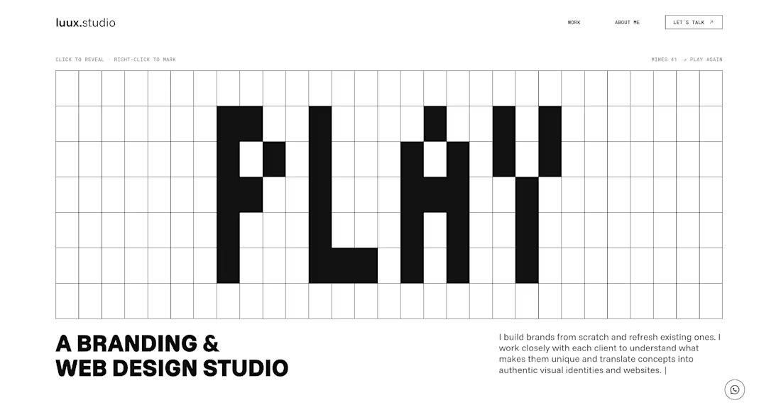
The new luux.studio website is live.
I rebuilt my site around one idea that guides how I work:
⚡️ every project starts by bringing light to what’s hidden ⚡️
So the homepage is a game.
A full-screen minesweeper where you explore the grid, read the clues and, eventually, find the spark. Hit a mine and it explodes, literally, into a “Start your project” button.
What else is new:
→ Three clear services: Brand Strategy, Visual Identity and Website & E-commerce
→ A work index where every project comes to life on hover
→ One person behind it all, from the first idea to launch
Designed and built in Framer, with a few custom code components for the game and the details.
Go play: luux.studio
How many clicks did it take you to find the spark?
Please, leave your feedback below 🫶🏻


Good work, very polished.

I built my entire portfolio website with AI. This is what it feels like to use it.
In 77 seconds, I scroll through the homepage, open the Attack Map case study, and show how the gallery and hover states work. The last stop is the About page.
I design B2B SaaS and cybersecurity products. If you have a workflow that's hard to use or an idea you'd like to test in a working prototype, send me a message here on Contra.


Congrats on the new portfolio!

Sharing a case study for an app walkthrough project I worked on back in January 🚀

Really clean walkthrough — the app stays dynamic without losing the user journey, which is the hardest part of a feature tour. The deep green 'Financement simplifié' frame sets the tone nicely too. Strong work, Hasmik.