The network for creativity
Join 1.25M professional creatives like you
Connect with clients, get discovered, and run your business 100% commission-free
Creatives on Contra have earned over $150M and we are just getting started
Back to feedPost
Just wrapped a full enterprise SaaS revamp — took a legacy platform used since 2010 and redesigned it into a modern, scalable product.
8 pages. One coherent design system. Zero inconsistency across screens.
Full case study: https://www.behance.net/gallery/249541559/Neosys-Revamp-Case-study
Open to remote contracts — fintech, SaaS, product design.

This came out really well 🔥 Great balance of creativity and execution. I’m usually into projects like this, so I had to take a closer look at what you’re building.

Thanks! Appreciate you taking the time to look. It was a fun challenge legacy systems have so much potential once you strip away the bloat
The network for creativity
Join 1.25M professional creatives like you
Connect with clients, get discovered, and run your business 100% commission-free
Creatives on Contra have earned over $150M and we are just getting started

Challenges
View all


Related posts


Product first or brand first? 🤔
We're cutting the promo reel for our case study and can't agree on its start. ✨
Which product ad opening would make you stay past the first 3 seconds?
Vote and tell why! 👇
Product DesignSoftware DevelopmentAdobe After EffectsCinema 4DFigmaBrand DesigncreativeaiworkflowUX Design


15 voted
25%
46 voted
75%
61 votes
Closed

I think both is important, but good product first.

Same data, two different ways to experience it 🤔
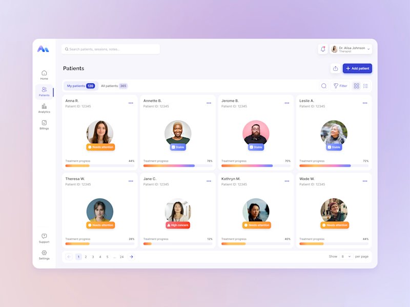
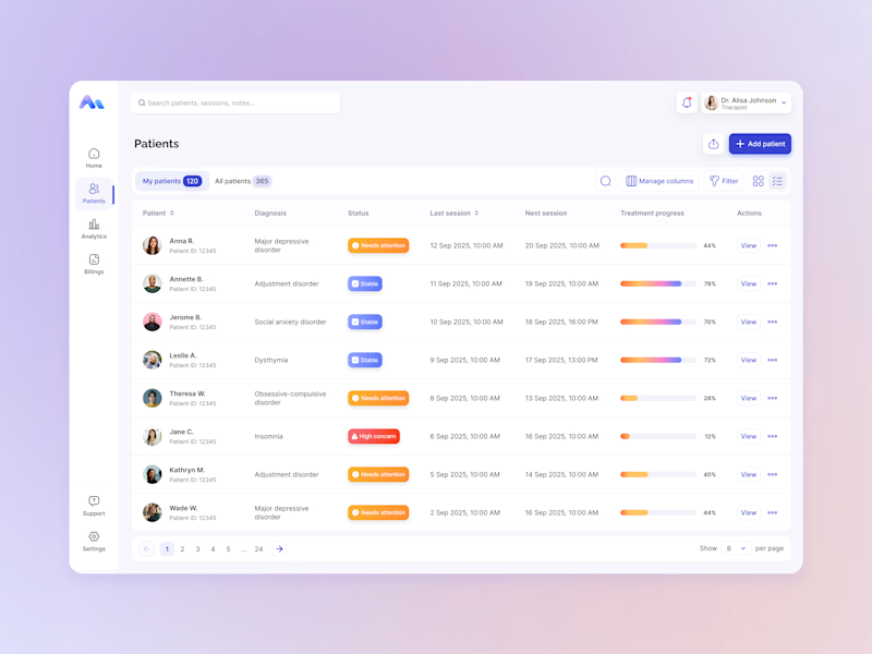
I explored two patient list layouts for a mental health platform: a card view and a table view.
Cards feel more visual and personal, but space is limited and adding more information can quickly make them crowded. For complex enterprise products, I often find tables more practical — they’re easier to scan, compare, sort, and can support more columns when users need greater visibility.
For this kind of workflow, I’m leaning toward the table view. Which would you choose — cards or table?
11 voted
55%
9 voted
45%
20 votes
Closed

For a mental-health patient list the choice isn't really card vs table — it's scan-speed vs context. The card wins the first meeting because the photo and name set the clinician's mental model before they touch the row, but the table is what holds up under the daily rhythm of...

The softest part of your day nobody talks about 🦆
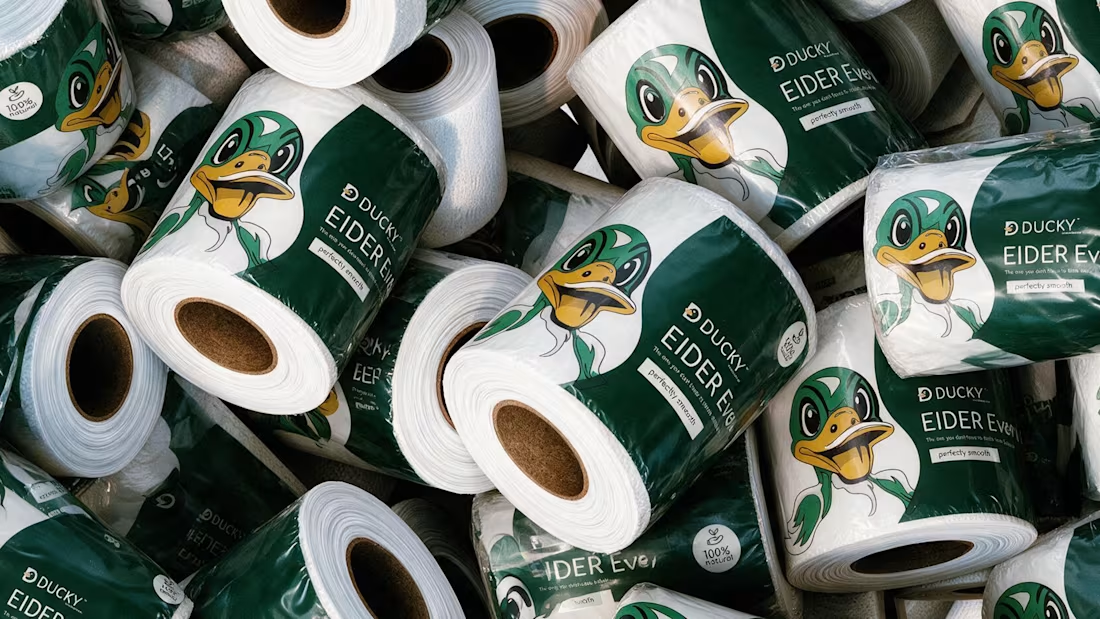
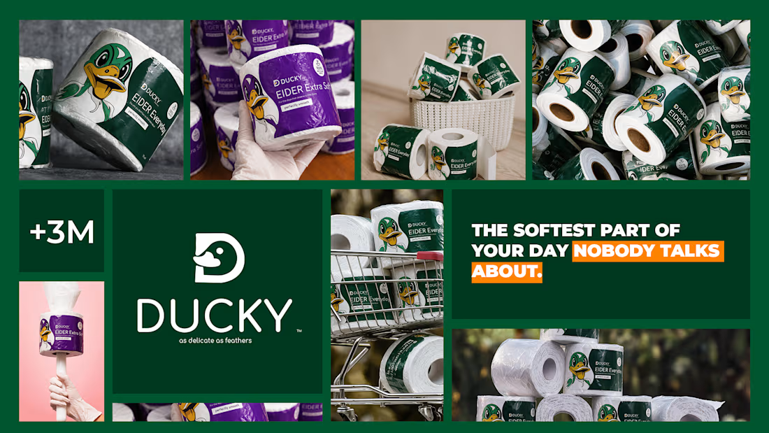
Spent the past week designing EIDER — a toilet paper brand built on a simple bet: even the most overlooked product in the house deserves real design attention.
No cartoon mascots. No literal bathroom jokes. Just calm pastel tones, restrained typography, and a quiet geometric duck mark — named after the eider duck, source of the softest down there is — that rewards a second look instead of shouting for one. 🪶
Sometimes the funniest thing a brand can do is take itself seriously.




Love the branding, it’s clean, balanced, and easy to follow.