The network for creativity
Join 1.25M professional creatives like you
Connect with clients, get discovered, and run your business 100% commission-free
Creatives on Contra have earned over $150M and we are just getting started
Back to feedPost

Tjena! Hola! Hey! Bonjour people! For this challenge I wanted to showcase my passion and obsession with sports / action sports branding in the niche of women sports!! I was actually impress with this tool!! it was my first time playing with this ai workflow. I wish I had more time to play with the typography 🧠 !!
but to be honest I'm just grateful if y'all just check it out : ) Good luck to the rest of y'all!!! Cheers!!🙌

Congratulations, Raisa 🎉
Thank youuu Golden!!!! did you also participate?

The network for creativity
Join 1.25M professional creatives like you
Connect with clients, get discovered, and run your business 100% commission-free
Creatives on Contra have earned over $150M and we are just getting started



Related posts

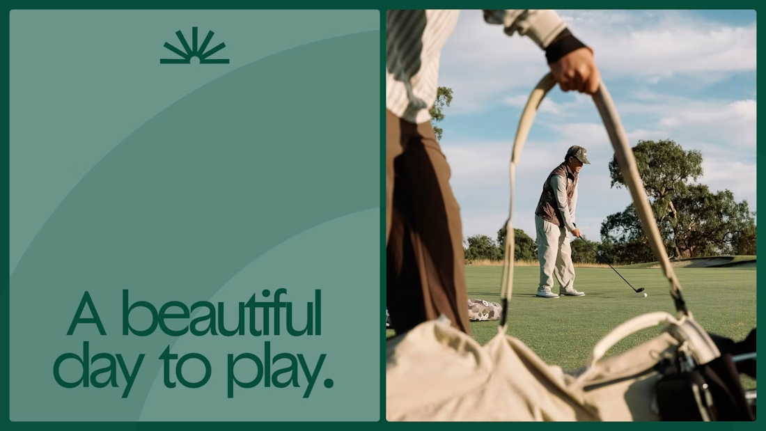
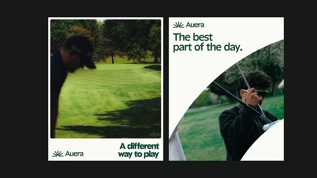
Had some fun creating these brand cards and a hand-drawn typographic mark for Between! ✨
Really enjoyed bringing these little details to life.
What do you guys think? 😊



this is amazing design

Premium Brand Identity & Bold Packaging
Take a look at this newly completed brand identity and packaging design project! I focused on clean lines, high-contrast layouts, and powerful typography to create an unforgettable premium aesthetic.
Whether you need a standout logo system, custom brand guidelines, or luxury structural packaging assets, I build visual solutions that drive real business impact.
🚀 Ready to transform your brand identity? Send a message today to collaborate on your design needs!


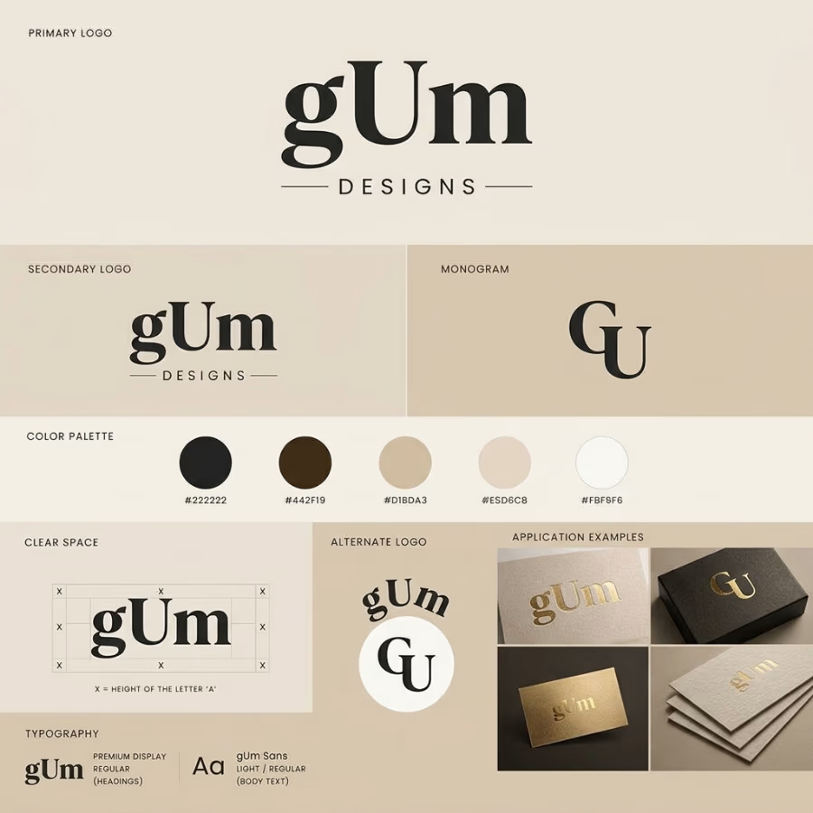

The clear-space diagram tied to the height of the letter A and the gold foil on the cards make this feel like a proper system, not just a logo. One challenge: the wordmark is gUm with a lowercase g, but the monogram reads GU, so the M drops out. Was that deliberate? A monogram...