The network for creativity
Join 1.25M professional creatives like you
Connect with clients, get discovered, and run your business 100% commission-free
Creatives on Contra have earned over $150M and we are just getting started
Back to feedPost
Every brand has a story.
For this project, the goal wasn't to create another drummer logo filled with drumsticks or drum kits. Instead, the identity was built around one essential tool every drummer knows: the drum key.
By combining the client's initials with this subtle reference, the result is a clean, memorable mark that reflects both personality and profession without relying on obvious clichés.
You can explore the full case study below. I'd love to hear your thoughts.
https://contra.com/p/P6lNZYFN-ivan-drummer-brand-identity-design?referralExperimentNid=DEFAULT_REFERRAL_PROGRAM&referrerUsername=the_maxa_design


Very smart! Drum stick feels generic. I agree with this. Only drummer relate, but hey, this is strong visual identity!

Thank you! Really appreciate your feedback. I'm happy the concept resonated with you.

Turning the drum key into a monogram is such a clever move. It feels authentic to the drummer’s world without relying on the usual visual clichés, and the negative space makes the mark especially memorable. Brilliant concept and execution! 👏
Thank you so much! I really appreciate your thoughtful feedback. The goal was to create something that felt authentic to a drummer while avoiding the obvious clichés, so I'm glad that came across. Thanks again for taking the time to share your thoughts! 🙌
The network for creativity
Join 1.25M professional creatives like you
Connect with clients, get discovered, and run your business 100% commission-free
Creatives on Contra have earned over $150M and we are just getting started














Related posts


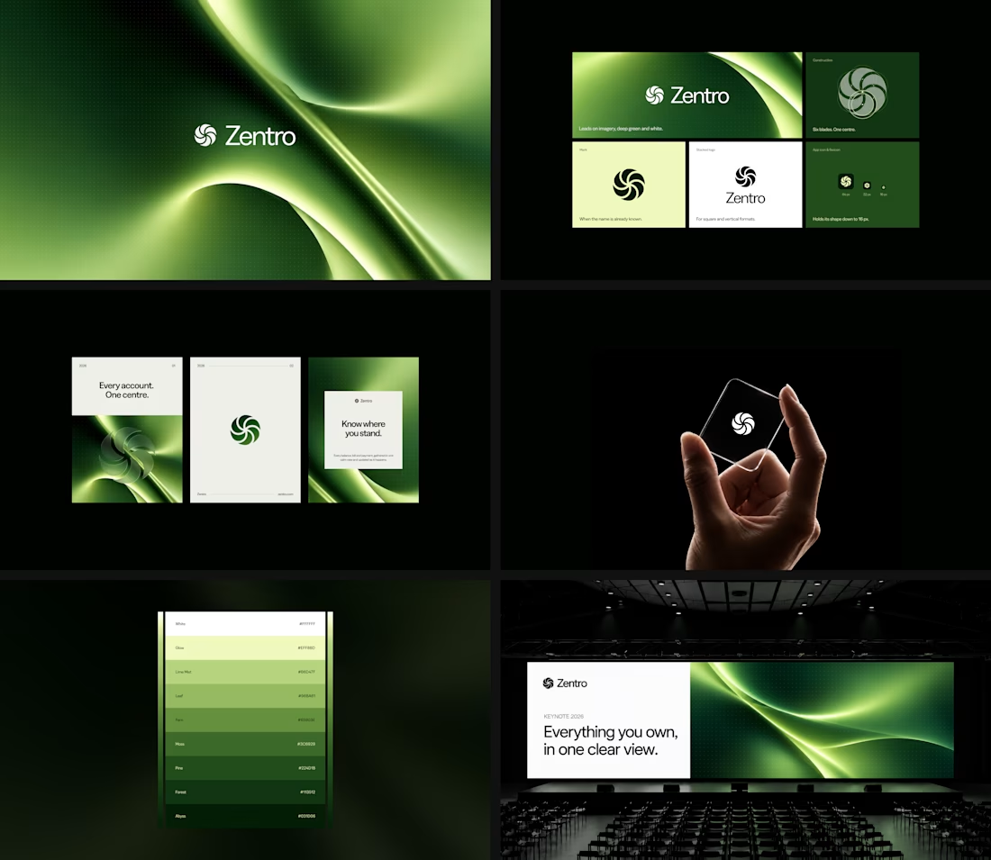

Clean and confident work! The green gradient with the mark feels very modern for fintech - trustworthy but not boring. The app screens look really polished. Curious how you landed on this mark, does it represent growth / movement?

HuroPay Branding for Fintech
We built its identity to feel the same way: fast, clear and human.
Need a branding? DM Now...
#branding #brandidentity #logo


Pulse Athletics... Branding & App design✨
Check it out
#app #sport #productdesign #uiuxdesign #uidesigner #uxdesigner #pulse #branding #brandidentity #brandstrategy #brandguidelines #logo #homepage


That's really stunning app design🔥🔥🔥
Great job Ziva🎉🎉🎉

