The network for creativity
Join 1.25M professional creatives like you
Connect with clients, get discovered, and run your business 100% commission-free
Creatives on Contra have earned over $150M and we are just getting started
Back to feedPost

The best thing I like about this is strategy, don't go rush ,. Relax but easy results.

The network for creativity
Join 1.25M professional creatives like you
Connect with clients, get discovered, and run your business 100% commission-free
Creatives on Contra have earned over $150M and we are just getting started











Related posts

The brief was simple. Show a new personalized news feature.
The obvious solution was to show a few clicks in the UI as you choose your topics. Clear, but not very interesting.
So I pulled that moment out of the interface first and turned it into a cloud of topics. You get the idea before you even see the product, then the video drops you back into the real UI and shows where it lives.
I really like these tiny decisions. The feature stays the same, but it feels easier to get and a lot more fun to watch.


Pulling the topic cloud outside the UI makes the feature instantly clearer.


The Clarify, Mobilize, Align framing gives this deck a clear narrative spine, Deep. Practical thinking, measurable progress is a message that will land in any boardroom. A minimalist approach makes the authority of the content stand out.

BEFORE vs AFTER
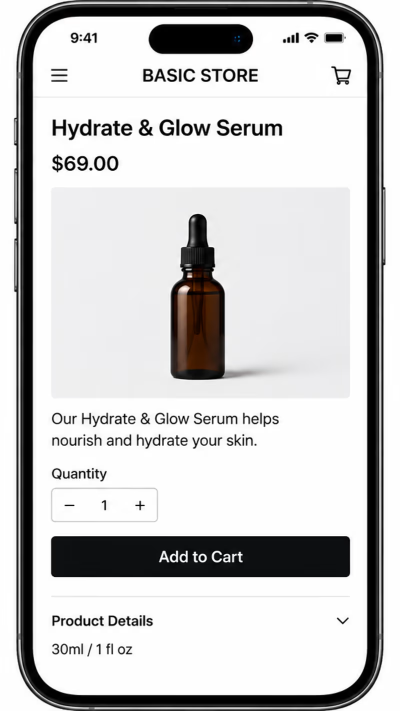
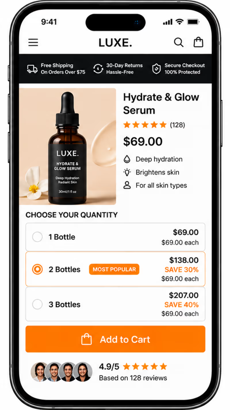
Which product page would make you more likely to buy?
Same product. Same price. Two different shopping experiences.
A — Before Elixir: A simple product page with a basic layout.
B — After Elixir: A more polished shopping experience with customer reviews, trust signals, product benefits, and quantity discounts.
As a developer interested in e-commerce and UI/UX, I believe great design should do more than look good — it should build trust and make buying easier.
👇 Which one would you choose: Before or After?
What makes the biggest difference to you: product presentation, reviews, trust signals, or discounts?
#Ecommerce #Shopify #UIDesign #ConversionOptimization #Figma #Canva #Framer #Adobe
4 voted
50%
4 voted
50%
8 votes
Closed

Customer reviews and trust signals make the biggest difference by far. For a $69 skincare bottle people need to see genuine ratings and money back guarantees before they hit buy. But the other elements still matter, better product photos make the brand look legitimate and bundle...