The network for creativity
Join 1.25M professional creatives like you
Connect with clients, get discovered, and run your business 100% commission-free
Creatives on Contra have earned over $150M and we are just getting started
Back to feedPost

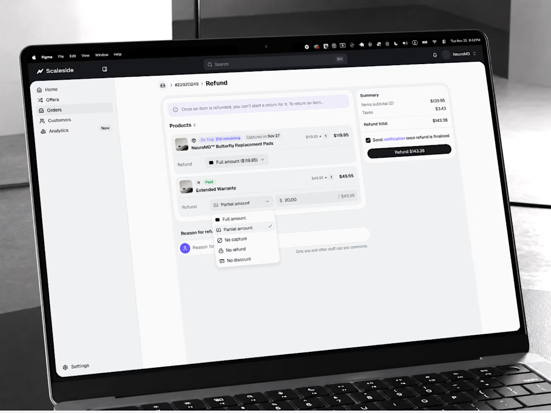
Reliqio's e-commerce platform development for Scaleside rests on one idea: the shopper tries first and pays later, and the merchant never holds a card number.
Scaleside is a Try Before You Buy checkout for brands that sell through paid ads. A shopper pays only for shipping, and the full amount is charged when the trial ends. For a client spending $5,000 a day on advertising, launch speed was a line in the budget.
How it works:
Offers and trials. Brands launch an offer and set a trial, and payment is captured only when it ends.
Orders in one place. Orders, customers, and full or partial refunds are managed from a single workspace.
PCI DSS by design. Card data never touches Scaleside's systems.
The stack. React, Node.js, and NestJS, with PostgreSQL and Firebase for data, Railway for infrastructure, and Sentry for monitoring.
What we delivered:
Discovery: two to three weeks.
MVP in production: about 2.5 months.
Card data stored on the platform: zero.
Reliqio started in early 2026 and continues to build the platform today.
Full case study: https://reliqio.com/case-studies/scaleside

Interesting model. From the storefront side, the hard part with try before you buy is usually the trust copy, not the checkout: shoppers need to see exactly when they'll be charged and how returns work right next to the CTA, or "pay only shipping" reads like a catch. Do brands...
The network for creativity
Join 1.25M professional creatives like you
Connect with clients, get discovered, and run your business 100% commission-free
Creatives on Contra have earned over $150M and we are just getting started

Challenges
View all


Related posts

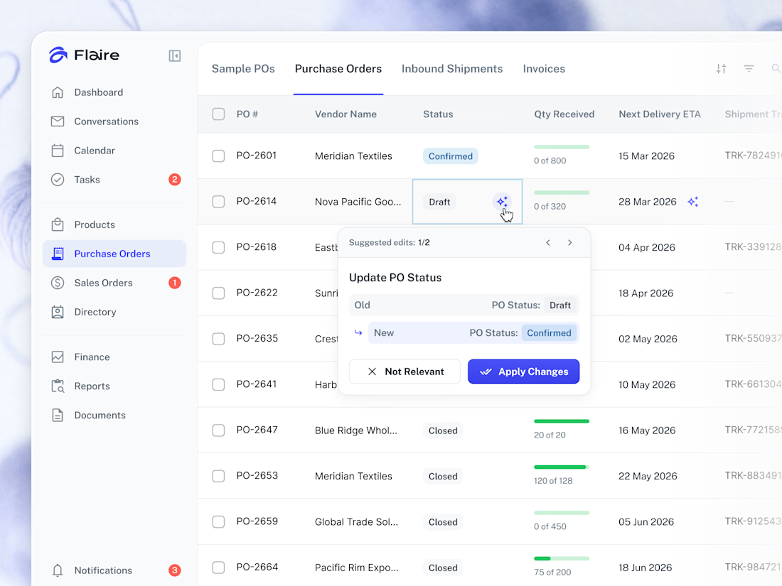
✨ AI Suggestions on the Purchase Orders list. Proposed record edits surface inline for the user to apply or dismiss in one tap.



Great work

My portfolio is live
I'm Daniel, a Design Engineer. I have designed, built, and scaled products from 0 to thousands of users and figures in revenue.
I can own any product phase, from concept and design to build, launch, and growth.
I'm open to product, brand, motion, and web design and development roles.
V1: https://danielbryte.com
Designed and developed by me.


I love the left panel on the case study page. 😍

A website should make the product easy to understand.
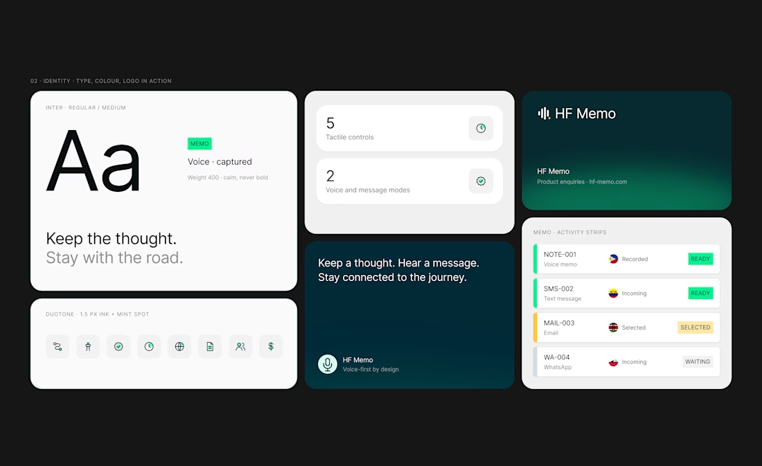
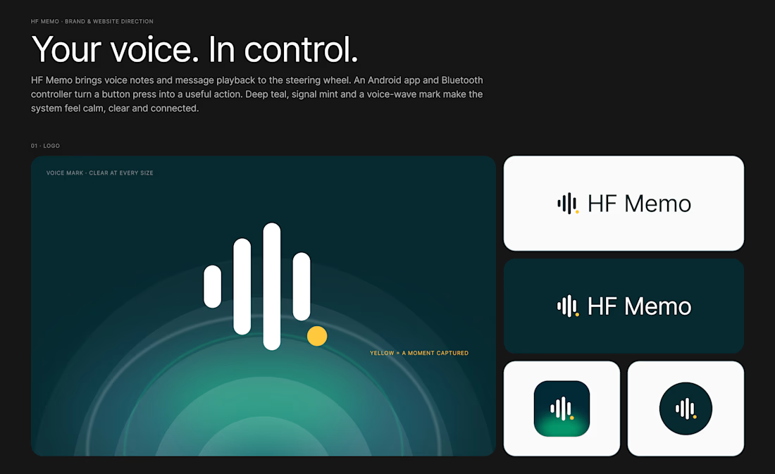
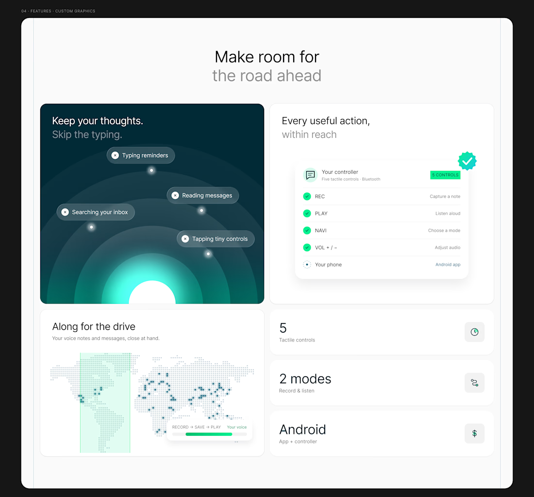
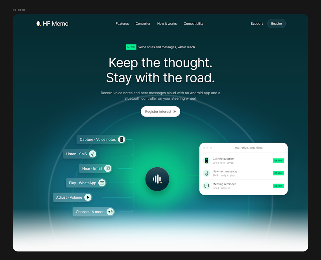
My latest redesign concept explores a new direction for HF Memo—an Android app and Bluetooth controller for recording voice notes and hearing messages aloud.
I focused on showing the experience: capture a thought, replay a recording, and understand what each controller button does.
Clean typography, light backgrounds, and lime accents give the product room to tell its story.
Designed in Figma, with editable layouts and custom graphics.
Have a product that needs a clearer website? Let’s connect.
#webdesign #uidesign #figma #productdesign