The network for creativity
Join 1.25M professional creatives like you
Connect with clients, get discovered, and run your business 100% commission-free
Creatives on Contra have earned over $150M and we are just getting started
Back to feedPost

RUGGEDIAN — Brand Exploration for a Gym That Doesn't Do Soft
Most fitness sites lean bright and motivational. RUGGEDIAN needed the opposite — something that felt like iron, sweat, and discipline before a single word was read.
This exploration builds the brand around a dark, industrial visual language: heavy slab typography, high-contrast imagery, and negative space that gives every section room to breathe before it hits you with the next beat. The scroll itself becomes part of the storytelling — content doesn't just appear, it earns its place on screen.
Motion approach (GSAP):
ScrollTrigger-driven reveals — text and imagery animate in sync with scroll position, not on a timer, so the pacing always feels intentional
Staggered entrances on stacked content blocks to build rhythm section to section
Parallax depth on hero and product imagery for a sense of weight and physicality
Smooth scroll easing layered underneath so the whole page feels controlled, not jumpy
The goal wasn't decoration — every animation is there to reinforce the brand's core idea: strength, control, and intent. Nothing moves without a reason.
#GSAP #ScrollAnimation #WebDesign #FrontendDevelopment #MotionDesign #BrandIdentity #FitnessBranding #GymBranding #UIUX #WebDevelopment #CreativeCoding #DarkUI #LandingPageDesign #InteractionDesign #WebflowDesign


The network for creativity
Join 1.25M professional creatives like you
Connect with clients, get discovered, and run your business 100% commission-free
Creatives on Contra have earned over $150M and we are just getting started







Related posts

Still finding little moments from this project that I want to share
A few more favorites from the launch video 💜


great work..

Love at first grid!
A short 2D motion study taking the Amorado logo from its construction grid to the final mark. Animated entirely in Spline.
A fictional identity concept for Amorado.


Hi guys! 👋
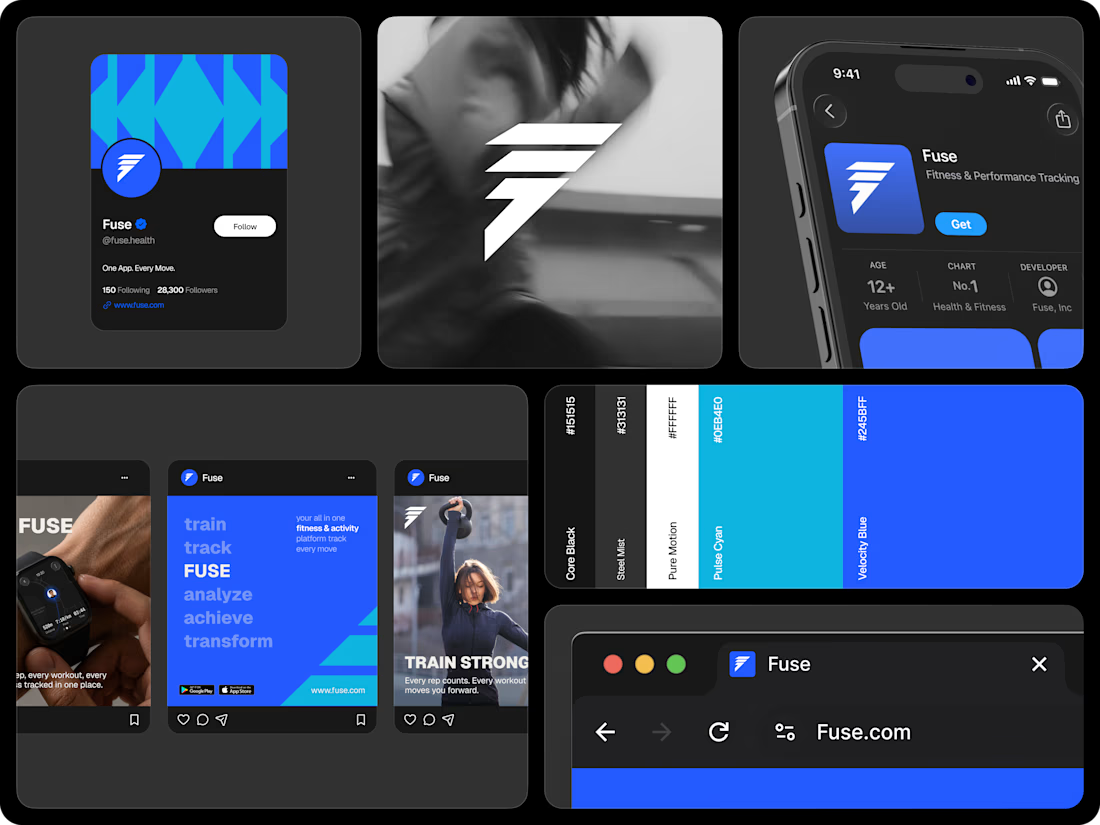
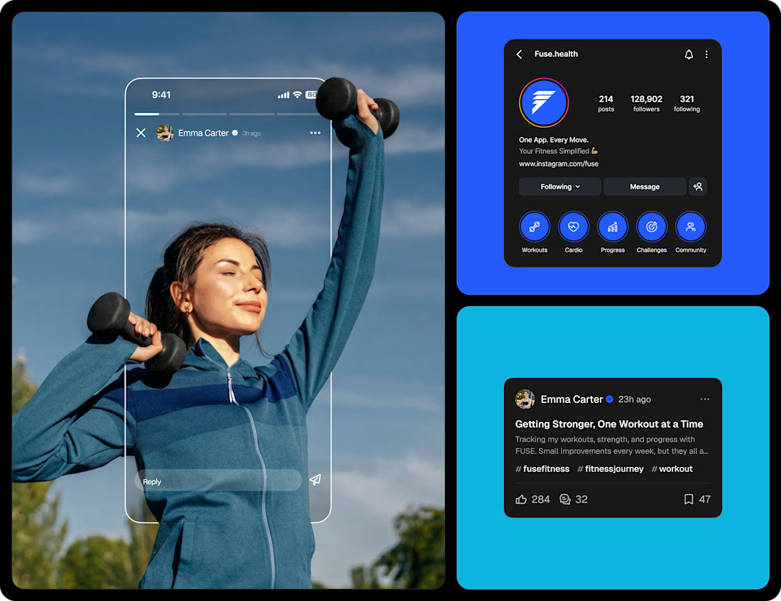
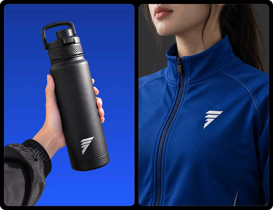
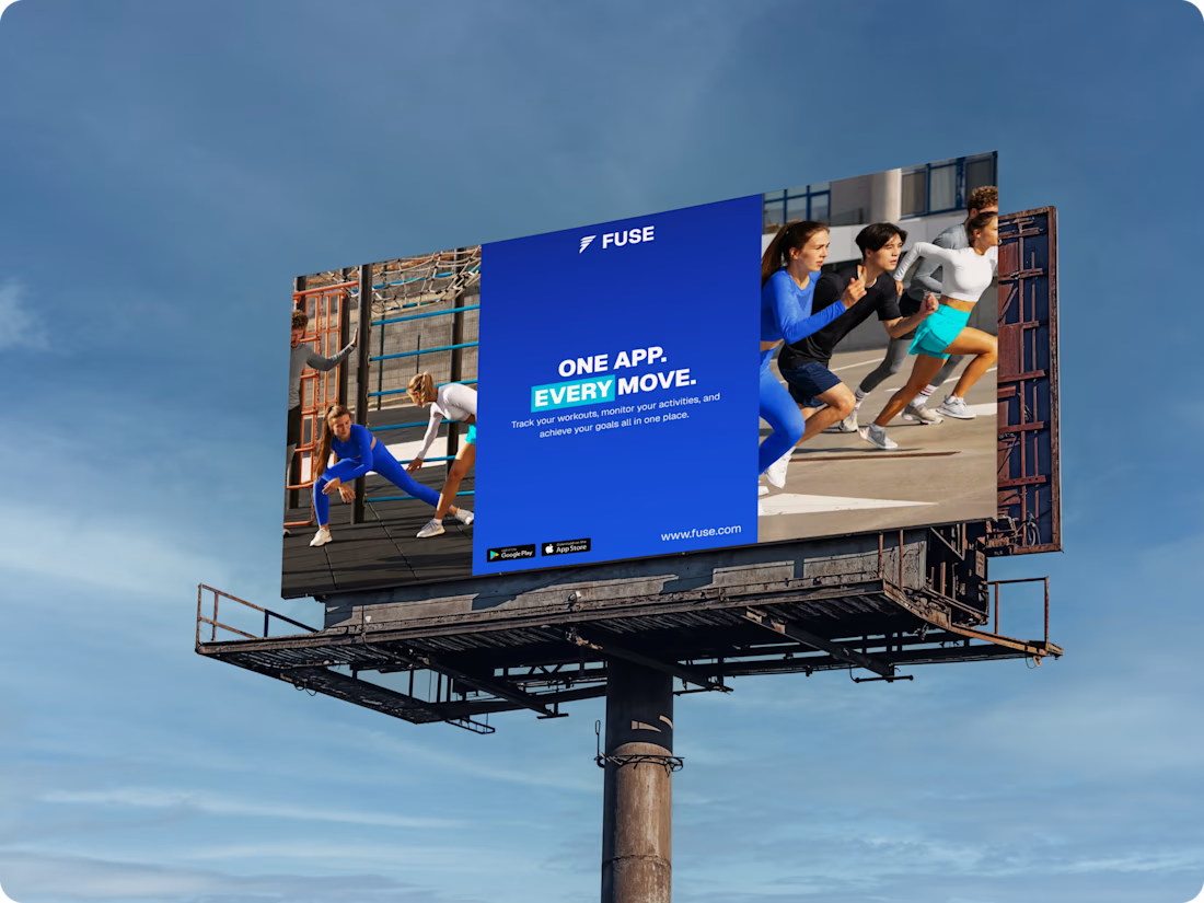
Just wanted to share my exploration as I’m learning to design branding through FUSE — Universal Fitness App Branding Identity.
What do you guys think? I’d really appreciate any feedback or suggestions. Thank you!

Clean and consistent branding! 👌