The network for creativity
Join 1.25M professional creatives like you
Connect with clients, get discovered, and run your business 100% commission-free
Creatives on Contra have earned over $150M and we are just getting started
Back to feedPost
Type that won't sit still. A short burst of clashing color, collage textures, and letterforms that refuse to behave, built for the love of noise, motion, and a little bit of chaos.
#MotionDesign #KineticTypography #AfterEffects #NeoBrutalism #MotionGraphics


This is a solid piece of work 🔥 You can really see the skill and dedication behind it. Keep building and improving excited to see what you create next

Thanks so much for the kind words! I appreciate the support as I keep pushing my craft and building out new projects. Stay tuned for what's next!
The network for creativity
Join 1.25M professional creatives like you
Connect with clients, get discovered, and run your business 100% commission-free
Creatives on Contra have earned over $150M and we are just getting started



Related posts


Taste Test: Bounce vs. Blueprint
Two 30-second motion pieces in two very different design languages, randomly drawn from a list of 60 styles.
Sprout: Flat Design
A houseplant-care app told with bright, shadowless shapes and springy bounce-in motion. Friendly icons, a weekly watering chart, a testimonial bubble and a “Pick your pal” shop all pop in with a circle wipe between scenes.
Atelier Nord: Modernism
An architecture studio told with restraint. Line drawings build themselves, from a house elevation to a floor plan, in a warm grey, black and off-white palette with a single orange accent. Clean type and sliding wipes keep it calm and precise.
One format, two moods: playful and rounded vs. quiet and exact.
2 videos · 30s each · 1080×1080 · 30 fps
Styles: Flat Design · Modernism


3 voted
43%
4 voted
57%
7 votes
Closed

Flat design, colors are eye catchy😊

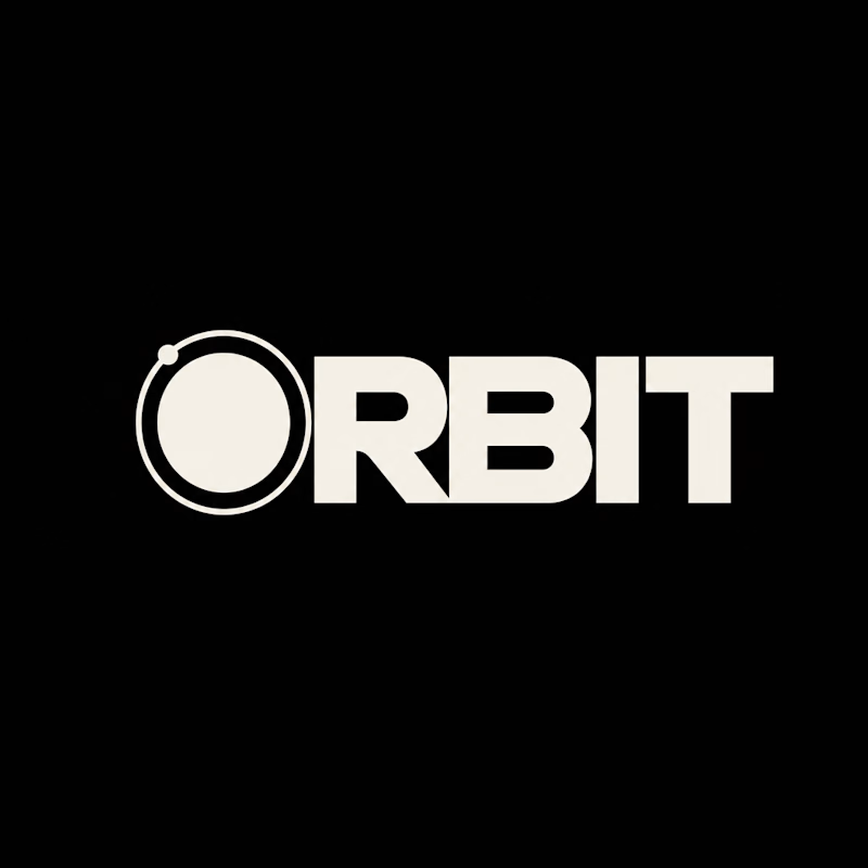
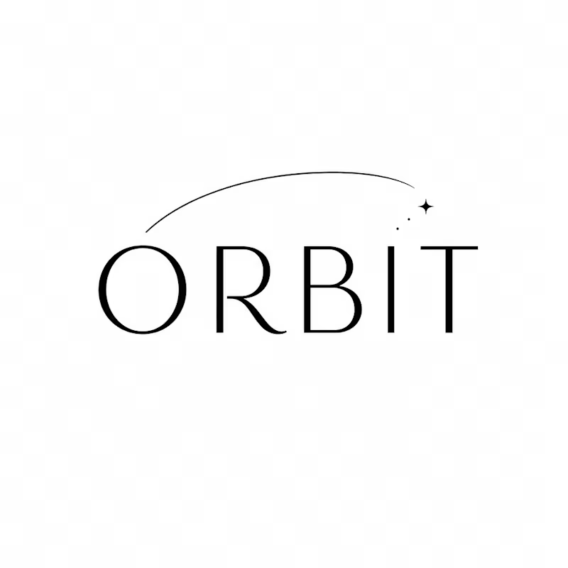
Which ORBIT pulls you in: the quiet one or the loud one? ✨
One name, two directions. Same idea, an object in motion around a center.
A → Heavy extended sans on black. The orbit is built into the O, a ring with a single satellite. Compact, graphic, impossible to ignore.
B → Light, high-contrast serif with a hairline arc and a tiny spark. The orbit is a gesture, a trail you almost miss. Elegant, airy, a little mysterious.
If you ask me, I'd pick A.

36 voted
80%
9 voted
20%
45 votes
Closed
