The network for creativity
Join 1.25M professional creatives like you
Connect with clients, get discovered, and run your business 100% commission-free
Creatives on Contra have earned over $150M and we are just getting started
Back to feedPost


The network for creativity
Join 1.25M professional creatives like you
Connect with clients, get discovered, and run your business 100% commission-free
Creatives on Contra have earned over $150M and we are just getting started



Related posts

A collection of high-converting social media creatives for food & beauty brands. I focused on clean, product-focused visuals that stop the scroll and drive "Shop Now / Order Now" actions. Designed for Instagram, Facebook ads, and menu posters.


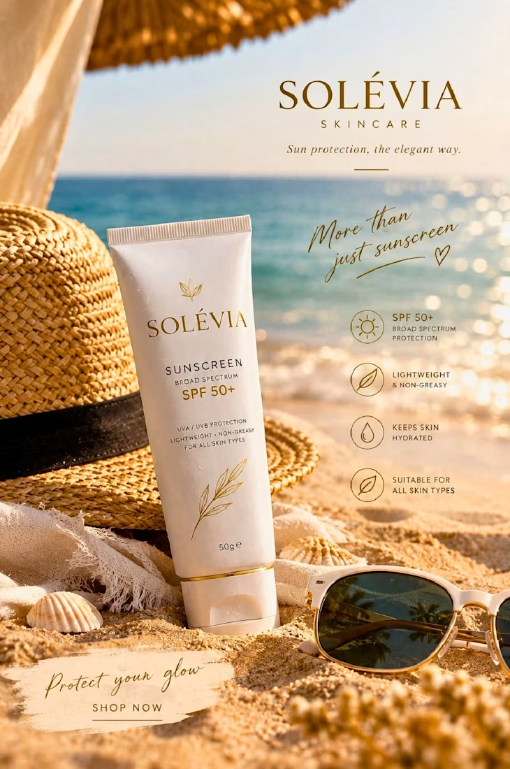
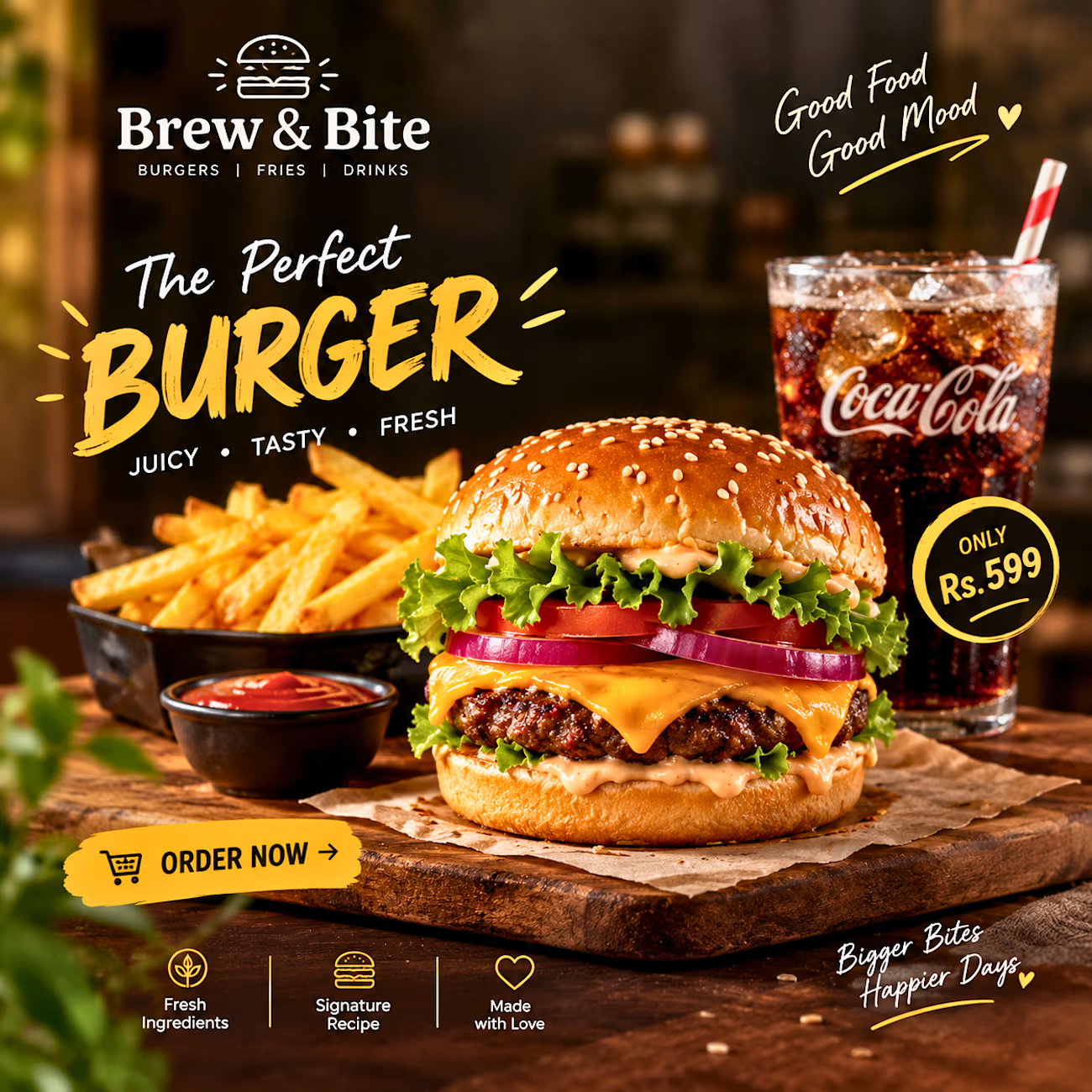
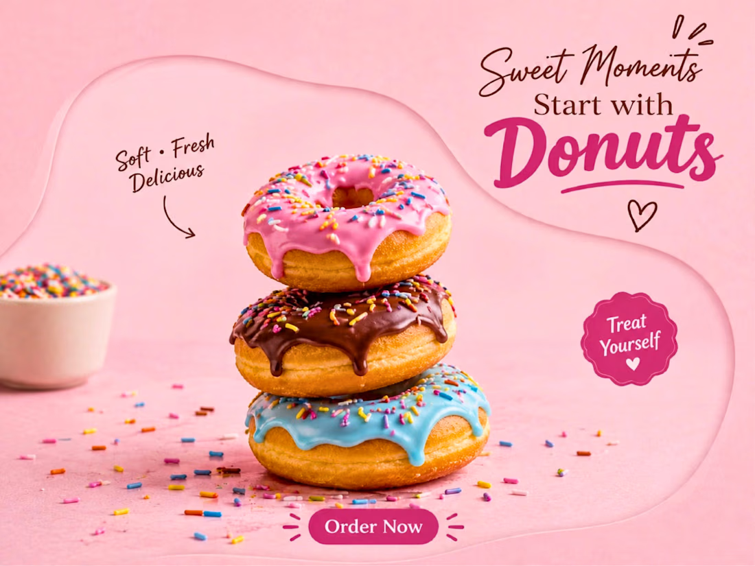
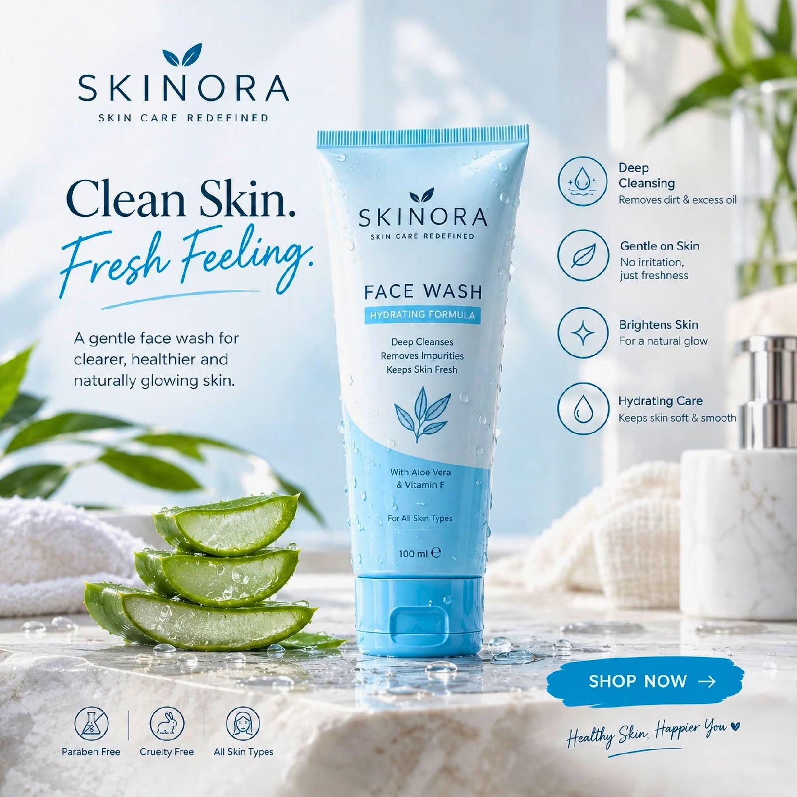

The pink donut tile stops the scroll, and the burger one has real appetite appeal. How do you keep a food set and a skincare set feeling consistent in one collection?

10 hours a week to get clients. posting your work or reaching out?
1 voted
33%
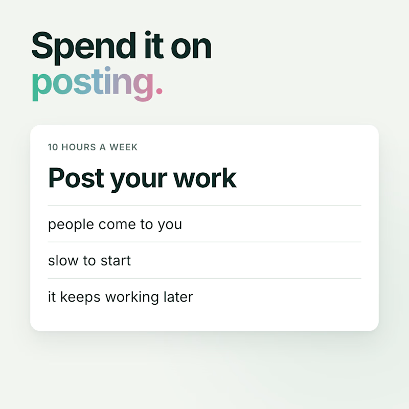
2 voted
67%
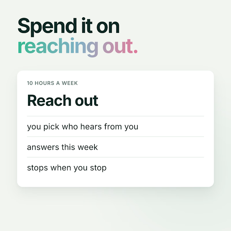
3 votes
Closed

Animated Infographic Design



Starting from one clear idea before any layout is the step most designers skip. In the animation, does the motion guide the eye in reading order, or is it mostly there to add energy?