The network for creativity
Join 1.25M professional creatives like you
Connect with clients, get discovered, and run your business 100% commission-free
Creatives on Contra have earned over $150M and we are just getting started
Back to feedPost

Nobody hurts a payments database with fraud checks. They hurt it with the month-end revenue dashboard.
Postgres is a row store, built for OLTP. All 8 columns of a payment sit together on disk. To SUM one column it reads all 8. 7 are waste. And that scan fights your checkout path for the same disk.
DuckDB and BigQuery are column stores, built for OLAP. Each column sits together on disk. The same query reads 2 columns and skips 6.
Flip the query and the winner flips. Fetch one payment by id: the row store answers in one index hop. The column store stitches the row back from every segment.
That is the whole split. OLTP fetches rows: payments, orders, logins. OLAP scans columns: reports, dashboards, analytics. Each cheap on one layout, expensive on the other.
#SystemDesign #PostgreSQL #DataEngineering #Databases
The network for creativity
Join 1.25M professional creatives like you
Connect with clients, get discovered, and run your business 100% commission-free
Creatives on Contra have earned over $150M and we are just getting started











Related posts


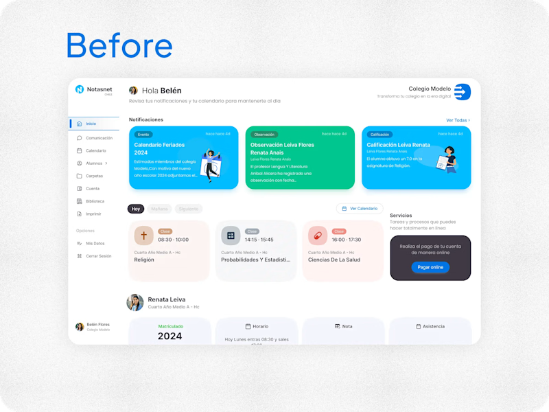
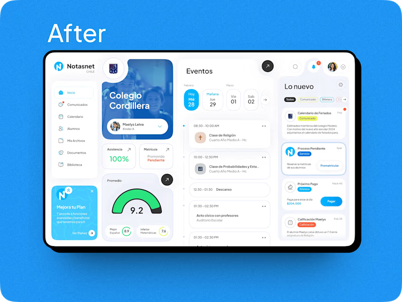

After absolutely it's more practical 🎉🎉🔥🔥

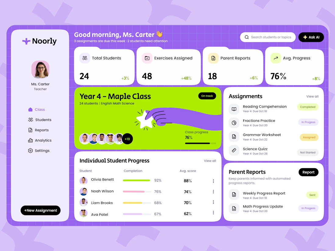
Noorly is a modern EdTech SaaS dashboard designed for teachers, students, and parents.
The platform brings classroom management, assignments, student analytics, performance reports, and parent communication into one cohesive experience. The design combines a playful purple and lime green color palette with soft pastel tones, rounded cards, and clear data visualizations.
The goal was to make complex educational information easier to navigate while helping teachers save time and make more informed decisions.
View the project:
https://dribbble.com/shots/27817401-Dashboard-Education-SaaS
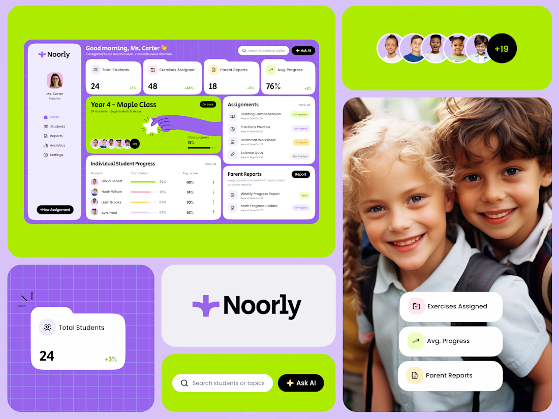
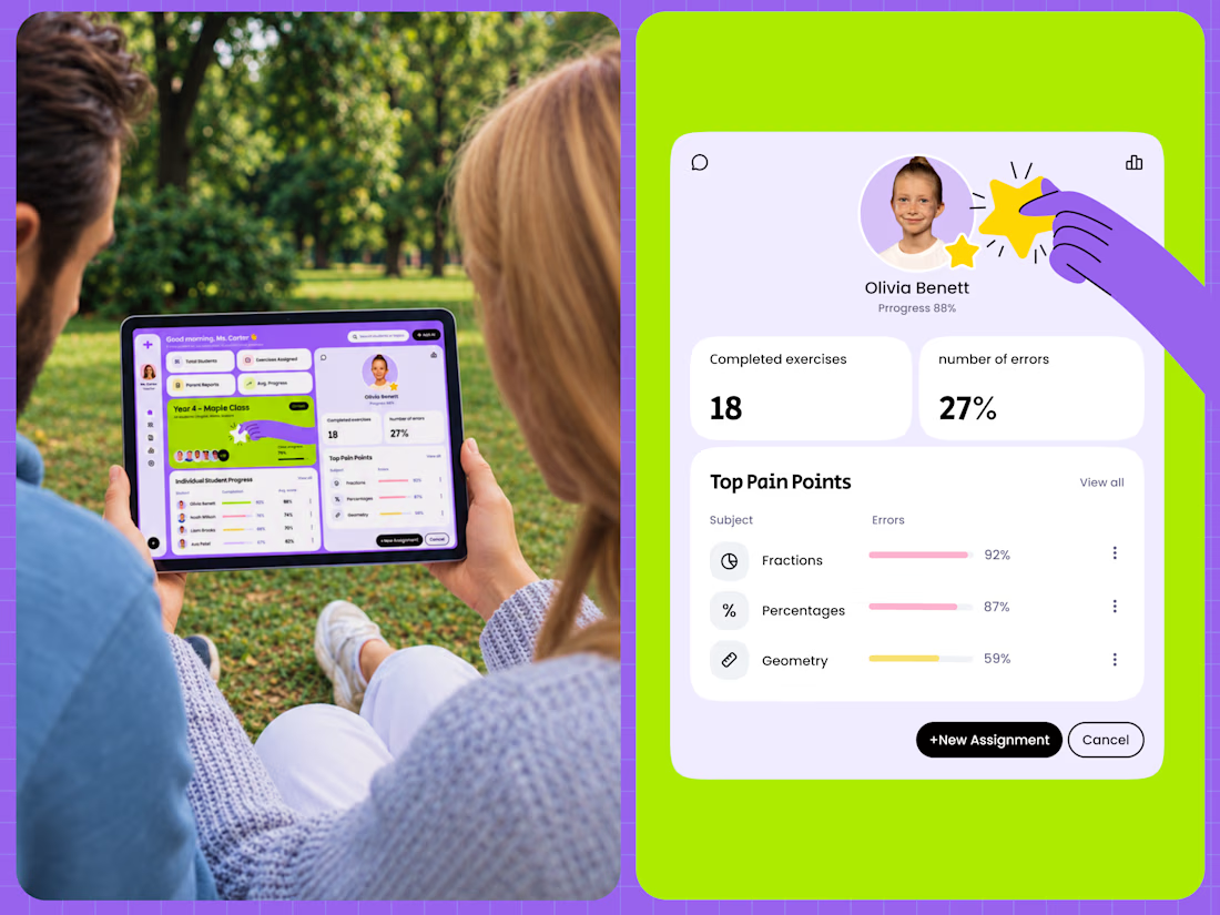

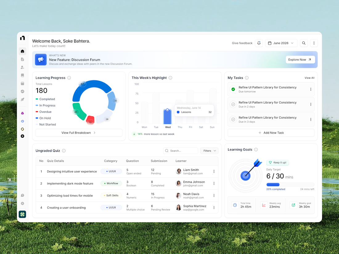
A modern learning platform dashboard designed to make education management, lesson tracking, and learning progress easier to monitor. The interface brings together course progress, weekly learning analytics, quiz submissions, task management, and daily learning goals in one organized workspace. With clean white layouts, colorful data visualization, intuitive navigation, and structured dashboard cards, this education SaaS UI creates a more focused, engaging, and efficient learning management experience.
📩 Collaborate with Us? Contra Cansaas Agency