The network for creativity
Join 1.25M professional creatives like you
Connect with clients, get discovered, and run your business 100% commission-free
Creatives on Contra have earned over $150M and we are just getting started
Back to feedPost

🌊 A flood warning is issued.
📱 WhatsApp is full of rumors.
📺 News channels are saying different things.
🚨 People don't know where to go.
☎️ Families are desperately searching for emergency numbers.
⏳ Every minute matters.
That's the problem I wanted to solve.
Introducing ReliefFlow — an emergency communication system designed to turn disaster information into clear, actionable guidance within seconds.
Simply select:
📍 Location
⚠️ Disaster Type
👥 Audience
🚨 Urgency Level
And ReliefFlow instantly generates:
📄 Emergency Posters
📱 WhatsApp Alerts
📢 Social Media Updates
🗺️ Community Action Instructions
🤝 Volunteer Coordination Guides
🚓 Police Contacts
🚑 Hospital Information
🚒 Rescue & Emergency Numbers
The goal isn't to generate more information.
The goal is to help people understand:
✅ What should I do right now?
✅ Where should I go?
✅ Who should I contact?
Because during a disaster, confusion can be dangerous.
X Post Link: https://x.com/i/status/2065858327381455155


The framing of the problem in the opening is exactly right. In a real disaster, the info chaos is often as dangerous as the event itself. Generating location-specific emergency posters, WhatsApp alerts, and volunteer guides from a single input removes a huge coordination...
Thanks a lot for your thoughtful feedback.


Thank you so much, you feedback really means a lot to me.
The network for creativity
Join 1.25M professional creatives like you
Connect with clients, get discovered, and run your business 100% commission-free
Creatives on Contra have earned over $150M and we are just getting started




Related posts


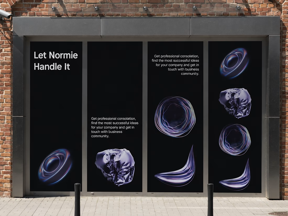
Fantastic execution man, what is the billboard for?

Hot take: Interaction isn't just decoration. It is the brand
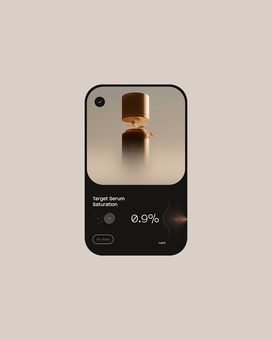
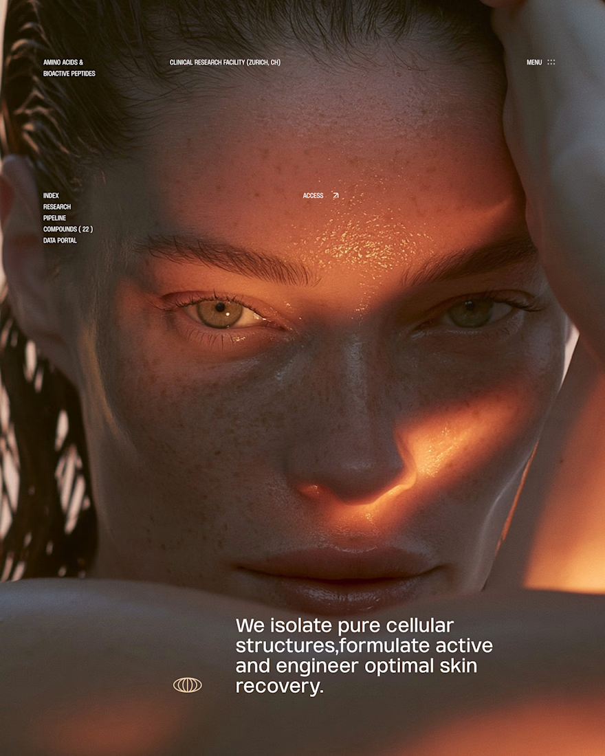
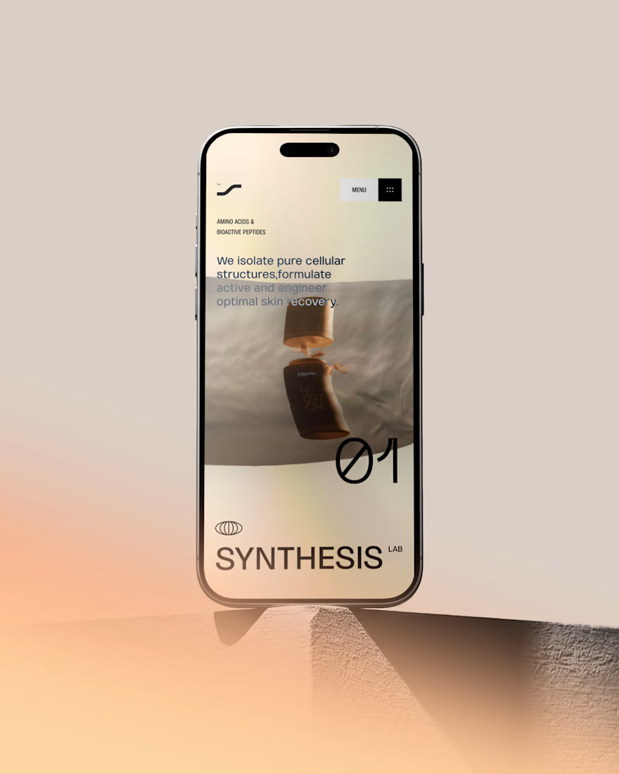
I built this visual concept for a Peptides brand using WebGL and fabric physics. The fluid motion isn’t a gimmick it’s the core identity.



GOATED

What should a creative agency website actually feel like?
For Orvika, we didn't want another agency site built around the same safe layouts and predictable sections.
We pushed the visual direction further with oversized typography, editorial layouts, bold imagery, and stronger contrast, while keeping the experience structured enough to communicate the agency's work and capabilities clearly.
The goal wasn't just to make it look different.
It was to make the agency feel different.
Designed in Figma and built in Framer.
We're sharing more of the websites and digital experiences we've been working on here over the next few weeks.


Very neat man