The network for creativity
Join 1.25M professional creatives like you
Connect with clients, get discovered, and run your business 100% commission-free
Creatives on Contra have earned over $150M and we are just getting started
Back to feedPost

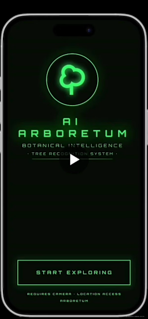
AI Arboretum: Botanical Intelligence System
Introducing AI Arboretum – a botanical intelligence system designed to help us reconnect with our urban green spaces.
What is it?
An AR-powered mobile experience that turns a simple walk in the park into an educational journey. By scanning trees, users get instant access to historical data, health status, and ecological impact of our urban giants.
Key features:
✅ AR-based tree detection & scanning.
✅ Historical data (Dendrochronology).
✅ Carbon sequestration & vitality tracking.
This project was a deep dive into "building in public," iterating on designs in Figma, and pushing the boundaries of what a mobile interface can communicate.
Figma Make:
Working Project File Link
Live Project Link:


The network for creativity
Join 1.25M professional creatives like you
Connect with clients, get discovered, and run your business 100% commission-free
Creatives on Contra have earned over $150M and we are just getting started








Related posts


This is fire 🔥


Kajabi isn’t only for courses 👀
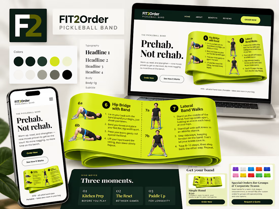
For Fit2Order’s new Pickleball Band, we created a complete product experience inside Kajabi – from the landing page and checkout to order forms, confirmations, and the post-purchase flow.
A fun one for us because it meant adapting Kajabi to work for a physical product while still keeping everything simple for the team to manage.


Prehab, Not rehab is a sharp headline for the band. The lime against deep green stays readable across all three devices.

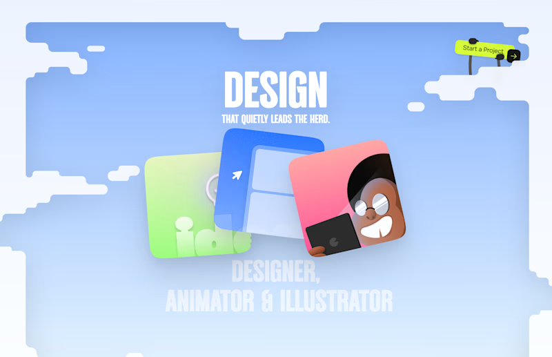
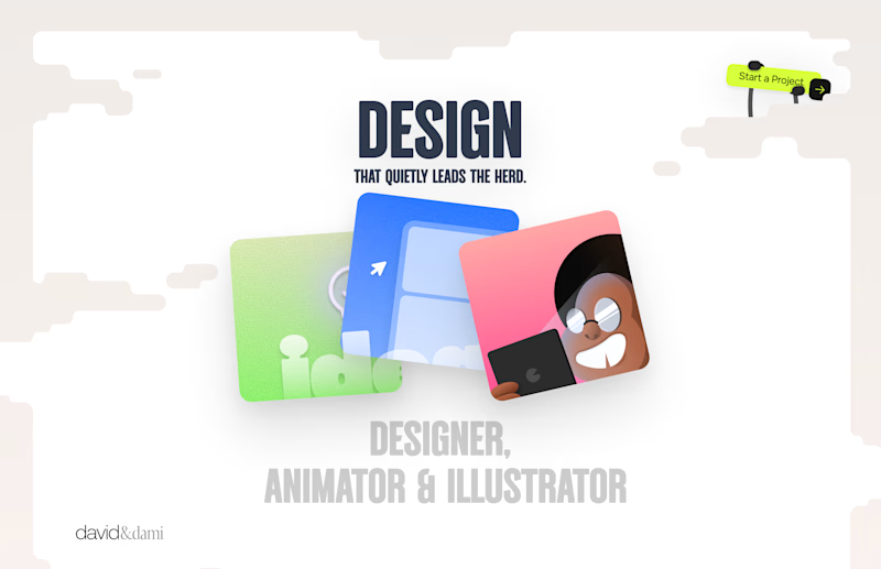
Should I go for left or right? Focusing on updating and finishing up my portfolio... and then I came across this crossroads. Another alternative is to make them switchable themes through a toggle, but I still need to decide which should be the default.
27 voted
75%
9 voted
25%
36 votes
Closed

Left is better because the text is readable, the overall blue background is not flashing to the eyes as compared to the right one.
For the top right button " Start a project ", you can add some animation so that it stands out and encourage users to click on it.