The network for creativity
Join 1.25M professional creatives like you
Connect with clients, get discovered, and run your business 100% commission-free
Creatives on Contra have earned over $150M and we are just getting started
Back to feedPost

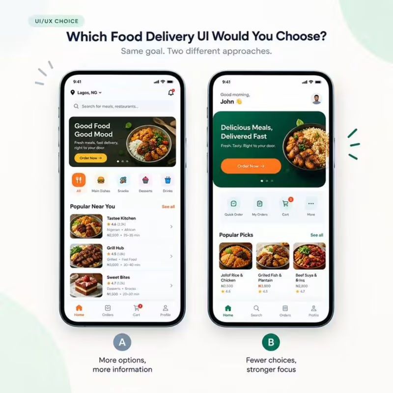
Which food delivery UI would you choose A or B? 👀
Both screens are designed to help users order food, but they take different approaches.
A provides more options and information upfront.
B reduces the choices and gives more emphasis to the primary action:
Order Now. From a UX perspective, the question is not simply which screen looks better. It is about which experience makes it easier for the user to accomplish their goal.
If you were using this app, which would you choose A or B? And why?
Drop your choice in the comments. I’d like to hear both designers’ and everyday users’ perspectives.
#UIDesign #UXDesign #ProductDesign #UserExperience #Figma #UXUI #DesignThinking
The network for creativity
Join 1.25M professional creatives like you
Connect with clients, get discovered, and run your business 100% commission-free
Creatives on Contra have earned over $150M and we are just getting started
Related posts

AI Mental Wellness Platform UI/UX Design
Designed a modern and intuitive AI-powered mental wellness website focused on emotional well-being and personalized digital experiences.
The platform features an AI therapist, mood tracking, meditation, sleep improvement, wellness plans, and data-driven insights. A calming blue color palette, immersive visuals, clean layouts, and thoughtful UI elements create a seamless and engaging user experience.
mentalhealthwebsitedesignartificialintelligenceAI VIsual DesignerResponsive DesignWeb DesignClaudeFigma


love how calm the mood tracking and meditation screens feel in this wellness design

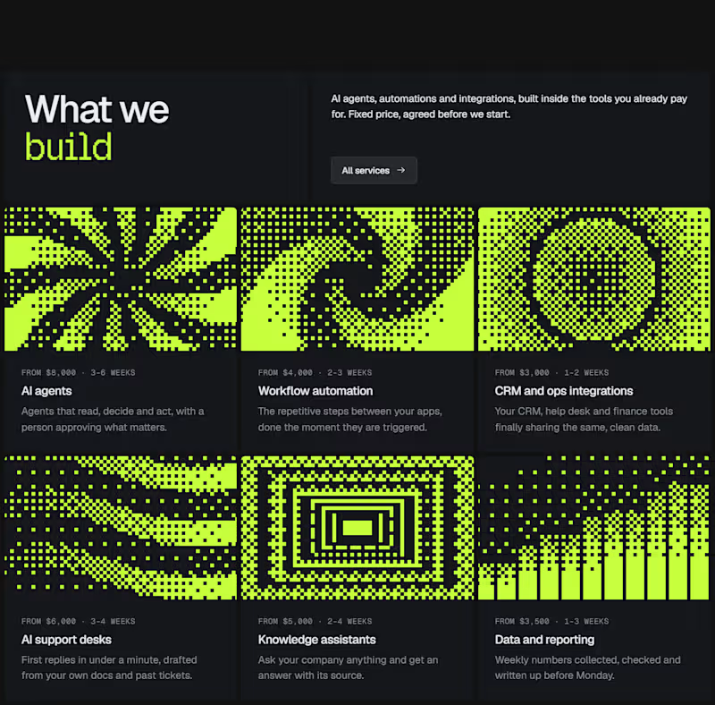
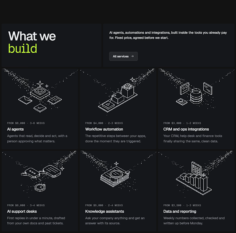
I experimented with a different illustration style for this section of my latest Framer template.
The goal was to make the UI feel more engaging without distracting from the content.
Which direction would you choose for a better user experience? Curious to hear your take. 👀
0 voted
0%
1 voted
100%
1 vote
Closed

A middle ground / mashup. I love the vibrance that Dither Patter brings, and the less distracting feel that Minimal Illustrations bring. A little bit of color to the Minimal Illustrations would land perfect!