The network for creativity
Join 1.25M professional creatives like you
Connect with clients, get discovered, and run your business 100% commission-free
Creatives on Contra have earned over $150M and we are just getting started
Back to feedPost

Designers and creatives, roast my latest build 👀
I have just launched a new Food Deals section for London For Cheap, built around a simple question: where can I get a genuinely good food deal in London today?
After spending way too much time designing and building it, I need some fresh eyes.
Does the concept make sense immediately? Is the information hierarchy clear? Is anything too busy? What would you remove, simplify or improve?
I am genuinely looking for criticism rather than compliments, so feel free to pick it apart.
#WebDesign #UXDesign #ProductDesign #feedback #WebDevelopment #London #LondonForCheap
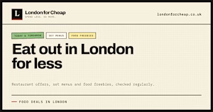
londonforcheap.co.uk
Food Deals in London Today: Restaurant Offers, Set Menus & Freebies
Great restaurant deals, set menus and food freebies in London, checked regularly. See today’s and tomorrow’s best offers, from £1 dishes to 50% off.
The network for creativity
Join 1.25M professional creatives like you
Connect with clients, get discovered, and run your business 100% commission-free
Creatives on Contra have earned over $150M and we are just getting started
Related posts

the reaction is why i do this.
brew & bite had great coffee, a pool table that's always busy — & no website. not even a domain.
so my brother designed it in figma, shot every photo at the café & built it with @Base44:
→ live open/closed
→ what's sold out
→ is the pool table free
the owner runs it all with one tap and in his own words " this makes it way easier to manage " this is his process video before you ask, no, i wasn't forced to post this from my account for reach


Every creature in this identity is watching you.
Little Fen, a wetland club for kids. 50 creatures. 3 colors. Everyone gets eyes.
Case study drops soon.
Which creature goes first?
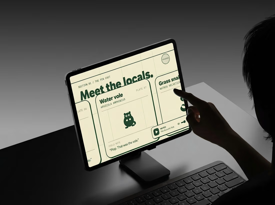
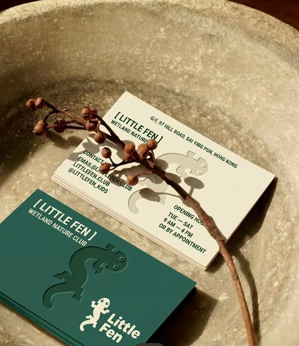
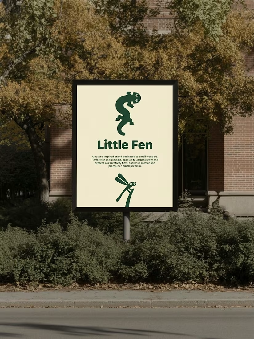

Hey Little Fen,
Can you see me?

Section, a matcha shop that runs itself
The problem A lot of matcha brands skip the story. You buy a tin and never learn where the leaf grew, how it was shaded or how it was ground. And the instructions come as a little booklet in the box that ends up in a drawer by the second bowl.
The idea Tell the story on the website, and move the instructions there too. Section is a concept matcha brand: the site follows one leaf from the field to your bowl, then sells one box with the matcha and the five tools a barista uses. There's no booklet in the box. The guide lives on the site: every part lettered A to F, four drinks, each step read aloud, and pages that turn by themselves while your hands are busy. Live: pure-section-space.base44.app
Automation depth Behind the counter, the shop runs itself:
Saves time: an order lands on the packing board the moment it's placed, with where it ships. Nobody copies orders out of an inbox.
Improves operations: stock counts itself. Every order takes its items off the shelf (a box takes one of each part). At 3 left the shop says "Only 3 left" and I get an email. At zero, the item sells out on its own.
Increases leads: a sold-out item offers "Tell me when it's in". That's a list of people who want to buy. When I type a new count, each of them gets one email.
Enhances the customer experience: the buyer gets an email at every step: got it, packed, on its way. The last one links to the guide, so the steps arrive before the box does.
The packing board is mine, behind a sign-in, and addresses are kept where only I can read them.
** It all runs on Base44: its database, Google sign-in, one backend function for the emails, and its hosting. **
Design quality
One idea runs through the whole brand: everything is drawn in one black line, and the only colour is the matcha's green.
The first screen is a small matcha bar. Scroll, and it opens into its own drawing.
The phone layouts are designed, not shrunk. The box, its price and its key stay at the foot of the first screen, and the guide's Back and Next stay under your thumb.
How I built it I tried style directions in Figma, built the site and automation in Base44, and I published from there. The video shows both sides: buying the box, and running the shop.
Real-world use Section is a concept, and no payment is taken. Everything else is built to run as a real shop: real orders, real emails, a locked staff board and private addresses. Add a payment provider, and a matcha brand could start selling with it.

Ohhhhh this is very nice