The network for creativity
Join 1.25M professional creatives like you
Connect with clients, get discovered, and run your business 100% commission-free
Creatives on Contra have earned over $150M and we are just getting started
Back to feedPost

i love this love language


This is my love language 🫶🏽

The network for creativity
Join 1.25M professional creatives like you
Connect with clients, get discovered, and run your business 100% commission-free
Creatives on Contra have earned over $150M and we are just getting started






Related posts

🎉 A new milestone: I’m officially a Jitter Expert on Contra!
I’m excited to have earned this recognition and to keep building better visual experiences for the web.
I enjoy creating clean, modern interfaces and motion-driven visuals that help products communicate more clearly — from animated UI elements to polished landing-page experiences.
Now I’m looking forward to connecting with founders, designers, and developers who need help bringing their ideas to life.
Working on a product that could use better motion or a more polished interface? Let’s connect.
#Jitter #MotionDesign #WebDesign #Contra #CreativeDevelopment



Congrats!!


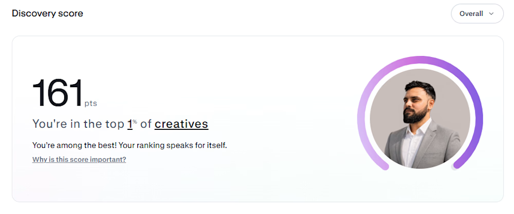
Made it to the top 1% on a random Monday. But to be fair, it took countless hardworking Mondays to get here. Forever grateful for the journey, the effort, and everything in between.
Next goal: Breaking past 175. 🚀

Congrats man


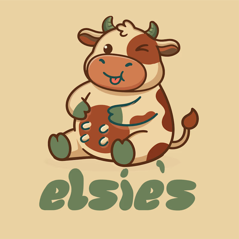
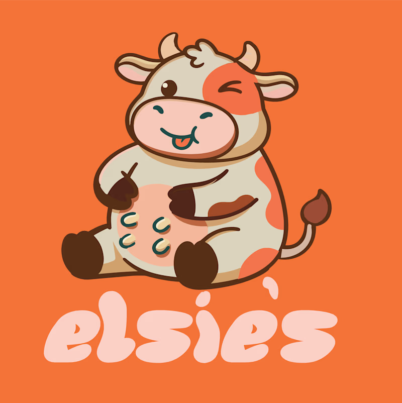
Meet Elsie’s 🐮🍊
Two logo variations, one happy little cow, and a whole lot of personality.
I’m exploring two directions for Elsie’s — a playful milk brand inspired by heritage, rustic charm, honest goodness, and nostalgia.
🌿 Version 1: Earthy, rustic, and rooted in tradition.
🍊 Version 2: Bold, cheerful, and full of playful energy.
Both bring their own character to the brand, but which one feels more like Elsie’s?
More branding and packaging coming soon. 🥛

5 voted
45%
6 voted
55%
11 votes
Closed
