The network for creativity
Join 1.25M professional creatives like you
Connect with clients, get discovered, and run your business 100% commission-free
Creatives on Contra have earned over $150M and we are just getting started
Back to feedPost

Fall Festival Flyer Design
Client Brief: Create a simple, elegant black-and-white flyer that organizes multiple event activities clearly while remaining easy and budget-friendly to print.
To deliver on the client's request, I focused on clean typography, structured layout hierarchy, and festive line-art accents to keep it engaging yet simple.
Check out the full project on my profile!
Need print or promotional materials designed to match your specific vision? Let’s collaborate!


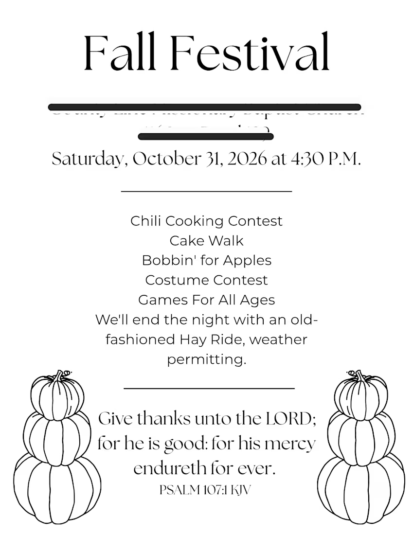

Using only black and white for a lively fall festival flyer is a smart move for keeping print costs low. It forces the design to rely on strong typography and layout structure rather than color to create visual interest.
The network for creativity
Join 1.25M professional creatives like you
Connect with clients, get discovered, and run your business 100% commission-free
Creatives on Contra have earned over $150M and we are just getting started

Challenges
View all


Related posts

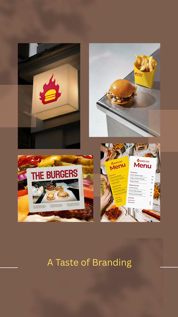
Restaurant Branding — Fresh from the Studio.
A fresh mix of restaurant branding explorations — from identity and packaging to menus and visual details.
I love creating food brands that feel bold, cohesive, and ready to be remembered.


KpiClock — animated hero with Unicorn Studio
Static hero backgrounds are easy to scroll past. So for KpiClock's marketing site, I built a living one — a soft, flowing gradient that moves on its own behind the headline, made with Unicorn Studio.
It's lightweight, runs smoothly right in the browser, and gives the whole hero a calm, premium feel without pulling attention away from the message or the CTA. Subtle motion, big difference.


The balance between animating the background and keeping the CTA readable is a common friction point. Subtle movement works well here because it draws the eye without competing with the core message.

Design Services — Starting at $5!
Looking for eye-catching designs for your brand, event, or YouTube channel? 🎨
I create: 🩷 Baby Shower Invitations 💍 Wedding Cards 👻 Horror YouTube Thumbnails ✨ Skincare & Beauty Thumbnails
🎨 Designed in Canva 💰 1 YouTube Thumbnail — $5 📩 DM me to discuss your design!
https://www.fiverr.com/s/p33wqP8 (Wedding card invitation)
https://www.fiverr.com/s/xrrk2q4 (Baby shower invitation card)
Let’s turn your ideas into eye-catching designs!
YouTubeThumbnail #ThumbnailDesigner #CanvaDesigner #HorrorThumbnail #SkincareDesign #BeautyDesign #WeddingInvitation #BabyShowerInvitation #GraphicDesigner #FreelanceDesigner
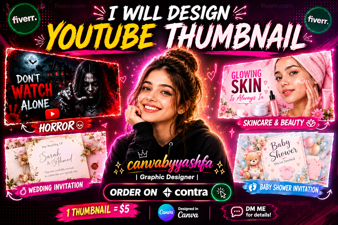
I noticed you're offering horror themed thumbnails for just $5 - that price point could really help new creators test out edgy branding without a big spend.