The network for creativity
Join 1.25M professional creatives like you
Connect with clients, get discovered, and run your business 100% commission-free
Creatives on Contra have earned over $150M and we are just getting started
Back to feedPost

Finally got my first expert badge from Frameship. Aiming for more.
The network for creativity
Join 1.25M professional creatives like you
Connect with clients, get discovered, and run your business 100% commission-free
Creatives on Contra have earned over $150M and we are just getting started



Related posts


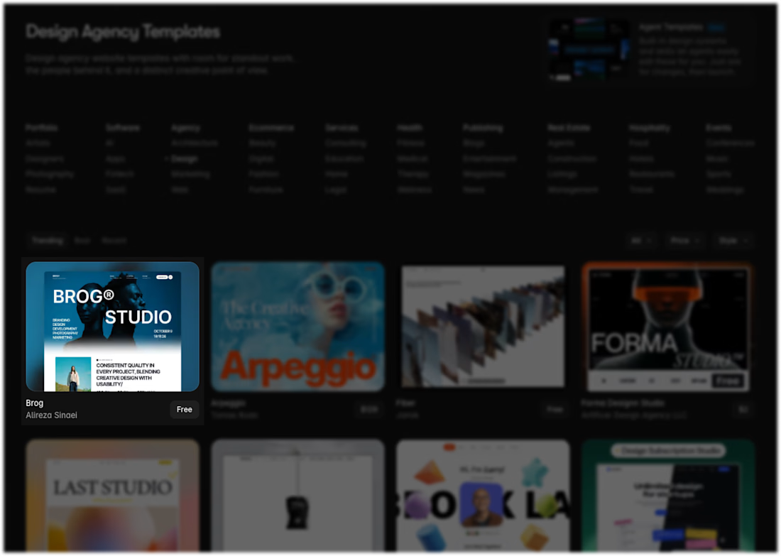
After a long journey, Brog just hit #1 on the Framer Marketplace in the Design category! 🎉
I’m beyond excited for this milestone. So much hard work, late nights, and dedication went into making this happen.
To be continued…
Huge thanks to @framer ❤️


Congrats on reaching number one!



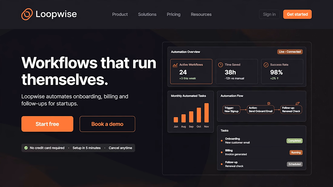
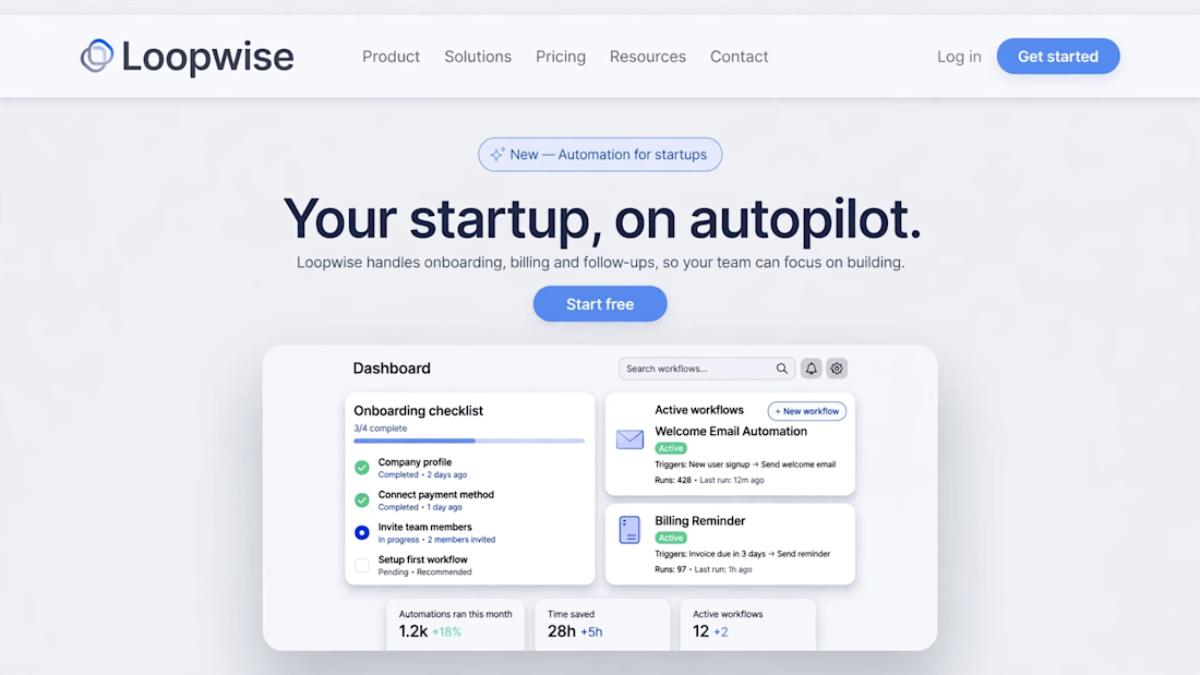
Which hero wins? Dark vs Light for a startup Framer site
Two hero sections. One startup. You decide.
I designed two hero sections for Loopwise — a fictional startup SaaS that automates onboarding, billing and follow-ups — as a website design + UI/UX concept, built for a Framer site.
A — Dark & Bold: "Workflows that run themselves."
B — Light & Clean: "Your startup, on autopilot."
Same product. Same message. Totally different first impression.
Vote in the comments: A or B — and tell me WHY. Which one would you click first? Which one feels more trustworthy for a startup? What would you change in the winner?
I'll build the winning hero in Framer and share the result in the next post — follow so you don't miss it.
This is a concept design exercise, not a live client project.