The network for creativity
Join 1.25M professional creatives like you
Connect with clients, get discovered, and run your business 100% commission-free
Creatives on Contra have earned over $150M and we are just getting started
Back to feedPost

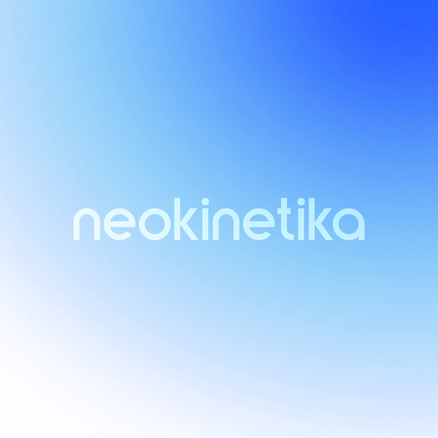
NEOKINETIKA - Brand Identity
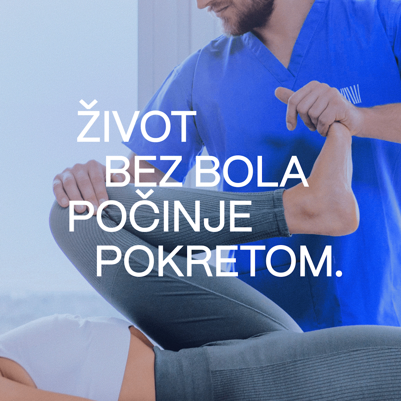
A rehabilitation clinic with over a decade of clinical experience behind it. While the team’s expertise dates back to 2011, the Novi Sad practice has since evolved into an independent clinic with a renewed vision, structure, and identity.
This project marked a clear transition: Not a rebrand for the sake of aesthetics, but a definitive step forward - aligning deep clinical knowledge with a modern, confident, and trustworthy visual presence. The goal was to respect the clinic’s experience while clearly communicating a new chapter.
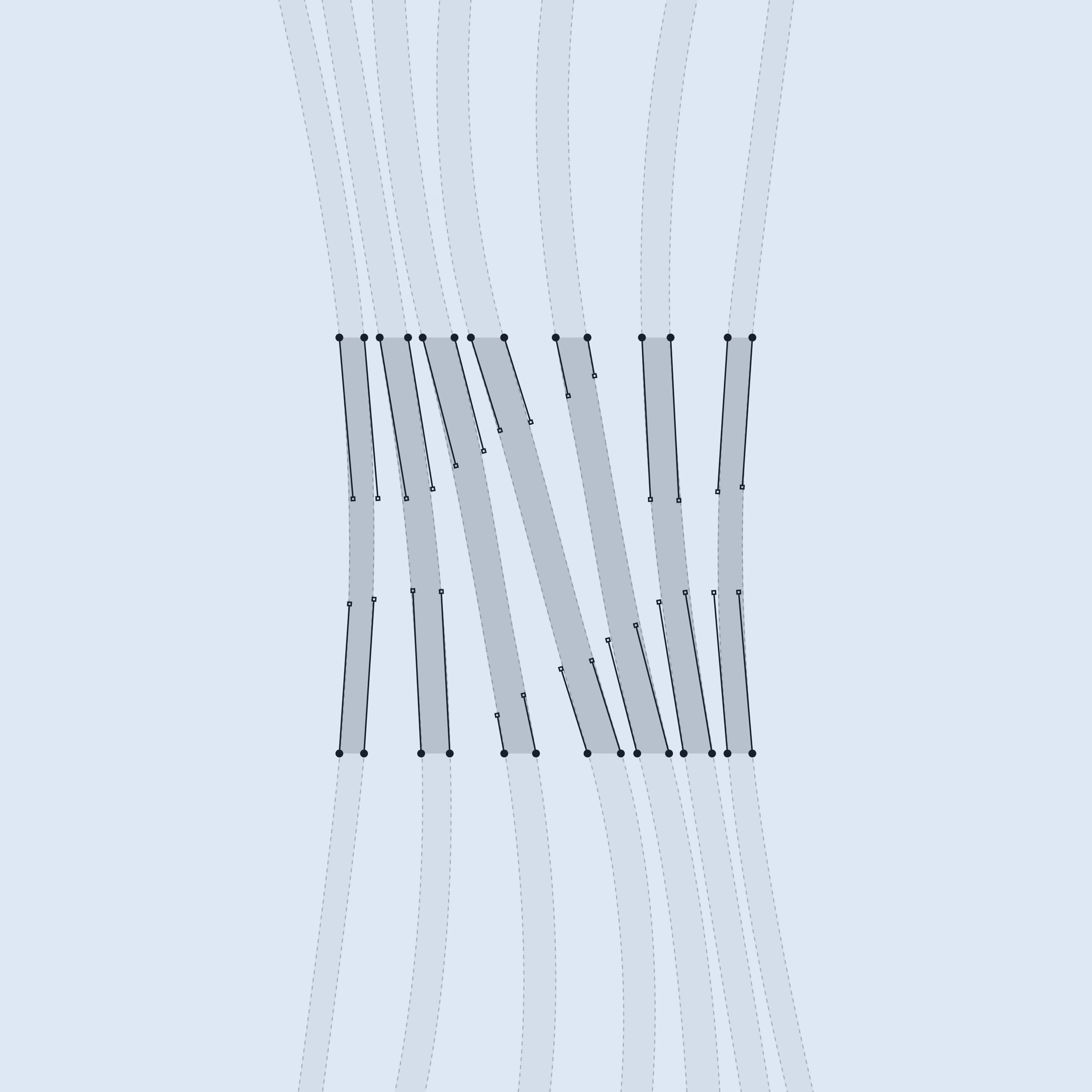
Rather than relying on decorative elements, the identity is built from functional, meaningful forms inspired by the human body and manual therapy itself.
NEO - new, renewed, evolved
Kinetika - movement, continuity, forward motion
The logo exploration focused on movement as a structural principle:
• Organic linear forms inspired by fascia fibers
• Abstract circular motion representing continuity and balance
• Monogram, which when rotated suggests a human figure moving forward
The network for creativity
Join 1.25M professional creatives like you
Connect with clients, get discovered, and run your business 100% commission-free
Creatives on Contra have earned over $150M and we are just getting started



Related posts



Great brand design 🔥🔥

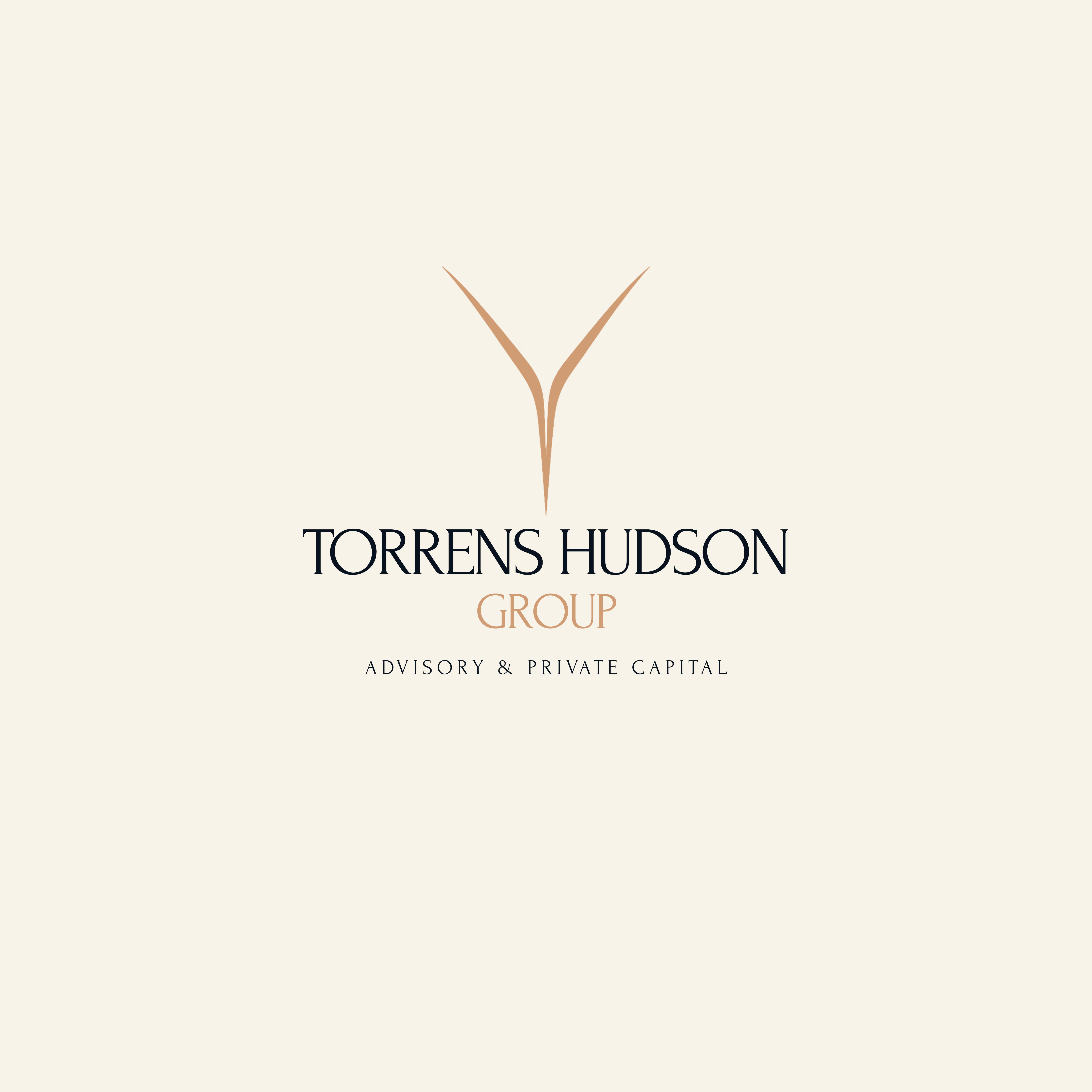
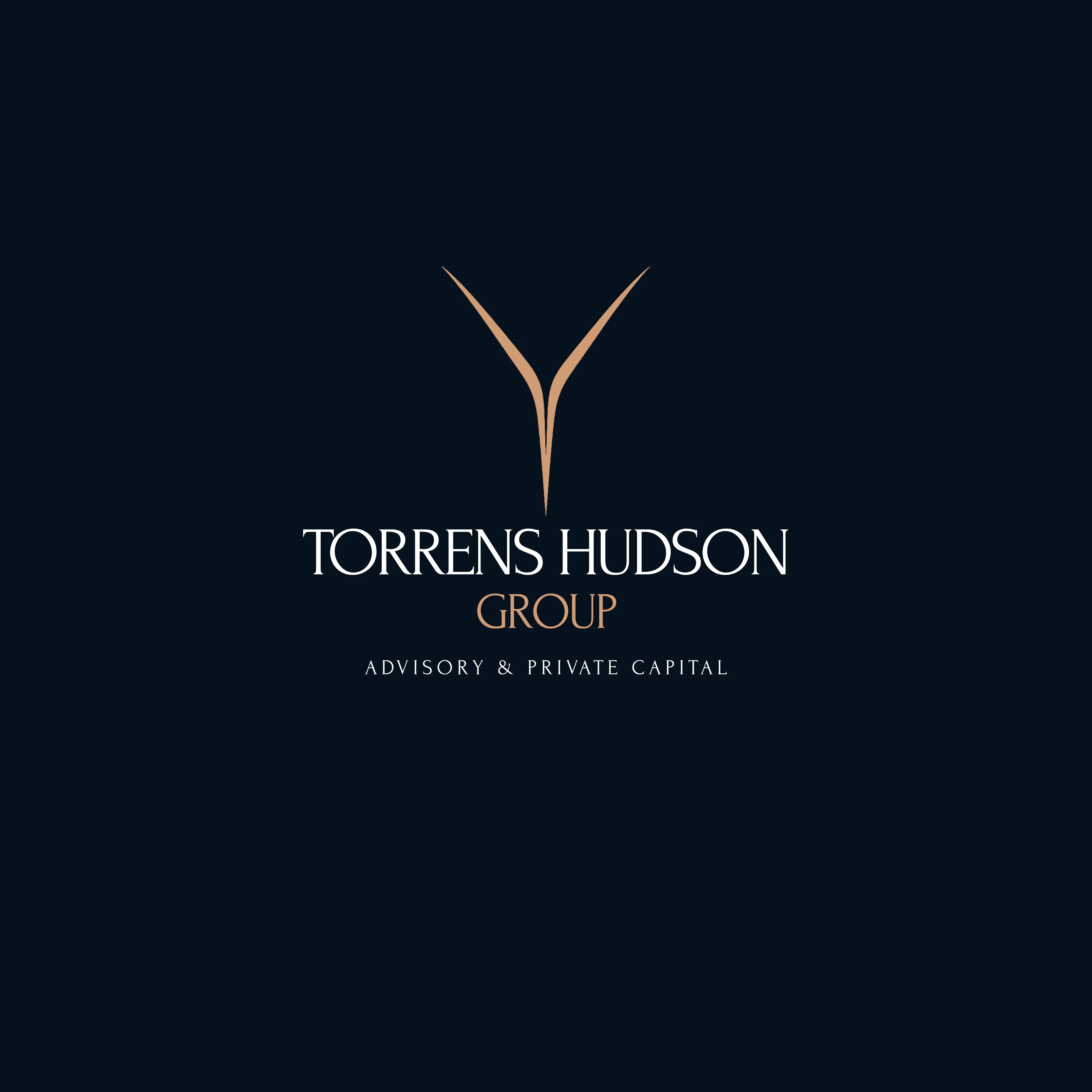
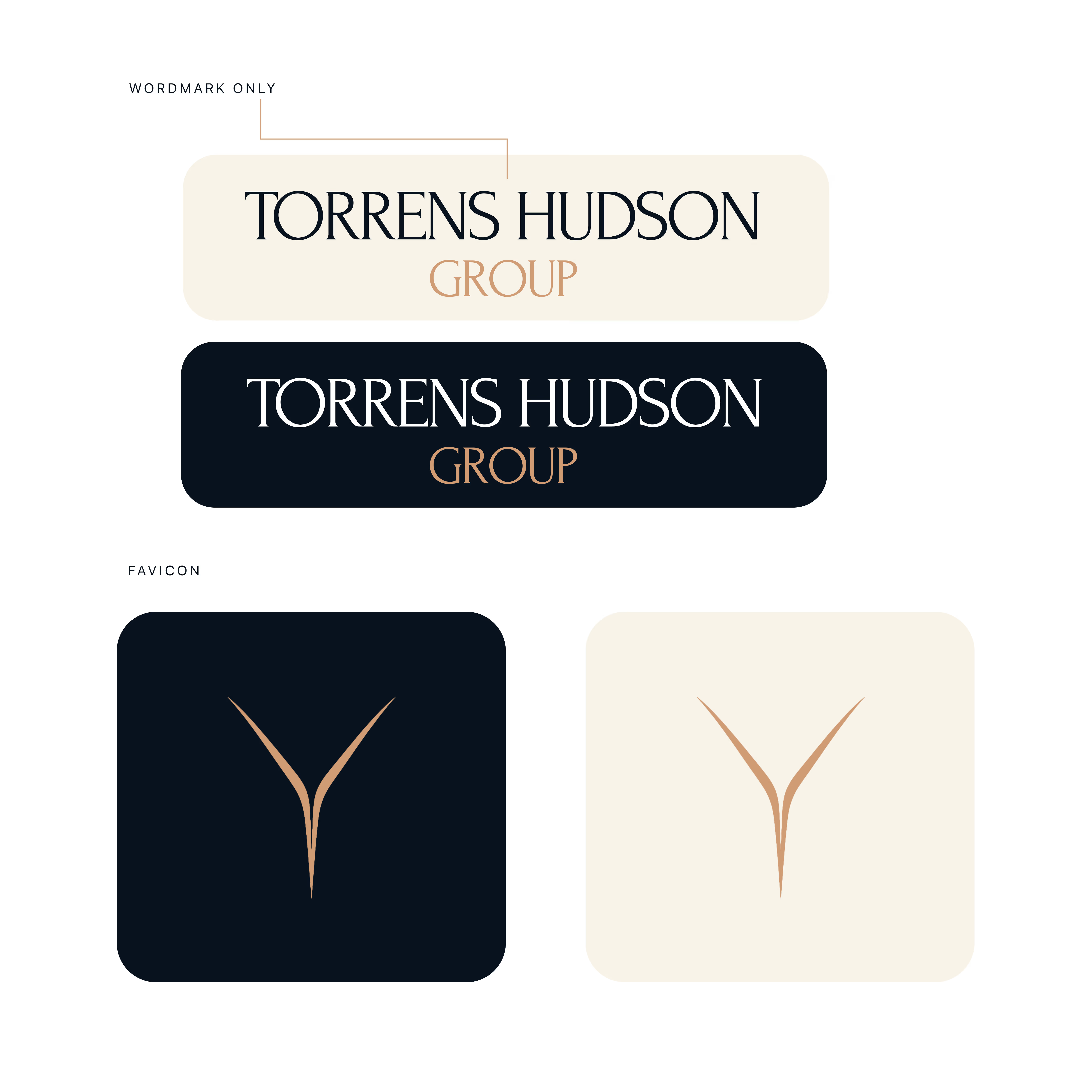
Torrens & Hudson - Brand Identity
Brand identity concept with an editorial serif wordmark, a minimal converging-rivers mark, and a navy, cream and bronze palette.
Nice work 🎉🎉


Follow for More Job posts!

wow Dada, Please do share for accountants as well😊


