The network for creativity
Join 1.25M professional creatives like you
Connect with clients, get discovered, and run your business 100% commission-free
Creatives on Contra have earned over $150M and we are just getting started
Back to feedPost
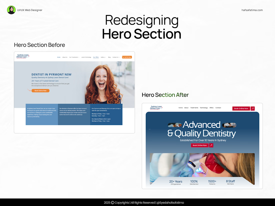
Redesigned the hero section for a cleaner and more cohesive look
The original hero section had:
– Inconsistent typography sizes
– Uneven spacing and margins
– A color scheme that didn’t align with the brand
In the redesigned version, I:
- Fixed typography hierarchy for better readability
- Adjusted spacing and alignment for balance
- Matched the colors to the brand palette
- Added social proof to build trust and credibility
Now the hero section not only looks aligned but feels more professional and brand-consistent.
#UIDesign #WebDesign #HeroSection #BeforeAfter #DesignProcess
The network for creativity
Join 1.25M professional creatives like you
Connect with clients, get discovered, and run your business 100% commission-free
Creatives on Contra have earned over $150M and we are just getting started
Challenges
View allTrending
Claude
Claude has entered the design space. How are you using Claude Design?
Contra University
Learn from expert creatives how to earn more using next-gen AI tools.
fifaworldcup2026
The World Cup is here and the whole world's watching. How are you designing for the world stage?
creativeaiflow
Creative AI workflows are evolving. What tools do you use, and what are their strengths and weaknesses?
freelancerlife
Freelancer life is wins, pivots, and everything in between. What’s yours right now?