The network for creativity
Join 1.25M professional creatives like you
Connect with clients, get discovered, and run your business 100% commission-free
Creatives on Contra have earned over $150M and we are just getting started
Back to feedPost

Fashion Ecommerce Bento Branding Motion

Nuvra explores a simple idea: Motion should guide, not overwhelm.
This AI fashion branding system uses a bento grid structure to break down complex features into clear, digestible moments.
From virtual try-on to curated fashion inspiration, every transition is intentional -...
The network for creativity
Join 1.25M professional creatives like you
Connect with clients, get discovered, and run your business 100% commission-free
Creatives on Contra have earned over $150M and we are just getting started











Related posts

The team is cooking
Motion design for the logo we are making for Nation e-commerce


Wou

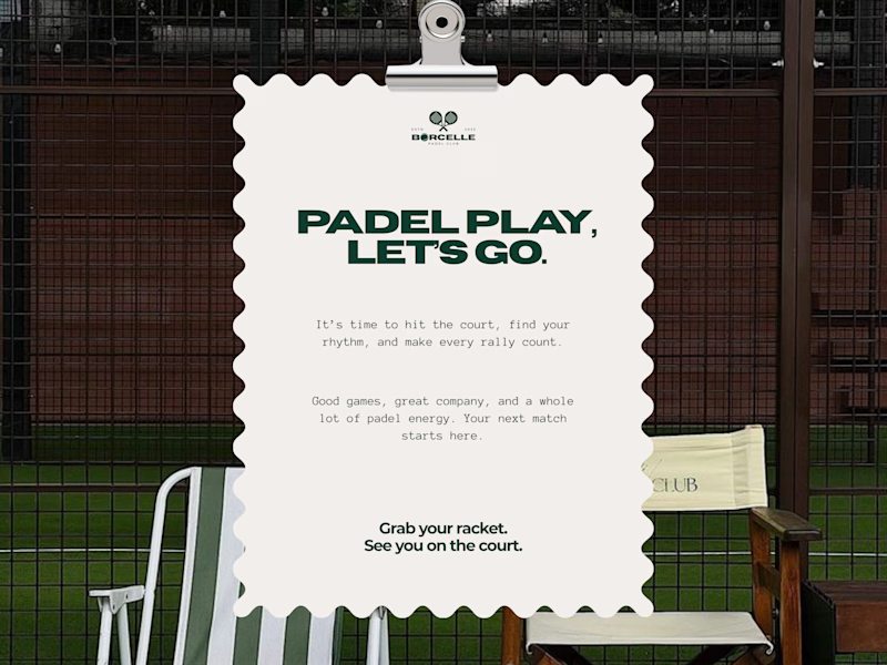
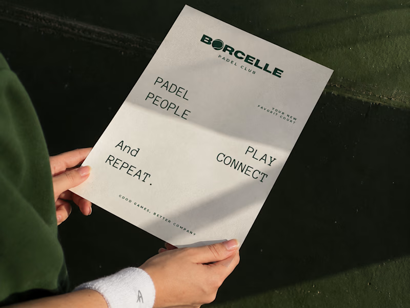
From the court to the little details, every touchpoint is an opportunity to bring the brand to life.
Good games, better company. 💚
What do you think of this direction?
11 voted
69%
5 voted
31%
16 votes
Closed
Amaizing

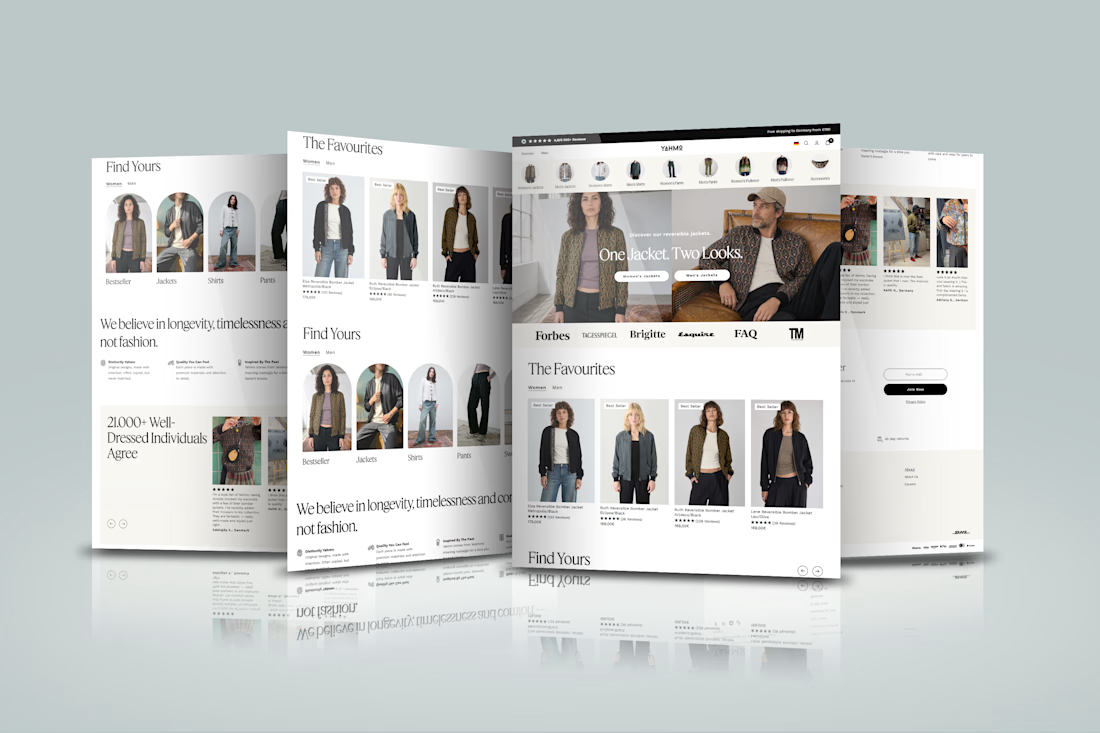
Designed a modern Shopify ecommerce experience for Yahmo, a sustainable fashion brand combining vintage-inspired designs with contemporary styles. The storefront showcases clothing collections, product imagery, category navigation, customer reviews, sustainability messaging, and shopping features that help customers explore products and shop with confidence.
The goal was to create a smooth shopping journey that reflects the brand’s colorful identity and ethical values while making product discovery simple and the buying experience seamless across devices.