The network for creativity
Join 1.25M professional creatives like you
Connect with clients, get discovered, and run your business 100% commission-free
Creatives on Contra have earned over $150M and we are just getting started
Back to feedPost


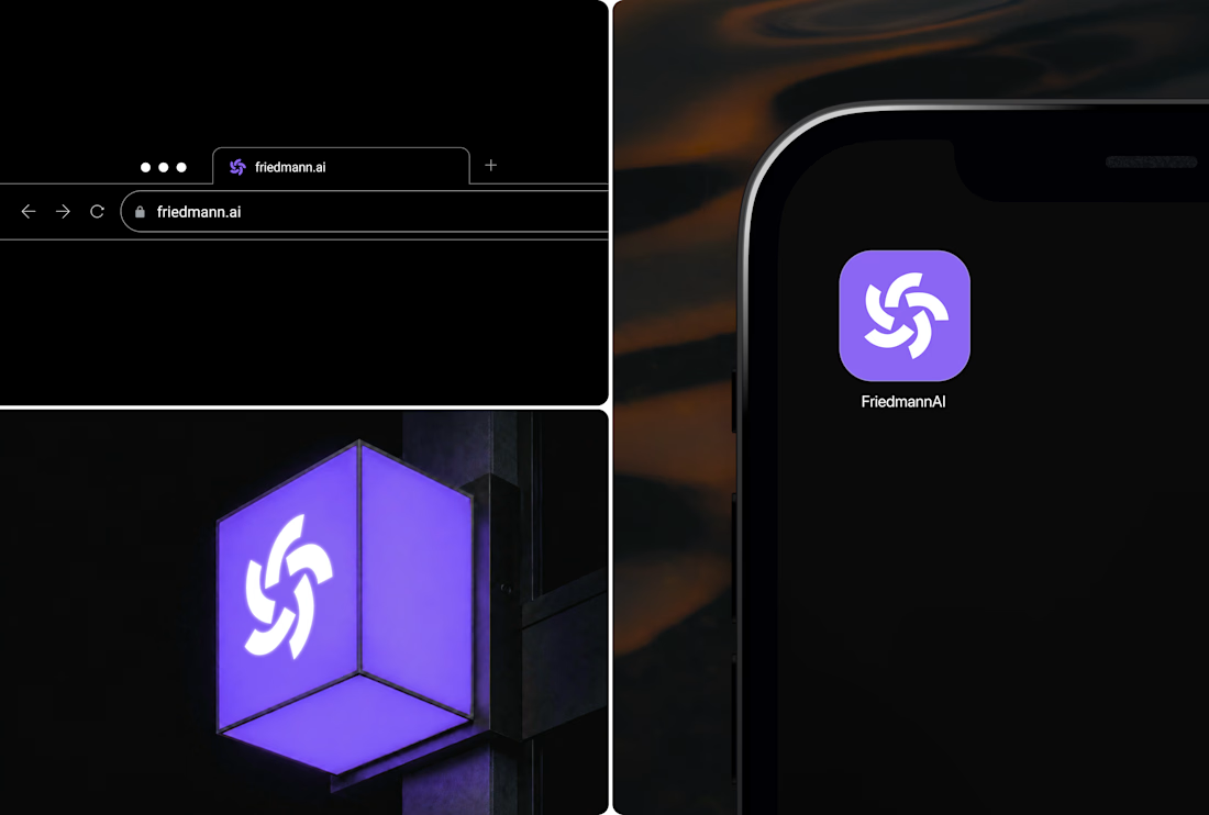
That gradient mark feels warm for an AI brand, a nice break from the cold blue-and-black palette most AI companies default to. Was moving away from that look a deliberate call, or is that just where the direction landed?
That's a smart read on where the AI branding category was headed, most of it still leans cold. Did Friedmann's team need convincing to move away from that, or were they the ones pushing for something warmer?


the FriedmannAI mark on that orange blue background looks really nice
The network for creativity
Join 1.25M professional creatives like you
Connect with clients, get discovered, and run your business 100% commission-free
Creatives on Contra have earned over $150M and we are just getting started



Challenges
View all


Related posts

Ram Mascot Logo Design


Reroll Brand Identity
A full visual identity created for Reroll, built around the idea of turning the “O” into a die.
The project includes logo design, social media identity, motion, graphics and a custom playing card back.
Creative direction: Dmitry Lepisov
Identity design + motion: Arthur Skripnik
3D + motion created with Spline


That mint card-back pattern is such a fun extra, and the chunky Anton headers keep the whole system feeling punchy.

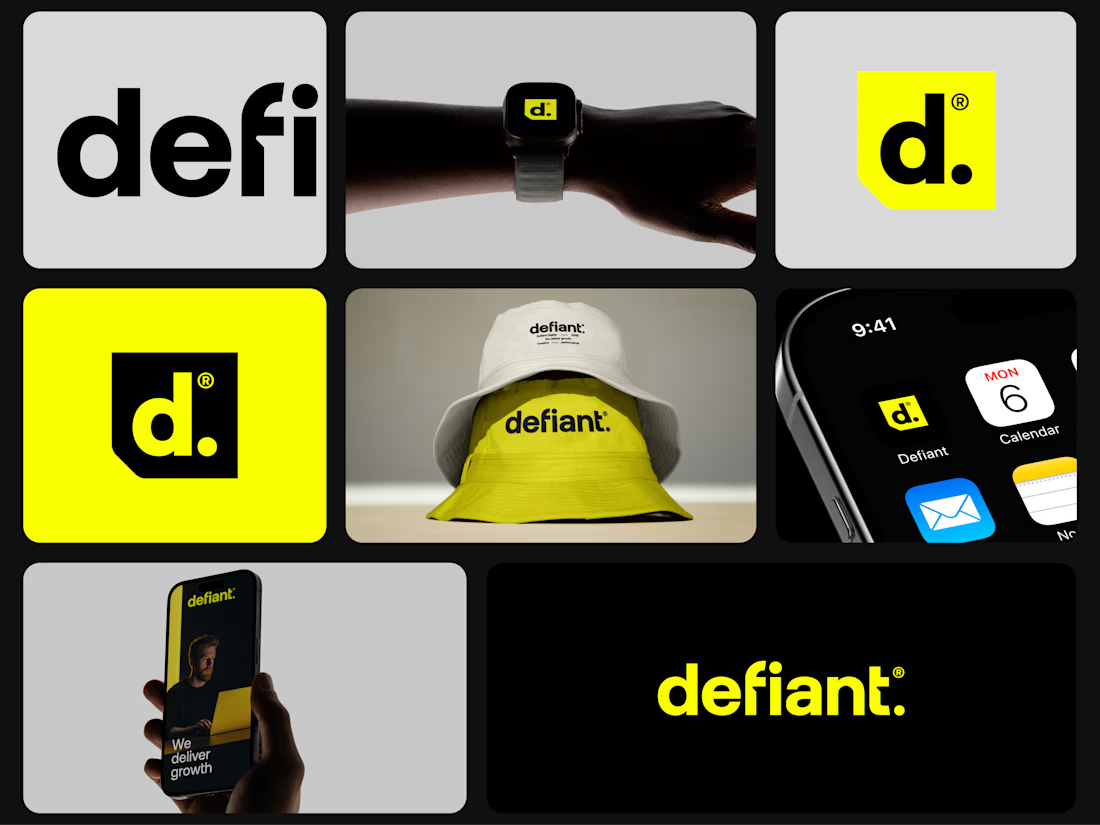
A little bit of the work I did for an agency in Australia some time ago.
I hope you like it.

Amazing