The network for creativity
Join 1.25M professional creatives like you
Connect with clients, get discovered, and run your business 100% commission-free
Creatives on Contra have earned over $150M and we are just getting started
Back to feedPost
Clean cash dashboard design
Buoy is a cash dashboard for finance teams. Every number is measured against one line: the least cash the company wants in the bank. Here, the weekly cash update: pick who gets it, add a line, send.
A concept I designed in Figma and built as a working prototype.
Case study: https://buoy-case-study.vercel.app


Crisp, clean, and effective.

Thank you!

Measuring everything against one "waterline" is such a clear mental model for finance teams, and the weekly update that drafts itself from the numbers is the part a CFO would actually use every Monday. Small detail I liked: showing the EUR conversion rate up top. When this moves...
The network for creativity
Join 1.25M professional creatives like you
Connect with clients, get discovered, and run your business 100% commission-free
Creatives on Contra have earned over $150M and we are just getting started





Related posts

NICE HUMANS
Making automation feel human.
Context
Nice Humans is a growing automation studio that helps teams streamline how they work. As they scaled, their brand no longer reflected the expertise or the people behind it.
The challenge
The automation market speaks in efficiency, systems and scale, and it often sounds interchangeable. Nice Humans needed to claim leadership in that space while standing for something competitors overlook: automation is ultimately about people.
The approach
Rather than starting with a logo, we started with a positioning: a team that builds for other teams. From there we developed a complete brand strategy, including archetype, tone of voice, verbal identity and a visual language. Each one was designed to balance technical authority with human warmth.
The outcome
A cohesive brand system that sets Nice Humans apart in a crowded category and gives them a clear, consistent voice to grow with.
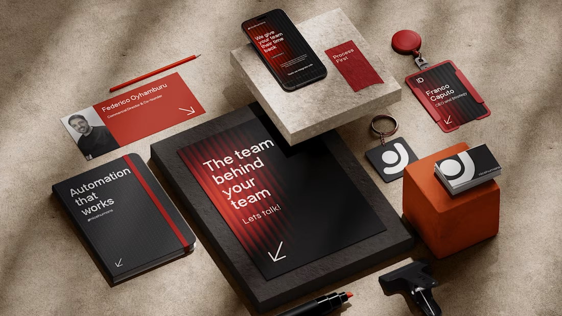
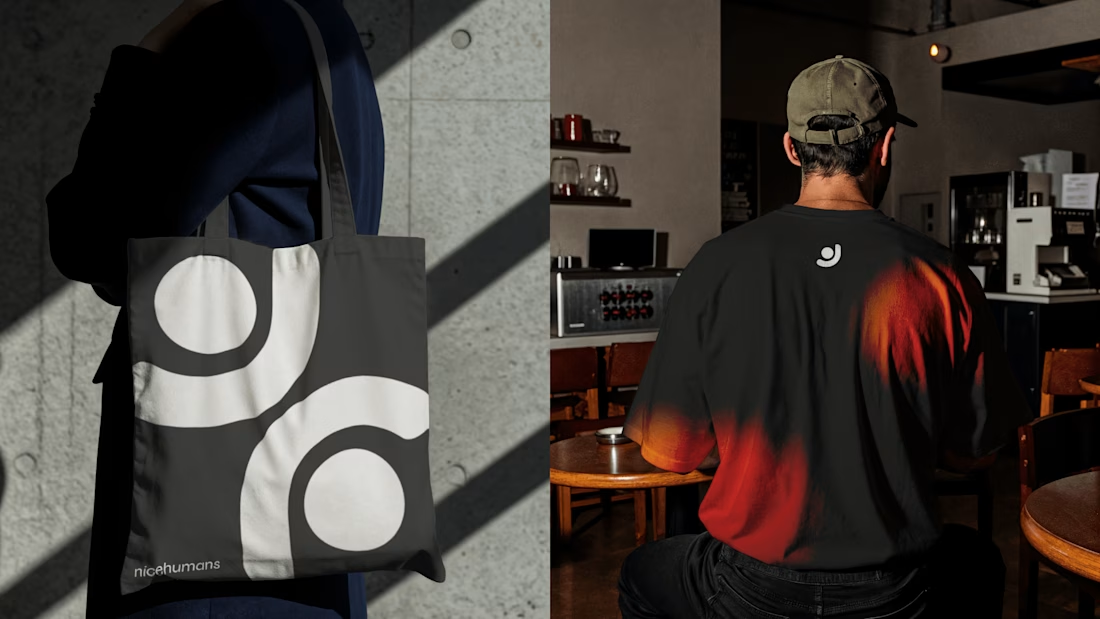
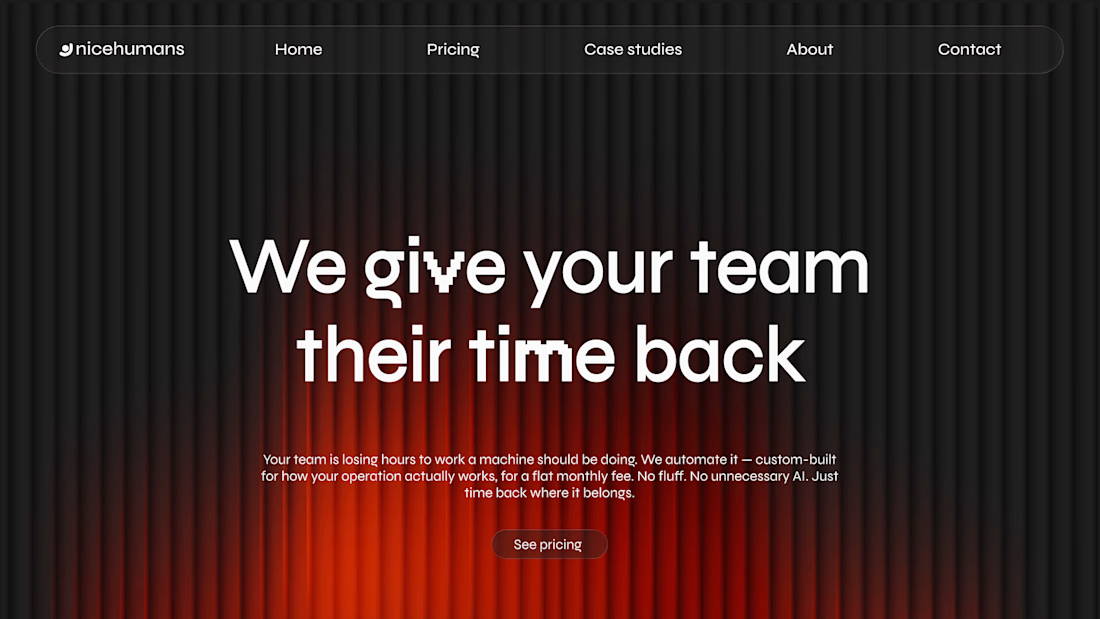
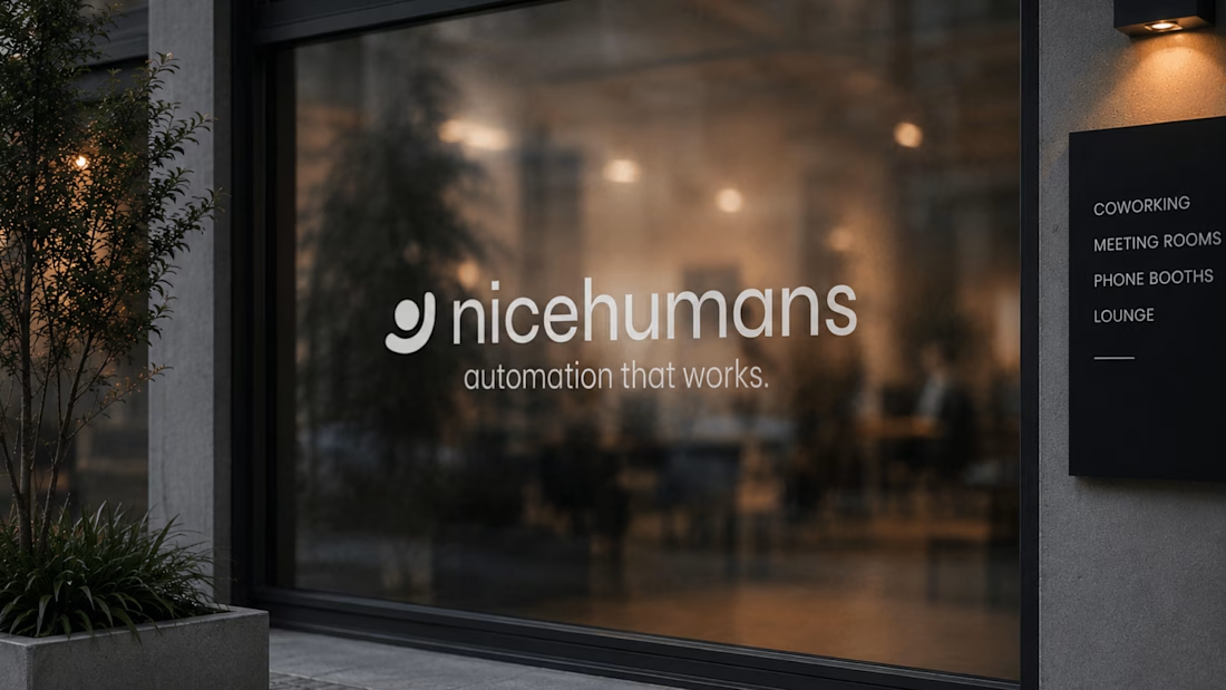

Great strategy and sleek execution! The visual hierarchy across web and print is spot on. 👏

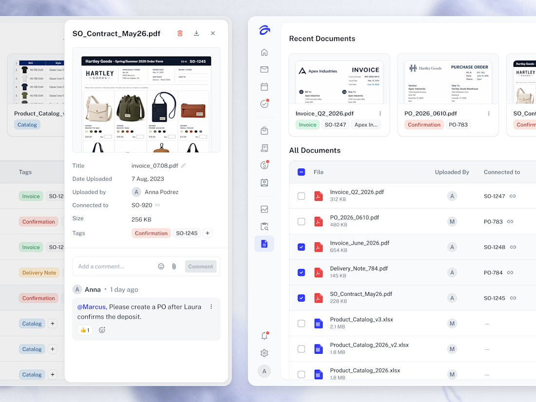
📂 Every file the business runs on, gathered in one library and linked back to the order it came from.



Creative work Anna

Mosaic: Curated Web Design Gallery
Mosaic is an internal Huehaus project: a gallery that features one standout website a day. We built it because we spend a lot of time looking for good references and wanted a place that only showed work we'd actually recommend. Every site is picked by hand.
The site is built in Framer. The layout is a simple grid that stays out of the way, with filters for 18 categories like Agency, Bold Type, Editorial, Minimal, and Dark Mode, so you can get from browsing to a specific reference quickly.
Outcome: Mosaic is live and updated daily. It gives designers a reliable place to find references and gives Huehaus a presence in the design community, while showing what we can build in Framer. It's one of the original 128 sites featured in Framer Gallery.


Amazing work!