The network for creativity
Join 1.25M professional creatives like you
Connect with clients, get discovered, and run your business 100% commission-free
Creatives on Contra have earned over $150M and we are just getting started
Back to feedPost
Here is my first submission for this hackathon.
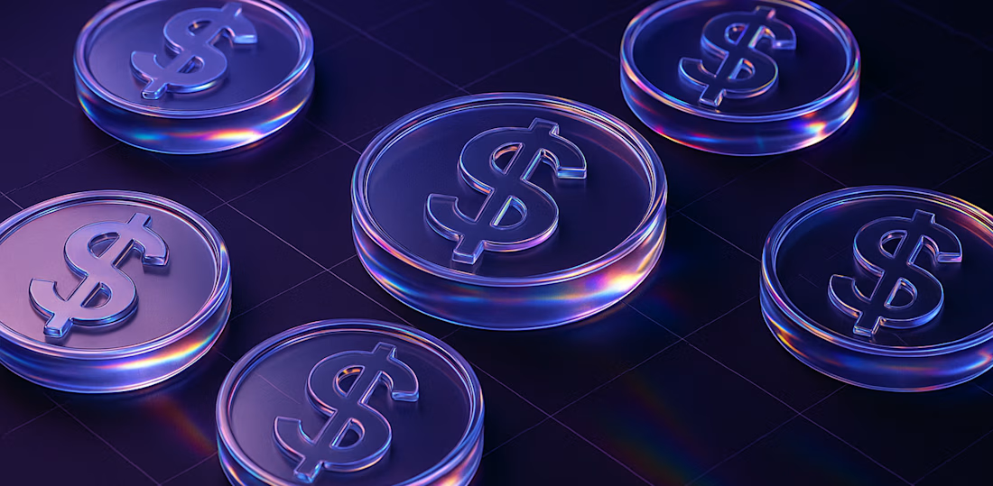
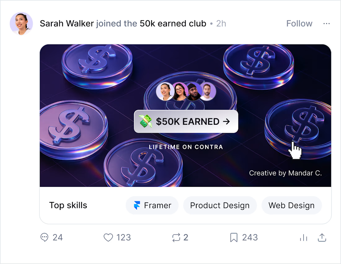
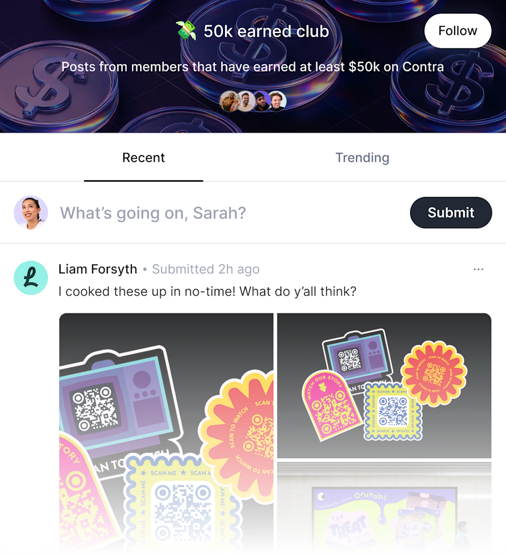
The clean 3D aesthetic paired with subtle neon hues gives it a premium, digital-native feel—like a trophy for your wallet. The currency icons are spaced rhythmically to convey momentum and consistency, echoing the idea of stacking wins over time.
The goal was to create something that feels both aspirational and grounded—something freelancers would be proud to see as a badge of their grind and growth. Think of it as a sleek visual high-five from the Contra to the creator.

@Mandar Chaudhari This is really nice🤩

@Oge ui/ux_Designer Thanks mate!

@Mandar Chaudhari Excellent Work
@Haidar A Thanks man!

@Mandar Chaudhari Looks Great 👌

@Mandar Chaudhari this is super clean
@Mandar Chaudhari please follow back so that I can see more of your post

@Mandar Chaudhari Sleek 3D neon feels like a digital trophy.
The network for creativity
Join 1.25M professional creatives like you
Connect with clients, get discovered, and run your business 100% commission-free
Creatives on Contra have earned over $150M and we are just getting started





