The network for creativity
Join 1.25M professional creatives like you
Connect with clients, get discovered, and run your business 100% commission-free
Creatives on Contra have earned over $150M and we are just getting started
Back to feedPost
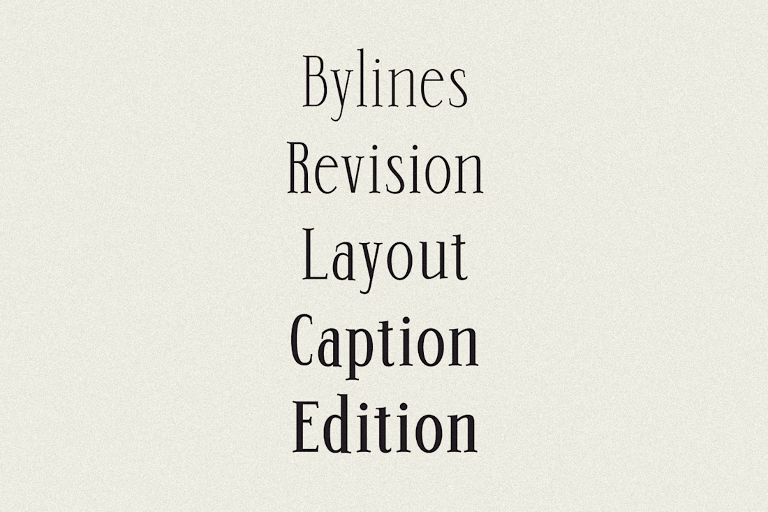
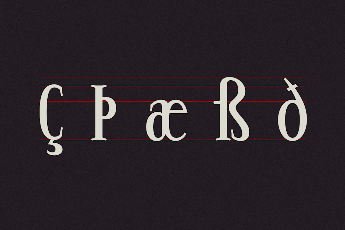
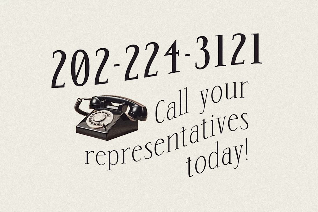
🔤 🖋️ Typeface Design: Op-ed
Inspired by the typography that defined 70s and 80s newspapers and magazines, Op-ed is a semi-condensed serif typeface with curved serifs and nostalgic charm. Its rounded, sculptural details bring a dynamic energy reminiscent of bold editorial design, blending classic sophistication with contemporary versatility. Ideal for both print and digital use, Op-ed captures the essence of retro editorial design while remaining refined and highly legible for modern applications.
It is a variable typeface and also supports 5 separate font weights. I will be working to expand its capabilities like additional glyphs to support more languages and italics.
@Isabel Ramos this feels so classy but with a fun twist, I love it
@Isabel Feuerstein Thank you so much! 😊
The network for creativity
Join 1.25M professional creatives like you
Connect with clients, get discovered, and run your business 100% commission-free
Creatives on Contra have earned over $150M and we are just getting started
Challenges
View allTrending
Claude
Claude has entered the design space. How are you using Claude Design?
Contra University
Learn from expert creatives how to earn more using next-gen AI tools.
MagicPath
The canvas is infinite, and exploration is becoming the workflow. How are you using MagicPath?
creativeaiflow
Creative AI workflows are evolving. What tools do you use, and what are their strengths and weaknesses?
freelancerlife
Freelancer life is wins, pivots, and everything in between. What’s yours right now?