The network for creativity
Join 1.25M professional creatives like you
Connect with clients, get discovered, and run your business 100% commission-free
Creatives on Contra have earned over $150M and we are just getting started
Back to feedPost


The network for creativity
Join 1.25M professional creatives like you
Connect with clients, get discovered, and run your business 100% commission-free
Creatives on Contra have earned over $150M and we are just getting started





Related posts

$10K earned on Contra. 🎉💸
Grateful for every client who took a chance on me. This is just the beginning. More great products, more real partnerships, more milestones to hit. 🙌
Thank you to everyone who's been part of it. Onward. 🚀
#10k #contraearnings #Freelance #Webflow #Framer #Webdesign


Congratulations nice job 🎉🎉

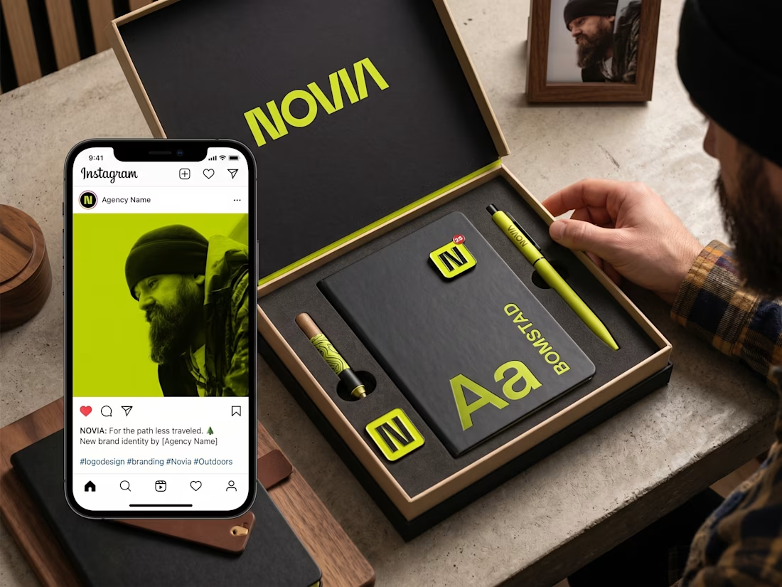
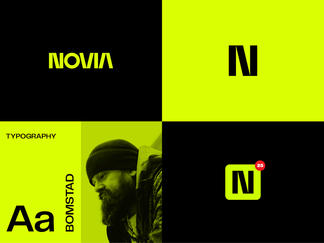
✨ Recent Work | Logo Design for Novia
Recently completed a logo design project for Novia, creating a distinctive and modern mark that gives the brand a clear visual identity.
The goal was to develop a logo that feels clean, memorable, and versatile — one that can work confidently across digital platforms, print materials, marketing assets, and future brand applications.
I focused on creating a strong balance between simplicity and personality, with careful attention to typography, proportions, visual balance, and scalability.
Project: Logo Design
Client: Novia
Services: Logo Design • Visual Identity • Typography • Brand Direction
Another identity project where a simple mark is designed to give a brand a strong and recognizable starting point.
#LogoDesign #BrandIdentity #Branding #VisualIdentity #GraphicDesign #LogoDesigner #CreativeDesign #BrandDesign #Novia

Wine Journey: Email Newsletter Designs
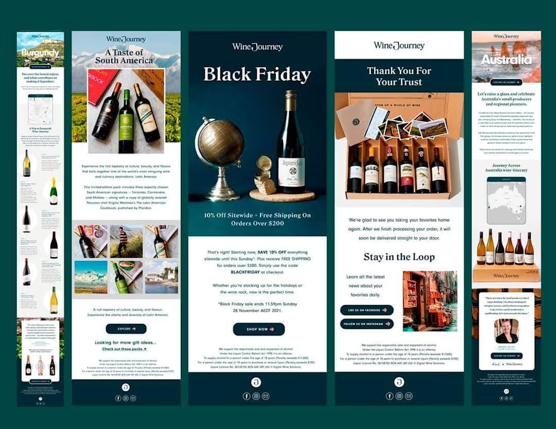
I designed a set of email newsletters for Wine Journey, an online wine club. The set covers a Black Friday promo, regional wine features (Burgundy, Australia, South America) and a thank-you email for customers.
Each one keeps the same clean brand look, with a clear button so readers know what to do next