The network for creativity
Join 1.25M professional creatives like you
Connect with clients, get discovered, and run your business 100% commission-free
Creatives on Contra have earned over $150M and we are just getting started
Back to feedPost


@Karolina Hess Love this! Very modern and sleek without feeling too cold.

@Madison Green thank you!

@Karolina Hess I like it at a first glance, but what's the idea behind the partitioned "O"? And why did you choose those colors? Just curious 😊

@Nico Ramella @Karolina Hess I'm also curious about the color psychology!
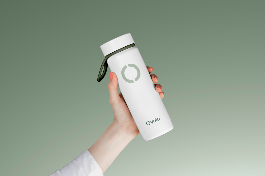
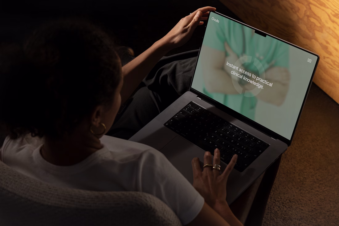
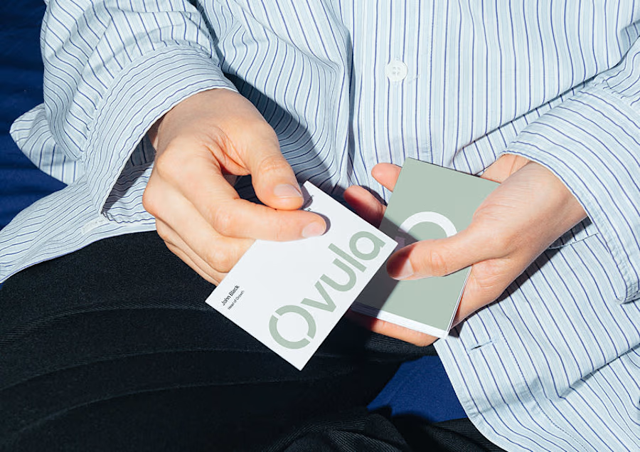
The split “O” in Ovula stands for connection and care — like two halves reaching out. It was inspired by linked hands and rings, symbolizing support, empathy, and simply being there for someone 😊
Sharing a Figma screenshot from my early explorations!
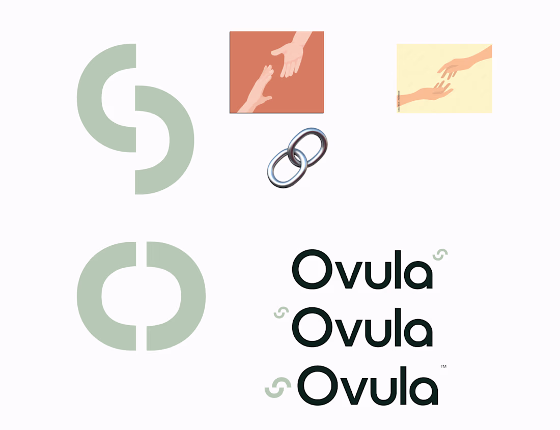
@Nico Ramella oh, and as for the colors: the greys bring a sense of softness and neutrality. The pistachio green is inspired by the color of doctors’ scrubs :) The dark greens add a sense of depth and trust. Hope it all makes sense :)
The network for creativity
Join 1.25M professional creatives like you
Connect with clients, get discovered, and run your business 100% commission-free
Creatives on Contra have earned over $150M and we are just getting started
Trending
maxearnings
The next frontier of payments is live on Contra. How are you maximizing revenue?
freelancerlife
Freelancer life is wins, pivots, and everything in between. What’s yours right now?
aidesignflow
AI tools are redefining how designer work. What does your workflow look like?
micrographics
Micrographics started as utility - barcodes, packaging, instruction labels. How would you use them?
aivideo
AI video tools are moving at warp speed. What tools are you using?