The network for creativity
Join 1.25M professional creatives like you
Connect with clients, get discovered, and run your business 100% commission-free
Creatives on Contra have earned over $150M and we are just getting started
Back to feedPost

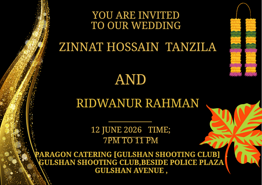
THIS IS[ MARRIAGE CEREMONY ]WEDDING CARD CREATED MY HAND
The network for creativity
Join 1.25M professional creatives like you
Connect with clients, get discovered, and run your business 100% commission-free
Creatives on Contra have earned over $150M and we are just getting started

Challenges
View all


Related posts

Working on a website redesign for one of the biggest crypto data providers.
Lots still under wraps, but these cards are my fav so far.
More soon ... 👀


The restraint in these dark cards is doing a lot of work—the tiny pixel details feel intentional, not decorative. The progression across the set makes the crypto product direction feel especially cohesive.

Designed and built a card purchase interaction for the iPhone Duo.

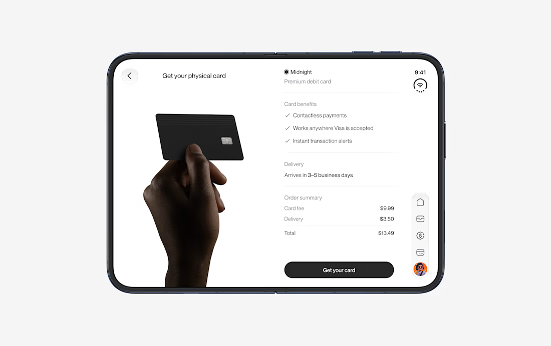
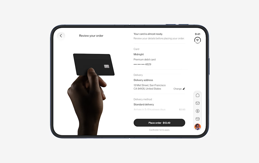
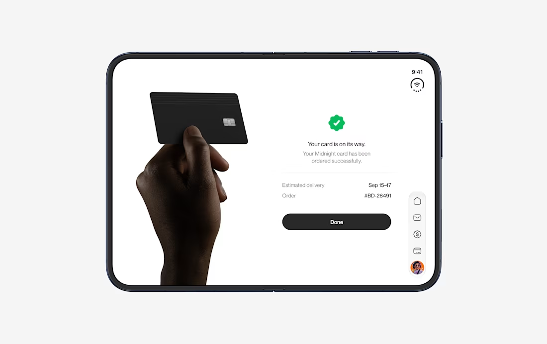
Love how the purchase flow stays focused while still showing the full iPhone Duo journey. The repeated card framing makes the interaction feel easy to follow.


How did you handle transitions between the carousel items?