The network for creativity
Join 1.25M professional creatives like you
Connect with clients, get discovered, and run your business 100% commission-free
Creatives on Contra have earned over $150M and we are just getting started
Back to feedPost

Sometimes a slide can look polished but still fail to communicate its message. The issue is often not the visual style, but how the content is presented.
A strong presentation starts with a clear idea. The audience should immediately understand what the slide is about and what they should take away from it.
Too much text, imagery, or decoration can quickly become distracting. Visual hierarchy matters just as much. Headlines, body copy, numbers, and supporting details should have different levels of emphasis, making the content easier to scan.
Another common mistake is judging a slide only from the creator’s perspective. Something that feels obvious to the designer may be unclear to someone seeing it for the first time.
That is why I always ask myself: Is the main message clear? Can the audience find the key information quickly? Does every element serve a purpose?
Effective presentation design makes information easier to understand, keeps attention focused, and highlights what matters most.

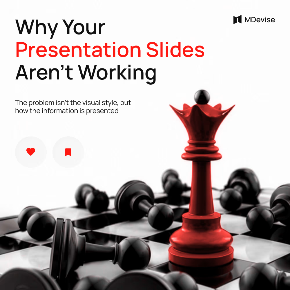

The contrast between the red focal piece and the monochrome field makes the hierarchy immediate. Nice example of using one strong visual metaphor to support the presentation’s message without adding clutter.

Love this!
The network for creativity
Join 1.25M professional creatives like you
Connect with clients, get discovered, and run your business 100% commission-free
Creatives on Contra have earned over $150M and we are just getting started

Challenges
View all


Related posts

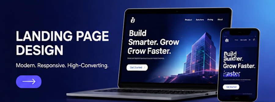
A landing page concept created for a fictional digital product business. The design focuses on clear messaging, strong visual hierarchy, intuitive navigation and strategically placed calls to action. The project demonstrates how thoughtful UI design can communicate value and guide users towards a desired action.
Deliverables: Hero section, feature sections, testimonials layout, CTA sections and responsive mobile concept.



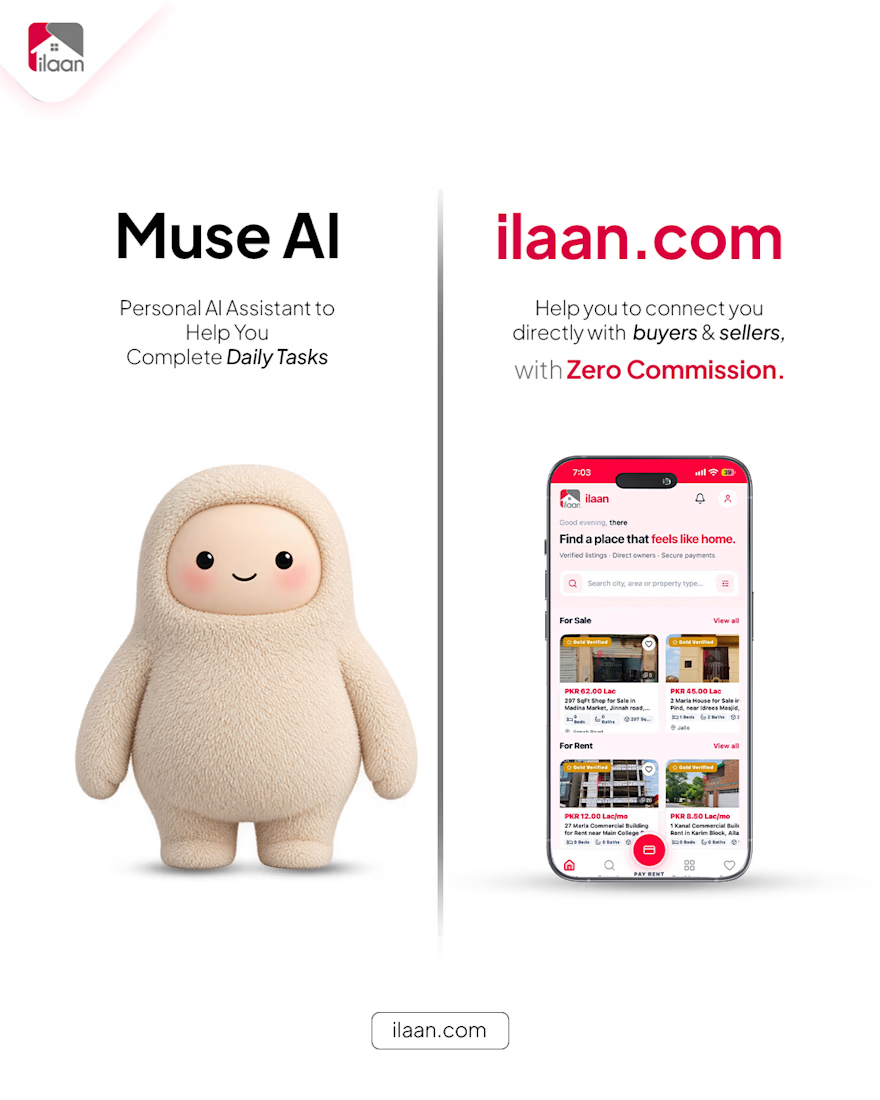
Designed a high-impact creative poster focused on modern visual aesthetics, bold typography, and dynamic layout structure. Built to capture attention, communicate key messaging clearly, and elevate brand presence across digital channels.
Tools used: Adobe Illustrator & Photoshop
Category: Creative Design / Brand Visuals / Social Media Design
#CreativeDesign #GraphicDesign #VisualIdentity #BrandDesign #PosterDesign #SocialMediaGraphics #AdobeIllustrator #Photoshop #DigitalArt #GraphicDesigner #CreativeVisuals #MarketingDesign


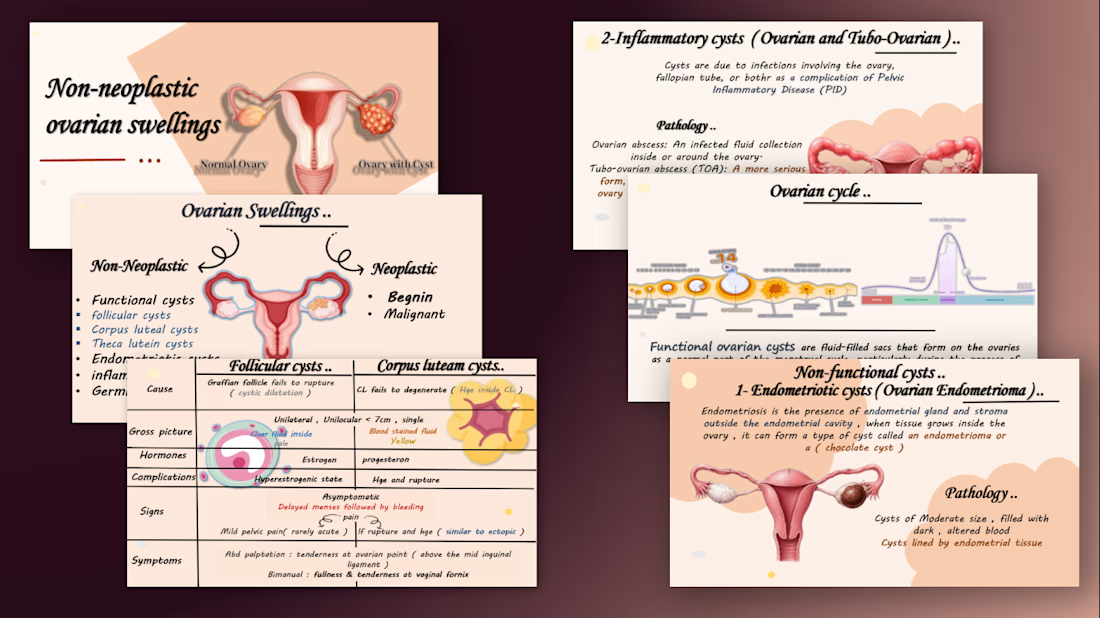
Medical presentation design and content writing