The network for creativity
Join 1.25M professional creatives like you
Connect with clients, get discovered, and run your business 100% commission-free
Creatives on Contra have earned over $150M and we are just getting started
Back to feedPost

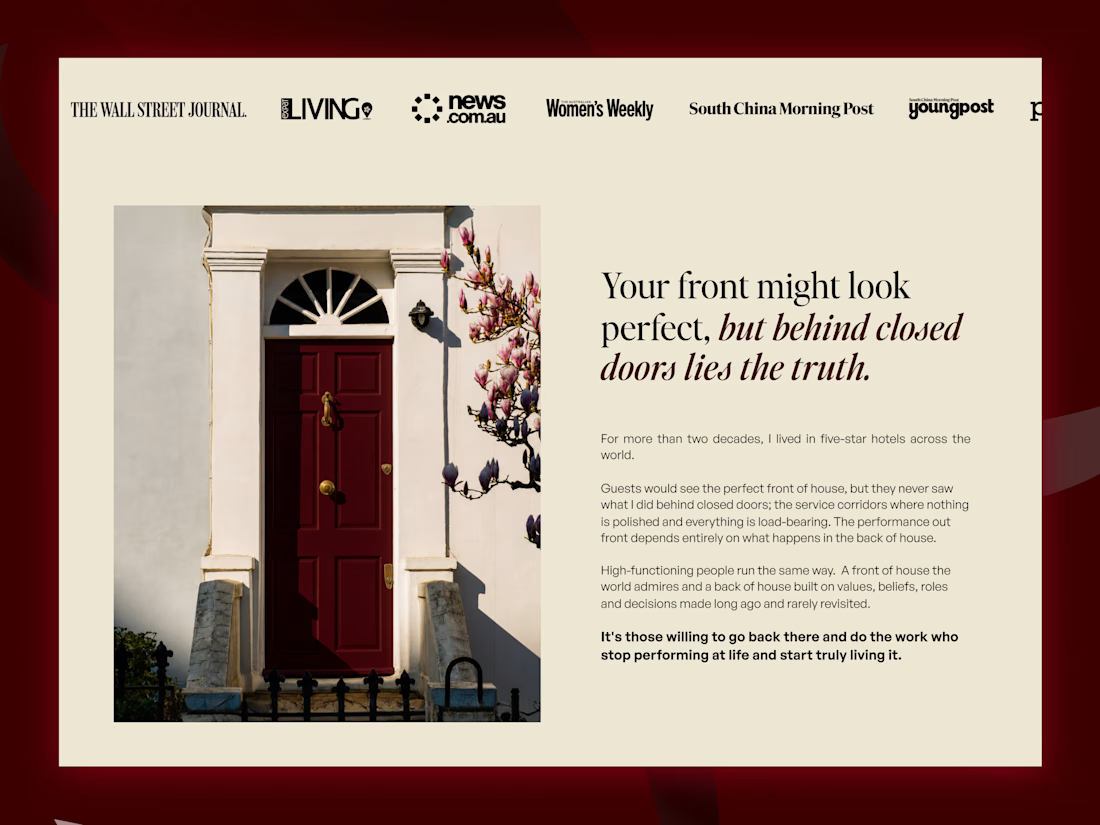

Do you mind sharing the inspiration behind the design

The deep red door as the hero image is such a strong metaphor. It makes the whole behind closed doors idea land instantly. And the editorial layout with the publication logos up top gives it real authority. Is the typography as central across the rest of the site, or does the homepage lean on it hardest?

The serif headline against the red door works really well.
The network for creativity
Join 1.25M professional creatives like you
Connect with clients, get discovered, and run your business 100% commission-free
Creatives on Contra have earned over $150M and we are just getting started



Related posts

AI can build your website.
It cannot understand who you are, how you are different and how to explain that to people through a website.

A clear story takes judgment.

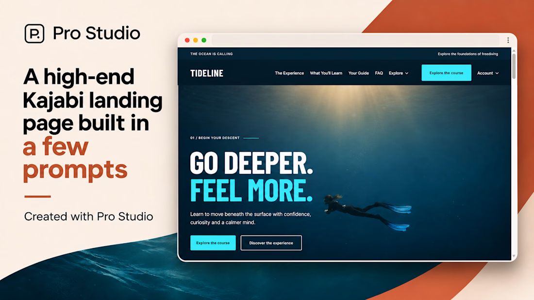
A great example of how a course landing page can have its own personality.
I really like the bold typography, immersive visuals, and how the entire design reflects the freediving experience.
Good work👏
#Kajabi #KajabiWebsiteDesign #WebDesign #LandingPageDesign


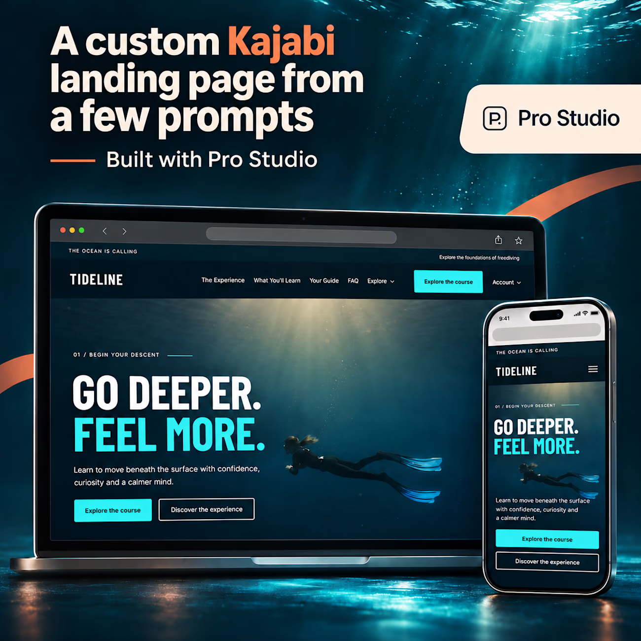
A high-end Kajabi landing page, built in just a few prompts with Pro Studio. 🌊
Meet TIDELINE: a fictional freediving school demo with immersive visuals, oversized typography, a custom header with dropdown navigation, and carefully crafted layouts. One page, with a whole lot of...

Amazing

For Ranch University, I designed and built a custom Kajabi website and course platform + community around ranch ownership and life on the land.
Earthy colors, ranch photography, and spacious layouts carry through the site, membership pages, and course presentation. I also handled the course structure and offer setup behind the scenes.
