The network for creativity
Join 1.25M professional creatives like you
Connect with clients, get discovered, and run your business 100% commission-free
Creatives on Contra have earned over $150M and we are just getting started
Back to feedPost
Made this today, React JS + GSAP
Animated - intro + hero section
text font size change feels little glitchy when noticed which is obvious with text, have to find out more refined way to do the same. (can be an image)


The network for creativity
Join 1.25M professional creatives like you
Connect with clients, get discovered, and run your business 100% commission-free
Creatives on Contra have earned over $150M and we are just getting started










Related posts

I thought that Managed version is more clean and readable and it took effort to hide letters, but the 1 vote it have is mine only.
But it's intresting to see, how i got humbled 😄

what do you feel as an designer or user, which one feels more graceful ?
3 voted
75%
1 voted
25%
4 votes
Closed

The full words in A give me something to follow right away. I'd compare what someone remembers after one viewing of each version.


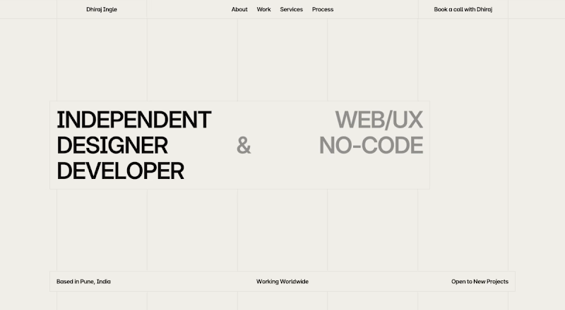
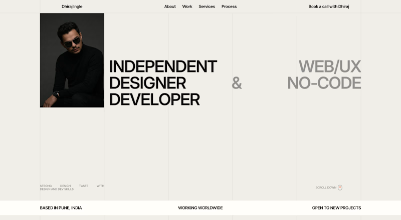

Option B looks better. Having your photo there makes the page feel personal and complete, while Option A feels a little empty on the left side. You could add a smooth cursor tilt effect to the portrait card so it reacts naturally to user movement.
3 Animated pages design - React + GSAP
when I saw it was built in GSAP I thought let's quit it and find another one.
but I knew that thought - it gives you a very valid reason to escape from hard work.
so i chose it and make it and learned too many insightful details about complex animations that depends on each other.
i thought GSAP is just like Motion so i don't have to learn it, but it's a freaking game changer.
