The network for creativity
Join 1.25M professional creatives like you
Connect with clients, get discovered, and run your business 100% commission-free
Creatives on Contra have earned over $150M and we are just getting started
Back to feedPost

Your website can pass the desktop test.
Pass the mobile test.
And still fail the visitor.
The gap? Everything in between.
A tablet in portrait. A smaller laptop. A browser beside another app.
Before you publish your next Framer site, try this 30-second check:
→ Slowly resize across the full width range.
→ Pause when a heading wraps or navigation gets crowded.
→ Check that images, cards and buttons still have room.
→ Fix the layout where the content needs it. Then verify on real devices.
A breakpoint is a design decision. Your visitor's screen isn't.
I created this motion study around FORMA, an original architecture website concept, to make that gap visible.
What usually breaks first in your builds: NAV, TYPE, or CARDS?
Need a Framer website that feels considered at every width? Let's talk.
Visuals: AI-generated imagery + illustrative layout animation.
Music: “Serene View” by Arulo, via Mixkit (Stock Music Free License).

The network for creativity
Join 1.25M professional creatives like you
Connect with clients, get discovered, and run your business 100% commission-free
Creatives on Contra have earned over $150M and we are just getting started











Related posts


this is really nice 100%. nice job

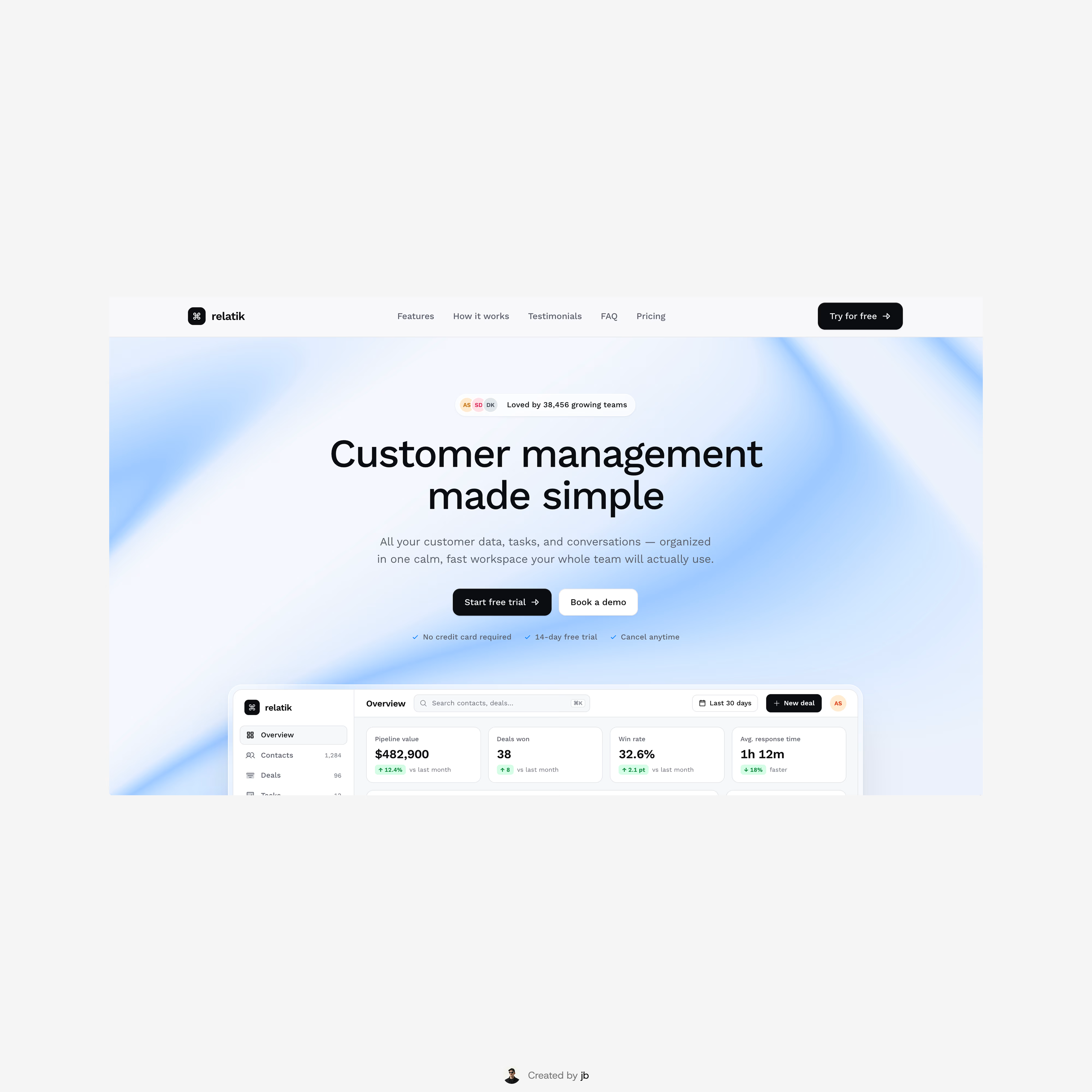
Relatik was my first ever Framer template. It didn’t pass the requirements when I started it over a year ago, but it felt like a shame to leave it in the archives, so I redesigned it and gave it a second chance.
I’d be happy if you checked it out!
Preview link



looking for a great designer

