The network for creativity
Join 1.25M professional creatives like you
Connect with clients, get discovered, and run your business 100% commission-free
Creatives on Contra have earned over $150M and we are just getting started
Back to feedPost

The network for creativity
Join 1.25M professional creatives like you
Connect with clients, get discovered, and run your business 100% commission-free
Creatives on Contra have earned over $150M and we are just getting started



Related posts

what do you think of the concept posters i made for nirvana event.
which looks the best a or b?
comment down your thoughts which you like which you don't.
2 voted
67%
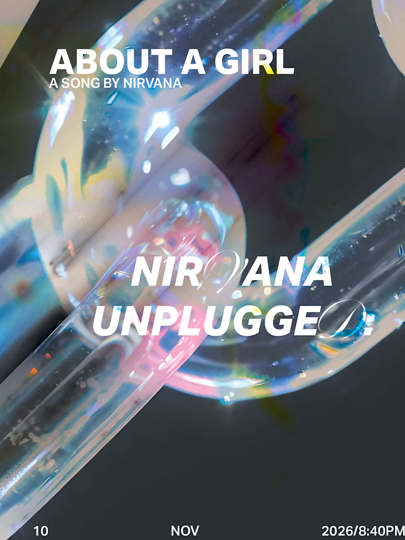
1 voted
33%
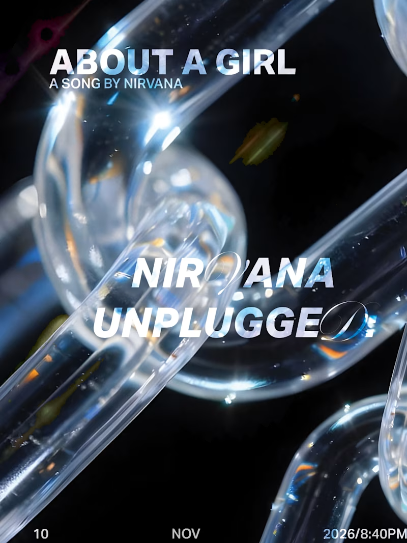
3 votes
Closed

I'd go with the cooler blue one on the left, the pink tint on the right competes with the white title. The date line at the bottom is tiny, will it be bigger on the final poster?


Great concept and a very strong visual direction.

I personally love pixel so that might seem a little biased lol, but that looks amazing 🤩

One pixel grid. A whole brand.
For Appy, a London product studio for impact-driven startups, the wordmark, icons, 3D smile and Appy Pixel, its custom typeface, all come from the same grid.
Appy Pixel won Typography at the Online Design Awards.
Type first or symbol first: where do you start a rebrand?