The network for creativity
Join 1.25M professional creatives like you
Connect with clients, get discovered, and run your business 100% commission-free
Creatives on Contra have earned over $150M and we are just getting started
Back to feedPost

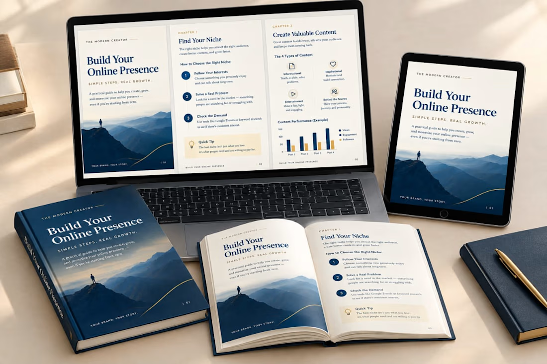
A professional digital guide can turn your ideas into a polished, valuable resource. 📘
I create clean, visually engaging digital products that help educators, coaches, course creators, and businesses present their content professionally.
From PDF guides and ebooks to educational workbooks, planners, and Canva templates, my focus is on combining thoughtful layouts, clear typography, and practical design.
✨ What I design:
• PDF guides & lead magnets
• Ebooks & digital workbooks
• Educational worksheets & activity books
• Teacher planners & printables
• Professional Canva templates
Looking for a designer to bring your next digital product to life? Let's connect!
💼 View my services and portfolio on Fiverr: [https://www.fiverr.com/s/zAAyVXK ]
#DigitalProductDesign #PDFDesign #CanvaDesigner #WorkbookDesign #EducationalDesign
The network for creativity
Join 1.25M professional creatives like you
Connect with clients, get discovered, and run your business 100% commission-free
Creatives on Contra have earned over $150M and we are just getting started





Related posts

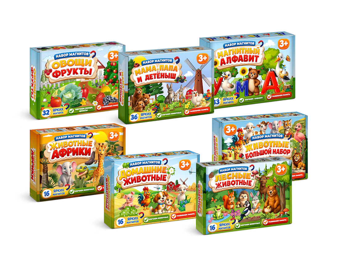
MagnoToys — Multi-SKU Children's Educational Packaging System
Design and systematic structural layout of a multi-SKU packaging line for children's magnetic educational games. I developed the unified brand grid, managed consistent color-coding across 5 different product variants, and created production-ready vector dielines with precise bleeding and folding lines.



Cool!

A modern pasta advertising poster designed with a warm, minimal color palette and bold typography. I combined a pasta dish photograph with oversized text, layered shapes, and promotional elements like 50% OFF and ORDER NOW to create an eye-catching food campaign.
I focused on typography, composition, contrast, and visual hierarchy while keeping the overall design clean and commercial.
Skills: Graphic Design · Food Advertising · Typography · Poster Design · Photo Composition · Promotional Design
#GraphicDesign #PastaDesign #FoodAdvertising #PosterDesign #Typography #FoodBranding #SocialMediaDesign #AdvertisingDesign #VisualDesign #CreativeDesign

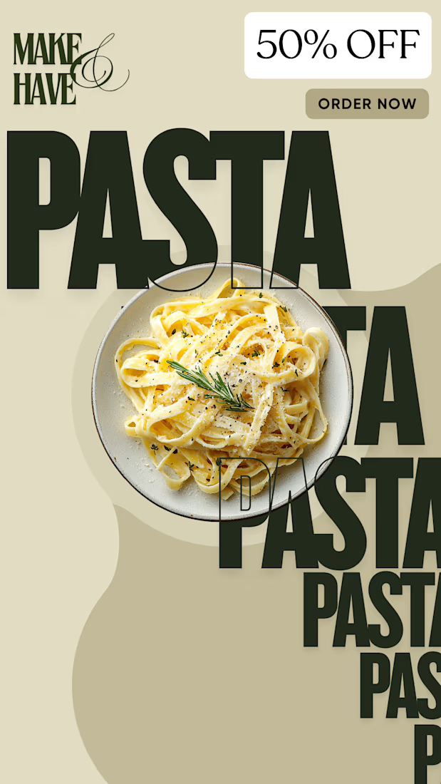

I noticed the oversized typography overlaying the pasta shot really pulls the visual hierarchy, letting the 50% OFF badge stand out without overwhelming the image

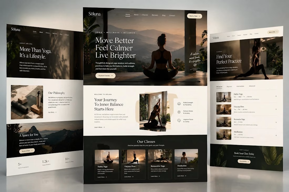
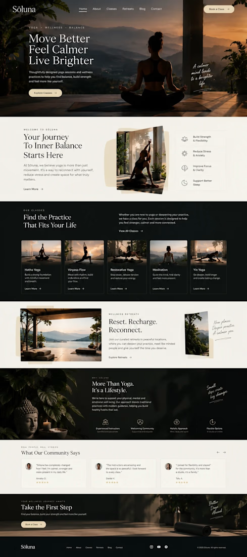
Sōluna | Yoga & Wellness
A yoga website designed to make you slow down before you even book a class.
Sōluna is built around a simple idea: yoga is more than the practice itself. It is about creating space to move, breathe and reconnect.
That idea became the starting point for the website.
I wanted the visual direction to feel calm without becoming predictable, so I combined warm neutral tones with deep charcoal, forest green and muted gold. Large photography, editorial typography and generous spacing give the page a slower visual rhythm.
The homepage introduces the brand, guides visitors through the different classes, highlights wellness retreats, shares community experiences and eventually leads them toward booking.
Rather than filling the page with typical fitness website elements, I focused on how the visitor should feel while moving through it.
Calm. Curious. Comfortable enough to take the next step.
Creative Direction: Yoga & Wellness, Web Design, UX/UI, Brand Design, Art Direction, Responsive Design