The network for creativity
Join 1.25M professional creatives like you
Connect with clients, get discovered, and run your business 100% commission-free
Creatives on Contra have earned over $150M and we are just getting started
Back to feedPost

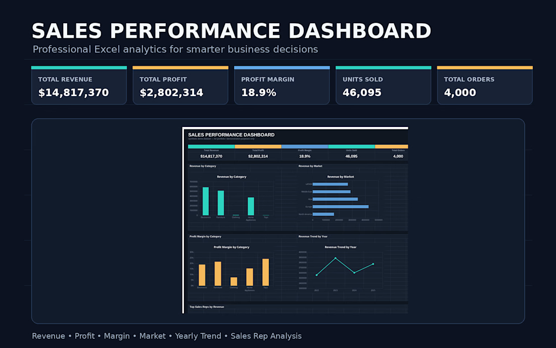
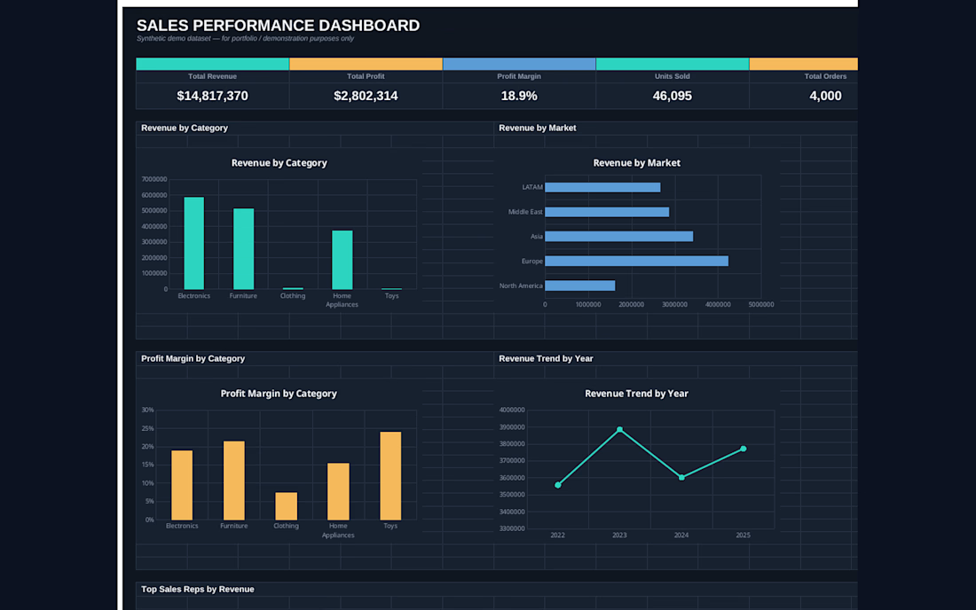
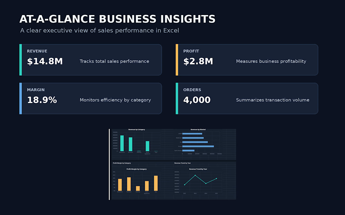
Sales Performance Dashboard in Excel

The network for creativity
Join 1.25M professional creatives like you
Connect with clients, get discovered, and run your business 100% commission-free
Creatives on Contra have earned over $150M and we are just getting started





Related posts

The client's inventory wasn't organized. Products weren't consistently recorded, there was no SKU structure, and the system's stock figures didn't match what was physically on the shelves. That made it hard to know what they really had, what it was worth, and what their cost of sales should be.
What I did
Chose the right tool. I recommended QuickBooks Plus, which handles inventory tracking properly, rather than patching up spreadsheets.
Built the product list. I added every product to the system and allocated a clear SKU to each one.
Sorted the inventory. I organized the stock records so each item could be identified and tracked.
Reconciled to a physical count. I compared the system quantities with the actual stock on hand and resolved the differences.


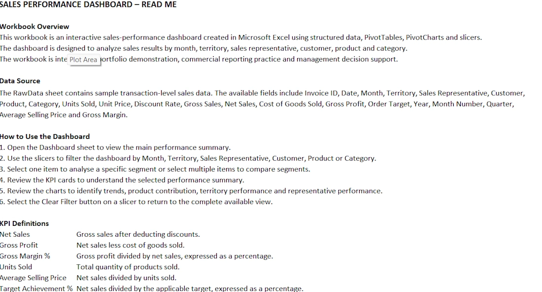
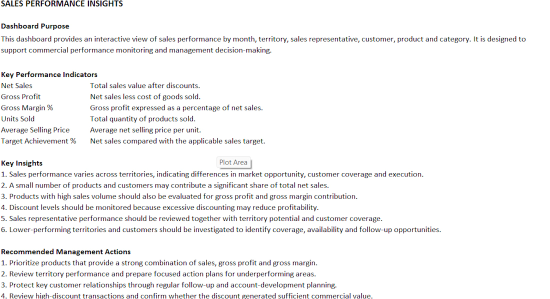
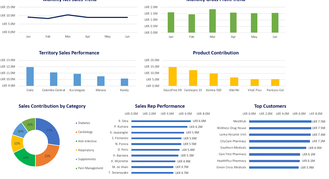
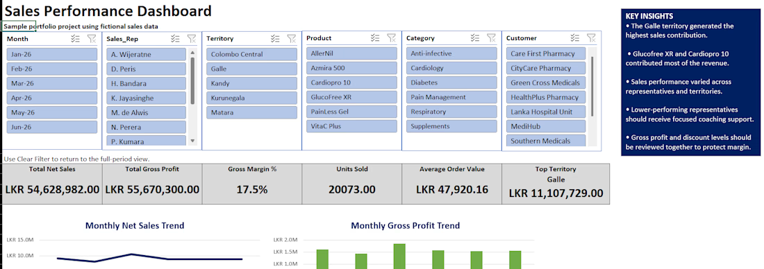
An interactive Microsoft Excel dashboard created to analyze pharmaceutical sales performance by month, territory, sales representative, customer, product and category. The dashboard includes KPI cards, PivotTables, PivotCharts, slicers, sales trends, gross profit, gross margin and management insights. The project uses synthetic data for portfolio demonstration.